Knepper's Peppers NEW label. VOTING CLOSED.

Hey everyone. Been doing some work for our friend Justaguy. Got a couple labels and we have decided to leave it up to the wisdom of the THP users to make a selection.

First, here is a picture of the black and white design on the bottle. A compositional rough if you will. Not for voting but more for spatial relationships.


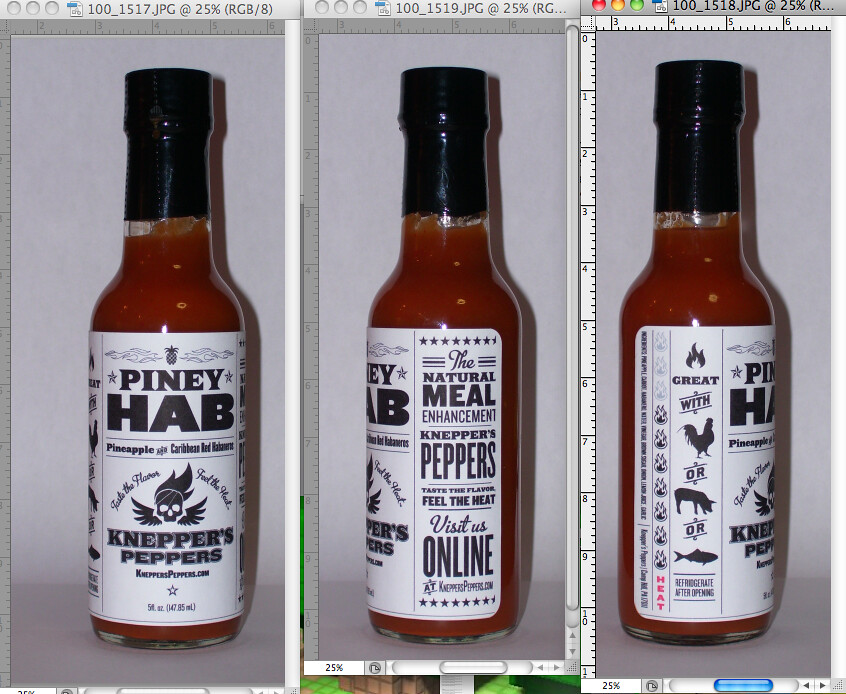
Ok. Now for the voting options. YOU GET TO PICK THE LABEL! PLEASE VOTE!

OPTION A:


OPTION B:

 
The added brown does make the label pop, but if you envision it on the bottle, like b&w pic #1, I think the brown side panels will shrink the visual front of the bottle and the bottle will look smaller when on a shelf.

You guys would have to print a couple, put 'em on the bottles and then stack up the bottles side by side to see if it does make it look smaller or not. Maybe keep the por/chicken/fish strip yellow and the flames could be brown.

Cool Label, though. Nice Job, Seth.
 
I'm really diggin' this label!!! Kind of a feast for the eyes. I saw the original B&W in a pic somewhere and Fell In Love with it! Then realized it was a rough draft. But I still love it! Maybe it reminded of an old-timey catalogue add or something. But anyway...of options A or B, I liked B best for it's pow and read - ability! Thanks for including us! Gor-geous-ness!!!!
 
On the contrary SL, I think on either one the first thing you will see (if they're faced properly on a store shelf), is PINEY HAB, then Brians logo.
Once you grab the bottle and start reading the sides, B is a feast for the eyes. I love the heat scale, and it really shows up better with the contrasts on the option B.

I vote B.

On another note, so many bottles are so full of colors, the B&W would stand out more than anything on a store shelf. (find a picture of Palky's house and see how many B&W labels he has)
Not sure where these bottle are targeted, but just a thought...
 
I like the way the words Piney Hab are presented in A more than B. On B the two vertical brown bands are excess brown to my eyes knowing there is orange contents behind it.

Great art work Seth

Mike
 
I think that choice A flows better when I read it. Too much contrast on choice B as stated above.
I do like the black and white as well.
 
I know I already commented- but-

when looking again, B still seems "busy". Maybe on label A, on the right side panel, make "KneppersPeppers feel the heat, taste the flavor" in the red color.


(by the time we're done, you'll be completely redesigning the whole thing. :lol: just kidding~~~ ) It's a great label, couple of tweeks and it's there.
 
Personally i like A but thats just my thing. From a marketing standpoint, I believe a marketing company would choose B due to the yellow/red shade which is known to excite hunger.
 
Back
Top