I don't get it.
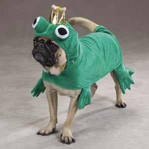
1. What's a Frog Dog?
2. It doesn't look like a hybrid dog/frog, it looks like a dog in a frog costume. If that's what you're going for, good deal. But it sounded like you wanted more of a hybrid.
3. In my opinion it would look better if "Frog Dog Sauce Co" was all on the same line, of if "sauce company" was very small underneath.
4. While red / green work as contrasting colors, this comes off looking cartoonish and not like a professional graphic for a product. Not a fan of the artwork. It looks like it was done in MS Paint .
5. The "glow" around the dog is more distracting than beneficial and the yellow outline around the image is very distracting. Is the dog supposed to be radioactive? If not, the glow doesn't make sense to me, and I get fixated on it rather than the overall label itself. Then you have a drop shadow on all the lettering - it's just too much. Less is more when it comes to special effects.
By the way, there's already a company named "Frog Dog". They are a marketing & communications firm. A fairly well established one at that. Might want to check out trademark issues in using this name before you burn too much time on a label? In the least it'll make it difficult to secure the URL for your website, and at worst they'll go after you for infringement.
http://frog-dog.com/
Good luck with your design - I'm sure it'll round out as you go through revisions - this one's pretty raw in my opinion.