misc Advertising campaign ads, did these myself

In an effort to pinch a few pennies I decided to try my hand at my own marketing visuals for Facebook ads...  Looking for thoughts, suggestions, ideas.
 
Quick info: these ads are targeted to serve people to my website for farming page clicks, and thus, must grab attention on the right side of the screen or news feed, against a white background.
 
The Campaign is called: Step Up Your Flavor
 
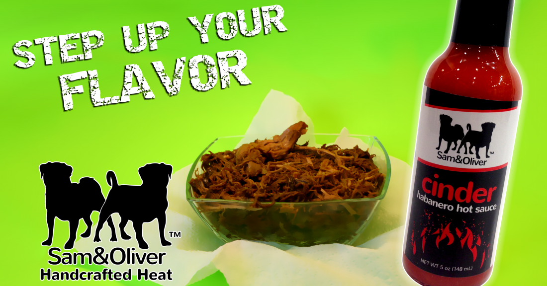
There are currently two completed that are worthwhile, and I'm doing one for Pizza and Wings.
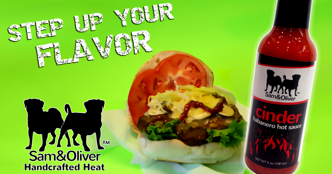
 
step up hamburger.PNG

step up pulled pork.PNG

 
Text on these ads are:
 
Text above picture (90 char max):
It's time to step up your flavor.  Try Sam & Oliver's Cinder hot sauce.  Get in the game!
 
Title (25 char max), below picture:
Sam & Oliver's Cinder
 
News Feed Link Description (200 char max), below title, below picture:
Sam & Oliver's Cinder hot sauce lets you step up your burger game with a true handcrafted, artisan heat.  Taste the difference a gluten-free, Paleo friendly hot sauce can make for your food!
 
Call to action: (what the button looks like)
Shop Now
 
Actual ad will look something like this in the news feed.  There will be a small thumbnail version of this on the right hand side of facebook, and will cost me about $255 to run it for 2 months.
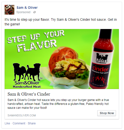
 
example.PNG
 
They look good!
 
Does the pork have any sauce on it? Need to see that.
 
"Step Up Your Flavor" is awkward. Our flavor? Step Up The Flavor.
 
The flavor. Your tastebuds. Not your flavor.

PS. That tomato looks weird. It is Photoshopped to the roll?
 
No, the tomato was actually legit, hand sliced... (actually 2 slices, one on top of the other)
 
Step up your game, is a phrase, as in "you need to step up your game if you want to win."...  I switched game to flavor.  I will try adding "The" isntead of "Your" - as the ad was attempting to talk directly to the reader in that motivational, loud voice.
 
The pork had sauce mixed in.  I wasn't sure how to get sauce on top as the cinder is red and blended a bit.  The entire pork batch was shredded and stirred in it.
 
EDIT: I also used an effect called "Bilateral smoothing" to take out all the hyper-details and sort of dumb-down the photo's details slightly, to make them consistent (so red stays red, white stays white) without the artifacts that often screw up an image.  I'll also repost it without this effect to show you.
 
Couple knee-jerk thoughts:
1. The font for "step up your flavor" looks a bit like the Doritos Jacked ads. Otherwise I like them.

2. A caution about using FB ads...I used them a couple of times and saw virtually zero benefit from them. Facebook's entire advertising "strategy" was a haphazard response to pressure from investors to monetize the site.

I'll avoid going into full blown rant mode, but I did some research and there are significant problems with paying for FB ads. I read a very good article (wish I sill had the link, but google is your friend) and FB ads are essentially worthless

Here's why: there are "click farms" in Asia & India who create millions of fake FB accounts.

FB sells you ads based on "exposure". And number of views.

There's nothing to discriminate between a fake FB profile "viewing" your ad and a real profile viewing your ad.

When I used FB ads, I saw a small spike in "likes" on my page - unfortunately they were all BS accounts. You can always tell - smokin hot chick or hipster looking dude with very few friends, all stock photos hastily added, employment of "ex florist at" or "ex barista at" etc.

There has been speculation that FB is funding these "click farms" to generate revenue, but to my knowledge this has not yet been proven.

Still - the fact is that someone is paying people to create bogus FB accounts and these bogus accounts will cost you money for no return when using FB ads.

I've not used them since I read that article. Please don't take my word for it, google it for yourself and come to your own conclusions, but near as I could tell FB ads were totally ineffective and a total rip off.

The latest trend by companies is to do "share/like" giveaways. "Today is sauces Friday! Spam all your friends with this ad and you might win a bottle of stuff!"

That circumvents FB's filtering of posts and (in my opinion) turns users into spammers. Good idea, just not something that I'm comfortable with doing as a company.

Hope this is helpful. The ads look good though! I'd just suggest putting them to better use than FB.
:)


Ps - I have a hard time telling what the bowl of shredded pork is - had you not told is I wouldn't have guessed. Would suggest going with something more obvious (you mentions pizza...that's always a good one)
 
The green came from a greenscreen setup haha. But against a white screen its a virtual bullhorn, so i left it.

The font is from dafont.com called "Destroy" a crumbling block font

I think i'll ditch the pulled pork pic. Two people i showed thought it was ground beef. Wtf? Lol
 
Kalitarios said:
Step up your game, is a phrase, as in "you need to step up your game if you want to win."...  I switched game to flavor.  I will try adding "The" isntead of "Your" - as the ad was attempting to talk directly to the reader in that motivational, loud voice.
 
The pork had sauce mixed in.  I wasn't sure how to get sauce on top as the cinder is red and blended a bit.  The entire pork batch was shredded and stirred in it.
 I also didn't get what the pulled pork was.  First view I thought it was wood chips.  Definitely go with something more recognizable like pizza.
 
 
We just had a 15minute family discussion about "Step Up Your Flavor" and we don't get it.  I mean, we get it...but it just doesn't work for some reason.  The 15 year old did not like it at all. 
 
There's something grammatically not right and I can't put a finger on it.  Maybe I don't get what "your flavor" is.  YOUR is personal/possessive.  YOUR game, YOUR efforts, but what is YOUR flavor?  The FOOD'S flavor can be improved, but how can a person's  flavor be improved????   
 
I dunno, I'll leave all the nitpicking of that to the English teachers in the group.  :lol: 


I don't mind the green, it definitely pops on a page.  I've never done FB ads, sounds like there's some things to research, though.
 
You know the point of a greenscreen is... um, to remove the green and replace it with imagery right? It's called chrome keying. But... the green is still there so... not sure of the point, lol.
 
Thanks for all the great input.  Much appreciated.
 
The green was used after a few of my own attempts to replace it with other visuals fell flat, and the green on white page really jumped out, especially when the add is only 3" wide.
 
The term "Your" as in "Step up your flavor" is supposed to be speaking one-on-one directly to the browser... the person sitting there with the mouse. It's an audience of one.
 
I'll mess with the wording but picture it voiced with a deep, burly voice, trying to "Wake up" the viewer.  Most people ignore the ads on the right side of Facebook.  But something that was neon green seemed to jump the best, the other color that was intense was Fuchsia pink.  I thought the green looked better than the pink for food since my product was already red.  I suppose neon yellow would work as well, which is yellow with a tinge of green in it anyway.
 
I've had a few sales from it, in fact, someone bought 3 cases outright specifically, so I guess it's paid for itself about 2/3 of the way ($255 estimated after 1.5 months).
 
I had the option of doing seamless credit card handling on the website, but it would have cost me about $275 to upgrade PayPal to PRo, enable the integration and then pay for a SSL certificate for my site, so I took a risk to see if this advert campaign would be a better use for my money, something that Lucky Dog pointed out a few weeks ago... weigh all my decisions.
 
So far I've had about 5 people message me from facebook asking more about the sauce, sold about 5 bottles and 3 cases as a direct result of the ad.  So it's not a total failure, and it will run until the end of October.
 
Back
Top