Some of you may know I am a Graphic Designer by trade, owning my own firm from 2001-2008. I have found (and this is just my opinion) that most hot sauce labels look, really dodgy. This is just one of my perks in life, I like good design and I think it means a lot more for a product than actually having a good product even though some will disagree especially with the saying, don't judge a book by its cover.
I am going to talk about three hot sauces, Defcon, Blair's and SFI. The first two being ones that I dare say, are the most well known of all hot sauces, besides perhaps Tabasco and Sirarcha, to compare to the sauce I want to talk about from SFI.
This is just all from my opinion, and from an Australian market point of view, the forum needs to get a bit more active, hence ...
Defcon - http://www.defconsauces.com/
Blair's - http://www.extremefood.com
SFI - http://www.scovillefoodinstitute.com/
If you compare the Blair's website to Defcon's, Blair easily has the better website but I find it a lot more annoying to use especially with the flames up the top. SFI has really good labels but a really shitty website, design should be uniform to create a brand image.

Defcon's labels look like the chemistry I use to use in the Photography dark rooms ... and something I would rather not drink. But that being said I actually think the design is quite smart, looking like a bottle of dangerous chemicals, especially with the name Defcon and the military applications associated with that name allows it to work. Still, I think this series of labels only really work towards chilli hunters, and not the general public in Australia - I believe this is completely different from the US market where there is a huge kind of military pride that does not exist in Australia.
Blair's for me is more about the reserves than the actually mainstream chilli sauces. Now it is true that the majority of well known US sauce is extract base, and the majority of Australian sauces are natural, so they cannot really be compared to each other. Going from Mild > Medium > Hot > Very Hot (Aussie Naga/Scorp blends) > Just stupid hot (US Extract sauces).
But Blair's really does have that following and brand image associated with his sauces. While I personally do not like his labels as much as some others, his packaging is really nice and stands out above most other sauces.
Blair's level of design is above almost all other competitors, which is perhaps why, along with his following, he can release reserves and have them sell out in less than a day. I see many chilli sauces here which are sold in the supermarket try and stand out by using 'special' ingredients, such as Cane Sugar instead of normal refined sugar or raw sugar, special types of tomatoes or things like that. While these can make a difference, saying having a white hab based sauce with white tomatoes, or fatalii with yellow tomatoes to get that colour you require, if the design let's down the sauce, it will still get judged before people buy it.
I realise that most people who sell hot sauce are starting out (especially in Australia) < 5 years, as Chilli was never that big until Nandoes came along, and it is a bit different in the US where you guys have had chilli as a part of normal everyday life being so close to Mexico and South America. Most people try to do things themselves, design websites, design labels, and think they look good when they really do not, perhaps blinded by their own pride or sense of self accomplishment.
I look back on the designs I did years ago whilst working and I think to myself, what the hell was I thinking? But at the time the design worked but compared to what we did in the later years, it is just so far beyond it. Design can only be taught so far as the basic principles, the same as Photography, exposure can be taught, composure can be taught to an extent of following basic rules to get a good image, but if you do not have an eye for it then you are pretty much stuffed. When I started in Photography after years of graphic design, I was almost colour blind to subtle changes in colour. With graphic design you work with basic colours, and when a colour is changed it is a major change, not a subtle change like a colour cast on the skin of a subject. It took me a good 3 1/2 years to be able to notice subtle colour changes after 7 years of design.
Also I see many people now trying to use gimmicks to stand out, such as the little skull key ring *I presume* on the bottle. I like it, I think its cute, but I do not think it would make a difference as much as a good label or packaging would.

Video Link: http://www.scovillefoodinstitute.com/The Big Idea with Donny Deutsch.wmv
Is it a million dollar label? I believe yes. This is the smartest f'en label I have ever seen on a bottle of chilli sauce and I wish I thought of it. However, their website sucks donkey balls when put next to their labels. Like, it is almost like they discovered this label by accident and don't have the design skills required to back it up with a good looking website.
This is so bloody important I cannot stress it enough.
Imagine if you walked into a supermarket and saw these sauces all lined up next to each other. You couldn't keep your eyes off them, they are so far away from the generic standard designs you see, from both a mainstream commercial approach to the minimalist high-class organic food that still stuffs up the design by being too minimal.
This is f'en good design, and I wish I didn't have to abbreviate that word because it would so get my point across better.
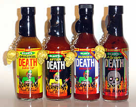
That being said, having a good label design is one thing if you do not have a brand image associated with it to back it up. If you look in the reflections of the bottles you see the person wearing white taking the photo ... guys, get some good photography done.
I know not everyone has say a studio setup of a floorpack and a product tent to take these kind of photos in, but it would make such a difference.
This;

Bad photo. Depth of field is used nicely, but it goes against the most basic law of photography of using thirds, it uses half, and looks shit. The line at the bottom of the bottles is straight but the top is not ... pisses me off and draws me away from the image. The photo shouldn't have been taken on such an angle, it should have shown more of the labels especially how it is used on the page.
If we look at the first photo from this company, where they are all in focus, we see the image is not straight, it is taken on an angle, the sauces are not in a perfect line ... the bottom again looks nice but the tops are all out of sync ... how is this possible when the bottles are all the same size?
Just careful placement of things can make such a big difference.
Good design costs good money unless you find someone who doesn't know how much their design is worth, or is doing it as a favour to you. Bad design can cost even more money, both in paying someone who designs something and it is not right (ie - choosing the wrong firm), to designing it yourself and turning away customers just based upon principles of bad design.
Blair's I presume paid for their website from this company; http://pixelbait.com/ ... I do not know how much for but the design works good, apart from a few little quirks I do not like but that is just down to personal preference.
Defcon works on its own by looking like a bottle of dangerous chemicals, I like the design but I do not think it would work with the general public here.
SFI has the best label design and they could basically take the world by storm if done right, do I believe they are doing it right now? No ... perhaps things are under way that we don't know about and they are going to make a uniform brand image, but as it stands at the moment, the labels are great but everything else is lacking. I feel almost pity that this design wasn't created for someone who can do things better than them. Time will tell and I really hope they get the rest of their design right.
If you come across a really good design idea, sauce name or anything, keep it to yourself until you have the money and expertise to exploit it's potential. Keep design uniform, create a brand image that people can associate with.
That's all ... it kind of sounds like a rant but I am at least hoping people can get some things out of it, much like the previous thread in which I discussed business with Chilliman ( Seed Company Questions - http://www.thehotpepper.com/showthread.php?t=11739 ) ... which if you haven't read you should read, because it contains some good information about business ethics and such. Not trying to start a fight or bring back the past, but it is kind of related to this thread, business and design.
Thats all ...
I am going to talk about three hot sauces, Defcon, Blair's and SFI. The first two being ones that I dare say, are the most well known of all hot sauces, besides perhaps Tabasco and Sirarcha, to compare to the sauce I want to talk about from SFI.
This is just all from my opinion, and from an Australian market point of view, the forum needs to get a bit more active, hence ...
Defcon - http://www.defconsauces.com/
Blair's - http://www.extremefood.com
SFI - http://www.scovillefoodinstitute.com/
If you compare the Blair's website to Defcon's, Blair easily has the better website but I find it a lot more annoying to use especially with the flames up the top. SFI has really good labels but a really shitty website, design should be uniform to create a brand image.
Defcon's labels look like the chemistry I use to use in the Photography dark rooms ... and something I would rather not drink. But that being said I actually think the design is quite smart, looking like a bottle of dangerous chemicals, especially with the name Defcon and the military applications associated with that name allows it to work. Still, I think this series of labels only really work towards chilli hunters, and not the general public in Australia - I believe this is completely different from the US market where there is a huge kind of military pride that does not exist in Australia.
Blair's for me is more about the reserves than the actually mainstream chilli sauces. Now it is true that the majority of well known US sauce is extract base, and the majority of Australian sauces are natural, so they cannot really be compared to each other. Going from Mild > Medium > Hot > Very Hot (Aussie Naga/Scorp blends) > Just stupid hot (US Extract sauces).
But Blair's really does have that following and brand image associated with his sauces. While I personally do not like his labels as much as some others, his packaging is really nice and stands out above most other sauces.
Blair's level of design is above almost all other competitors, which is perhaps why, along with his following, he can release reserves and have them sell out in less than a day. I see many chilli sauces here which are sold in the supermarket try and stand out by using 'special' ingredients, such as Cane Sugar instead of normal refined sugar or raw sugar, special types of tomatoes or things like that. While these can make a difference, saying having a white hab based sauce with white tomatoes, or fatalii with yellow tomatoes to get that colour you require, if the design let's down the sauce, it will still get judged before people buy it.
I realise that most people who sell hot sauce are starting out (especially in Australia) < 5 years, as Chilli was never that big until Nandoes came along, and it is a bit different in the US where you guys have had chilli as a part of normal everyday life being so close to Mexico and South America. Most people try to do things themselves, design websites, design labels, and think they look good when they really do not, perhaps blinded by their own pride or sense of self accomplishment.
I look back on the designs I did years ago whilst working and I think to myself, what the hell was I thinking? But at the time the design worked but compared to what we did in the later years, it is just so far beyond it. Design can only be taught so far as the basic principles, the same as Photography, exposure can be taught, composure can be taught to an extent of following basic rules to get a good image, but if you do not have an eye for it then you are pretty much stuffed. When I started in Photography after years of graphic design, I was almost colour blind to subtle changes in colour. With graphic design you work with basic colours, and when a colour is changed it is a major change, not a subtle change like a colour cast on the skin of a subject. It took me a good 3 1/2 years to be able to notice subtle colour changes after 7 years of design.
Also I see many people now trying to use gimmicks to stand out, such as the little skull key ring *I presume* on the bottle. I like it, I think its cute, but I do not think it would make a difference as much as a good label or packaging would.
Video Link: http://www.scovillefoodinstitute.com/The Big Idea with Donny Deutsch.wmv
Is it a million dollar label? I believe yes. This is the smartest f'en label I have ever seen on a bottle of chilli sauce and I wish I thought of it. However, their website sucks donkey balls when put next to their labels. Like, it is almost like they discovered this label by accident and don't have the design skills required to back it up with a good looking website.
This is so bloody important I cannot stress it enough.
Imagine if you walked into a supermarket and saw these sauces all lined up next to each other. You couldn't keep your eyes off them, they are so far away from the generic standard designs you see, from both a mainstream commercial approach to the minimalist high-class organic food that still stuffs up the design by being too minimal.
This is f'en good design, and I wish I didn't have to abbreviate that word because it would so get my point across better.
That being said, having a good label design is one thing if you do not have a brand image associated with it to back it up. If you look in the reflections of the bottles you see the person wearing white taking the photo ... guys, get some good photography done.
I know not everyone has say a studio setup of a floorpack and a product tent to take these kind of photos in, but it would make such a difference.
This;
Bad photo. Depth of field is used nicely, but it goes against the most basic law of photography of using thirds, it uses half, and looks shit. The line at the bottom of the bottles is straight but the top is not ... pisses me off and draws me away from the image. The photo shouldn't have been taken on such an angle, it should have shown more of the labels especially how it is used on the page.
If we look at the first photo from this company, where they are all in focus, we see the image is not straight, it is taken on an angle, the sauces are not in a perfect line ... the bottom again looks nice but the tops are all out of sync ... how is this possible when the bottles are all the same size?
Just careful placement of things can make such a big difference.
Good design costs good money unless you find someone who doesn't know how much their design is worth, or is doing it as a favour to you. Bad design can cost even more money, both in paying someone who designs something and it is not right (ie - choosing the wrong firm), to designing it yourself and turning away customers just based upon principles of bad design.
Blair's I presume paid for their website from this company; http://pixelbait.com/ ... I do not know how much for but the design works good, apart from a few little quirks I do not like but that is just down to personal preference.
Defcon works on its own by looking like a bottle of dangerous chemicals, I like the design but I do not think it would work with the general public here.
SFI has the best label design and they could basically take the world by storm if done right, do I believe they are doing it right now? No ... perhaps things are under way that we don't know about and they are going to make a uniform brand image, but as it stands at the moment, the labels are great but everything else is lacking. I feel almost pity that this design wasn't created for someone who can do things better than them. Time will tell and I really hope they get the rest of their design right.
If you come across a really good design idea, sauce name or anything, keep it to yourself until you have the money and expertise to exploit it's potential. Keep design uniform, create a brand image that people can associate with.
That's all ... it kind of sounds like a rant but I am at least hoping people can get some things out of it, much like the previous thread in which I discussed business with Chilliman ( Seed Company Questions - http://www.thehotpepper.com/showthread.php?t=11739 ) ... which if you haven't read you should read, because it contains some good information about business ethics and such. Not trying to start a fight or bring back the past, but it is kind of related to this thread, business and design.
Thats all ...