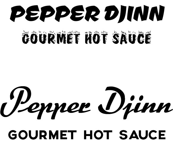
OK Have been working on my label art, this is not a finished product and I know the text is in need of work.
I would like some input on what I have been getting done.
What do you guys think? Again keep in mind I am still working on it and I know of a few things that need fixing,
I would like some input on what I have been getting done.
What do you guys think? Again keep in mind I am still working on it and I know of a few things that need fixing,