labels Need Help Critiquing Label

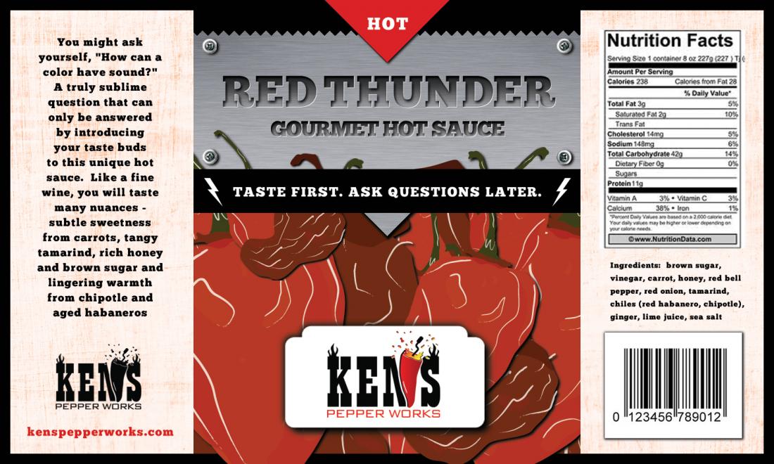
I just received the first draft of the Red Thunder label and would love some community input.  I have thoughts of my own but will hold off to see if others independently have the same.  Here it is.  Thanks in advance.
 
Ken
 
KPW_Label_Draft_1.jpg

 
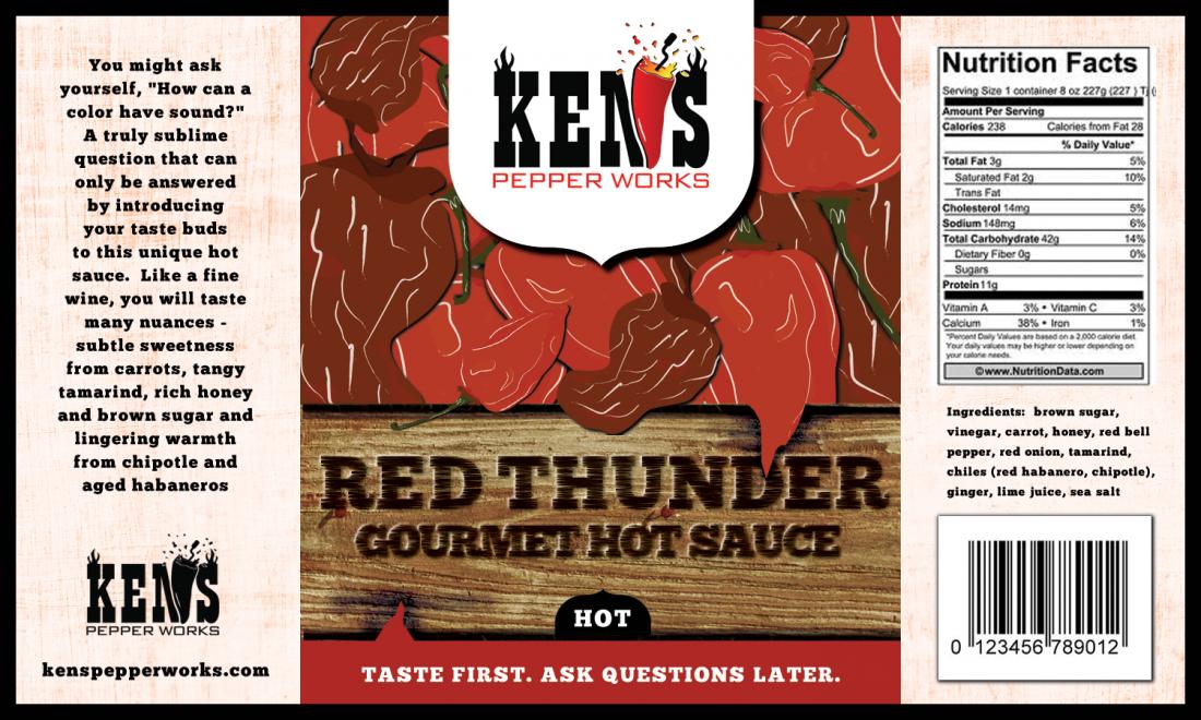
Oops.  I didn't realize there were more coming.
 
KPW_Label_Draft_2.jpg


PepperDaddy said:
Most consumers won't dissect a label like this   
 
Actually I respectfully disagree there - I think most consumers do, just not the way we're analyzing it component by component. 
 
But there's no question that consumers are driven to make a purchase by what they see.  
 
I'll use my labels as an example: at 1st I launched with 3 flavors. 3 color labels. Simple I thought. Had the thermometer on the side "romance" panel to tell people how hot it was. The bottom center of the front panel read "FIRE-ROASTED HOT PEPPER SAUCE" on every bottle. 
 
Over 5 pages of discussion and no one called that out. I wish they would have - my 1st review by a big review site who reviewed all 3 together called that out in the review. Cost me a full point in packaging. Also didn't help that the reviewer was color blind, so the whole means of differentiation was a big fail. 
 
Luckily that was my test batch and I "only" had 70 cases of each. But on the very next run I corrected all 3. 
 
Now, you might think "well that's a review site - of course they dissected the label". But I was in just 2 stores so I was selling those bottles at my farmer's markets. and probably 90% of the customers called it out too. And they loved the sauce and loved the labels so it wasn't like they were crapping on it. They were being helpful and/or they were confused by it. 
 
The consumer is taking in more of your label than you give them credit for - they're just processing it all in one shot. And they're not going to see what we see here - we have the luxury of seeing all 3 panels. That was my mistake with the heat level. "well it's right there on the thermometer!" - yeah, only if they pick up the bottle and turn it. And that's a lot to expect someone to do. If they don't think the heat level is appropriate based on your imagery, they're not gonna get that far. 
 
A suggestion for you Ken: take that image above and open it in photoshop or even MS Paint.  Cut it into 1/3's and print those out. Then examine them individually. In this order
1. Center panel. This is what the consumer sees and nothing else. Nothing. It's on a shelf, next to other sauces and its own brother sauces and the consumer only sees that center panel.  Does it say it all?  Like I said - I didn't understand the marriage at all until I read your romance panel, which I won't see from just the front panel. 
 
2. Ingredients panel/nutrition statement.  More and more consumers are checking ingredients. 
 
3. Romance panel. If you're lucky they'll get this far, and this is where you "woo" the customer. Put in a bit about Ken's - it could be 8 words. Tell them something about Ken's Pepper Works, because at this point they are interested in the sauce, make them interested in your company. Even if it's "Ken's Pepper Works makes all natural sauces out of Kalamazoo." - Bam, you just told them where you're from and you've reinforced that you're all natural. Simple. 
 
Again - one man's opinion, but I see this all the time - several days a week, several hours a day. Customers who pick up the bottle look at the front, rotate to ingredients, and then read some of the romance panel in that order. Not every customer, but a LOT of them. I catch myself doing this at the store. 
 
Point is that by dissecting the label into those 3 parts and examining the components individually, you won't be influenced by any other part of the label. The front panel needs to stand on its own and be entirely clear what your theme is. The name, the imagery and any other dialogue on that panel will tell the consumer what they need to know to get them to that next step of reading your ingredients. 
:cheers: 
(I wish I was here to give me that advice on my 1st run. lol) 
 
well, since you asked, I'll throw my 2 pennies in the pool~
 
 
In no particular order-
The name says "Island Sunshine" but nothing references WHICH island.  We assume its a tropical one from the graphics, but nothing in the text references Jamaica or wherever the scotch bonnets  are grown or Hawaii for the pineapples.  You don't want to get too locked into something like (Scotch bonnets grown in the Caribbean), because then you technically wouldn't be able to use SB grown anywhere else. 
 
Is it "marriage of pineappleS and bonnetS"?  I'll let the gramir police deal with that one. :lol:
 
If you go with the marriage theme- use "Pair Island Sunshine with ...etc etc"
 
I think the Logo block can work with both light and dark labels.  On this one, make it transparent or even an off-white tan color so it's not so stark.  It will still be recognizable and the other darker labels can stay with the white background.
 
Place the Couple closer together?
 
Move the Net Wt to the right, it doesn't have to be in the center of the front panel.  It's cluttering up the Happy Couple.
 
Like the Honeymoon theme, especially since there's honey in the sauce. 
 
Honey-moon Hot Sauce.......(gotta be careful with that name....folks might get "creative" on their honeymoon and end up in a pickle!  :lol:)
 
 
Romance panel-
____________________________
 
Experience the perfect marriage of pineapple and scotch bonnet peppers kissed with tropical honey, ginger and spices in our Tropic Honey-moon Hot Sauce. 
 
Pairs best with chicken, pork, fish, mac-n-chz, etc.  The list is never-ending. 
 
Say "I DO!" to Tropical Honey-moon Hot Sauce.  You'll love it for life! 
___________________________
 
ps- I have no idea what "tropical honey" is other than the obvious...(.honey harvested in the tropics)....it just sounded cool!
EDIT- list it as "kissed with tropical ginger, honey and spices." 


The chile dude does need some work, and even the pineapple chick.  They don't look Cool yet....but the concept could work. 
 
The chile dude should be fully in the label, not faded out on the edge.  P-apl chick can skootch to the right making more room.
 
Maybe move the Logo block to the left, make the background off-white and bring a palm tree branch across one corner of it. 
 
Net Wt option2-  split the Taste/Ask tagline in half and move out to the ends of the lower banner.  Put the NetWt down in the gold banner. 
 
OK...that's enough to keep you going for a bit!  :)
 
Hawaiian Honeymoon was playing on pineapple, your first ingredient... honey, also in there, and marriage. IMO it tied it all together.
 
But then again, you can never really sell a name to someone that is set on something.
 
On a negative note the ocean is yellow. Not sure why?
 
Blue water would pop, and remove that dulling red filter to make it all pop.
 
Cool. Good luck.

salsalady said:
Honey-moon Hot Sauce
 
SL I thought of the hyphen too, to really play on the honey. Great minds...
 
salsalady said:
well, since you asked, I'll throw my 2 pennies in the pool~
 
 
In no particular order-
The name says "Island Sunshine" but nothing references WHICH island.  We assume its a tropical one from the graphics, but nothing in the text references Jamaica or wherever the scotch bonnets  are grown or Hawaii for the pineapples.  You don't want to get too locked into something like (Scotch bonnets grown in the Caribbean), because then you technically wouldn't be able to use SB grown anywhere else. 
 
I guess I really don't care which island.  There are tropical fruits and peppers w/ palm trees and beach.  It can be any island the consumer wants  :P
 
Is it "marriage of pineappleS and bonnetS"?  I'll let the gramir police deal with that one. :lol:
 
If you go with the marriage theme- use "Pair Island Sunshine with ...etc etc"
 
I like the word "Pair".  Sounds a little higher end.
 
I think the Logo block can work with both light and dark labels.  On this one, make it transparent or even an off-white tan color so it's not so stark.  It will still be recognizable and the other darker labels can stay with the white background.
 
Place the Couple closer together?  Will do
 
Move the Net Wt to the right, it doesn't have to be in the center of the front panel.  It's cluttering up the Happy Couple.
 
Like the Honeymoon theme, especially since there's honey in the sauce.  Just a touch.
 
Honey-moon Hot Sauce.......(gotta be careful with that name....folks might get "creative" on their honeymoon and end up in a pickle!  :lol:)
 
 
Romance panel-
____________________________
 
Experience the perfect marriage of pineapple and scotch bonnet peppers kissed with tropical honey, ginger and spices in our Tropic Honey-moon Hot Sauce. 
 
Pairs best with chicken, pork, fish, mac-n-chz, etc.  The list is never-ending. 
 
Say "I DO!" to Tropical Honey-moon Hot Sauce.  You'll love it for life! 
 
 
Kissed is a great adjective, so I'll have to work it in.
___________________________


ps- I have no idea what "tropical honey" is other than the obvious...(.honey harvested in the tropics)....it just sounded cool!
EDIT- list it as "kissed with tropical ginger, honey and spices." 


The chile dude does need some work, and even the pineapple chick.  They don't look Cool yet....but the concept could work. 
 
The chile dude should be fully in the label, not faded out on the edge.  P-apl chick can skootch to the right making more room.
 
Many are saying this and I will scoot the happy couple to the right.
 
Maybe move the Logo block to the left, make the background off-white and bring a palm tree branch across one corner of it. 
 
Net Wt option2-  split the Taste/Ask tagline in half and move out to the ends of the lower banner.  Put the NetWt down in the gold banner. 
 
OK...that's enough to keep you going for a bit!  :)
The Hot Pepper said:
Hawaiian Honeymoon was playing on pineapple, your first ingredient... honey, also in there, and marriage. IMO it tied it all together.
 
But then again, you can never really sell a name to someone that is set on something.
 
On a negative note the ocean is yellow. Not sure why?
 
Because LD says never put blue on a label, so I told the designer a couple labels back to replace blue w/ other colors.  I just did a quick online search and could not find anything confirming this.  TryMe Tennessee Sunshine has a blue sky.  I would like to have some blue and will rethink unless someone has proof that blue is bad on food labels.
 
Blue water would pop, and remove that dulling red filter to make it all pop.
 
Cool. Good luck.

 
SL I thought of the hyphen too, to really play on the honey. Great minds...
Everyone can forget about the Hawaiian Honeymoon.  It ain't gonna happen  ;)  Although pineapples are grown in Hawaii, not the Caribbean, when one thinks of the Caribbean one thinks of pina coladas and other fruity drinks that contain pineapple.  And although pineapple is the main ingredient, this is a hot sauce after all.  The primary taste is peppers.  You just don't need as many to get the flavor across.  And the peppers come from the Caribbean. Just like palm trees, ocean and beach.  Last time I checked, Hawaii was an island.  If the consumer wants to think it's Hawaii then that's cool.  If they think it's Jamaica then that's cool too.
 
I also think I will decrease the size of the logo area by 10% on all labels to may make room directly underneath for a small banner (the same width as the logo) that says hot, medium or medium hot.
 
Also, keep in mind I'm not spending $1,000+/label.  That's what many wanted when I looked around.    
 
Thanks for all the input!  My labels get better w/ every iteration and even the previous labels are still getting reworked and improved.
 
Ken
 
Because LD says never put blue on a label, so I told the designer a couple labels back to replace blue w/ other colors. I just did a quick online search and could not find anything confirming this. TryMe Tennessee Sunshine has a blue sky. I would like to have some blue and will rethink unless someone has proof that blue is bad on food labels.
What? Lmao - you're blaming me for your yellow ocean? Haha no - I said blue is not a common product label color & that there aren't a lot of blue labels - but there are some. I was just at the store - green dominates, blue is uncommon.

In my marketing classes they taught that blue may be considered less appealing because blue is subconsciously associated with death (cold & blue), depression, bad weather, sadness, etc.

All that said it's also context specific - if you have a bluebird or blue ocean it's perfectly ok to color it blue because that's what color they are. :lol:

I wouldn't make that color dominate the label - I'd do blue water with a yellow "kiss" of sunshine because I think it helps to break up the blue, but it's not like there's a law against blue on a label.
 
It's been proven red and yellow stimulate appetite which is why most fast food places use it, yeah, but that doesn't mean you can't have sparkling blue waters on a tropical label... :)

The Oreo box is blue and I think they're doing alright. :)
 
Go down the breakfast cereal aisle and you'll see every color of the rainbow, and lots of blues.

The "appetizing" color rules are more designed for when you are thinking about eating, like driving down the highway, not looking at a shelf with 100 products. At the supermarket, you are there to buy not eat. Different rules apply. What pops in the sea of labels?

You can still use appetizing colors but don't be afraid to just use whatever you want, and what pops! I've seen all kinds of great hot sauce labels in all colors!

Use what works for your theme.

That's my opinion.
 
Agree THP - for me it was personal preference. I opted to go with Purple rather than Blue - I just thought it had better curb appeal. The blues looked too close to the gray of the dog and the whole label sort of blurred together. 
 
And the product itself shouldn't be blue because for the most part there aren't blue foods and humans are pretty well conditioned to not associate the color with appetizing. 
 
That all said, blue raspberry otter pops are super awesome on a hot summer day. :p
 
Well, my labels are done.  They are posted below as promised.  Thanks to everyone for your help.  The final product is vastly different from the initial labels and I mean that in a good way.  I don't have the nutritional info yet but everything else is final. I'll still probably make a tweak or two as time goes on but this is basically it.  Thanks again.
 
Red-Thunder_2.jpg

 
Rio-Grande-Mud_2.jpg

 
Island-Sunshine_2.jpg


Back
Top