So, tweaking my labels...(yet again), and what I have come up with in my mind does not leave proper room for a 'flavor' profile in the center panel of the label.
Here is a current sample of my label...
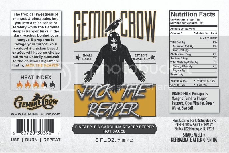
I have 'Pineapple & Carolina Reaper Peppers' front and center.....
I've done my list of pro's and cons, and my two big points that kept coming to me were....
1. Having the flavor profile front and center (like they are), allows for the customer to have an immediate reaction to the sauce..... Love it , look further, and purchase.....Or immediately dismiss (maybe they dont like Pineapple, etc...)
2. Putting the flavor profile within the romance text instead, forces the customer to pay nore attention to the sauce...pick up the bottle, read the romance text and or ingredients and then make a decision.....no immediate yes or no......every sauce is almost on the same playing field...allows for more seller/customer conversation....more interaction...forces the deller to 'sell the sauce'....
i see and agree with both sides....went through my collection of sauces and see labels that have the flavor profile front and center..and plenty that don't...
what are your pro's and cons of keeping the flavor profile upfront as opposed moving it to the left?
Here is a current sample of my label...
I have 'Pineapple & Carolina Reaper Peppers' front and center.....
I've done my list of pro's and cons, and my two big points that kept coming to me were....
1. Having the flavor profile front and center (like they are), allows for the customer to have an immediate reaction to the sauce..... Love it , look further, and purchase.....Or immediately dismiss (maybe they dont like Pineapple, etc...)
2. Putting the flavor profile within the romance text instead, forces the customer to pay nore attention to the sauce...pick up the bottle, read the romance text and or ingredients and then make a decision.....no immediate yes or no......every sauce is almost on the same playing field...allows for more seller/customer conversation....more interaction...forces the deller to 'sell the sauce'....
i see and agree with both sides....went through my collection of sauces and see labels that have the flavor profile front and center..and plenty that don't...
what are your pro's and cons of keeping the flavor profile upfront as opposed moving it to the left?