artwork Logo Feedback

Just wanted to get some opinions on this logo. :) Nothing is set in stone and It's just something that is being played with so please rip it apart!! 
 
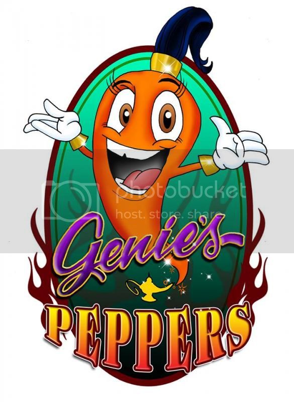
My sauce is being looked over as we speak (I have two I'm ok with the rest I"m trying to develop) ! I hope to get to first stages of production soon. I'm going to use this image for samples right now. :) 


couple other critiques-
I'd like to see more flames, starting below "peppers".  Like the color change.
 
The word "peppers" needs some work.  The P and the S are not the same size.  I don't like the heels on the E that stick up and down.  Makes it look un-balanced to me.  Without knowing what graphics program is being used...I'd take the word PEPPERS and Create Outline of the word (which takes the word out of Text format and makes each letter a separate graphic outline).  The letters can then be manipulated separately.  Shave the heels of the E's, reduce the S height, maybe shave the heels of the S also....
 
The right side line of the hair is kinda wonky.  I'd like to see 3 hair pieces curl out.
 
Already said...but fix the eyes
 
more details on the lamp, or at least some shading.  Everything else has details, the lamp looks like a total cut-n-paste image.
 
 
Good start on it, I can envision a nice looking label when finished.  Did I understand you to say you have a different label being created for a different sauce?  Is this not your overall brand logo?
 
Back
Top