I am in the process of becoming legal and everyone on this site has provided an incredible amount of good advice it's so much appreciated. Now I would like to ask for feedback on my logo. Most of my sauces feature smoked peppers, hence the name. I'd love to know what you think.
You are using an out of date browser. It may not display this or other websites correctly.
You should upgrade or use an alternative browser.
You should upgrade or use an alternative browser.
artwork Logo feedback
- Thread starter UpInSmoke
- Start date
I don't like it. It looks like a "real" pepper pic with some basic fonts and busy smoke. All good logos need to look good on black and white, for example, if someone ordered a white T-shirt, or, on your business letterhead, how would this look? Also all good logos need to look good as a "bug" which means, when it's really small it is still legible. This does not pass either test. A great example is Coca-Cola.
The Hot Pepper said:I don't like it. It looks like a "real" pepper pic with some basic fonts and busy smoke. All good logos need to look good on black and white, for example, if someone ordered a white T-shirt, or, on your business letterhead, how would this look? Also all good logos need to look good as a "bug" which means, when it's really small it is still legible. This does not pass either test. A great example is Coca-Cola.
Great feedback. Thank you.
No problem. It's close actually just needs a little work. I could see a silhouette version, getting rid of the blue flames at the bottom, and simplifying the smoke whisps, and you could have a nice black or white logo. You could have a color one too but needs to be simpler.
The Hot Pepper said:No problem. It's close actually just needs a little work. I could see a silhouette version, getting rid of the blue flames at the bottom, and simplifying the smoke whisps, and you could have a nice black or white logo. You could have a color one too but needs to be simpler.
Thats exactly what I was thinking. I like the color version for black backgrounds and the web site but maybe a stripped down version for letterhead, etc..
Maybe turn down the smoke and go with regular red/orange fire. A blue flame is usually smokless so this looks unatural...
I'd recommend a simpler logo. Like thp said, needs to also look good small. I feel like most hot sauce labels and logos are more basic, easily identifed thick lined and simple fonts. Most the coloring is solid. Also, the fine lines and coloring in the smoke might not translate well to labels.
Here's some popular examples that I mean
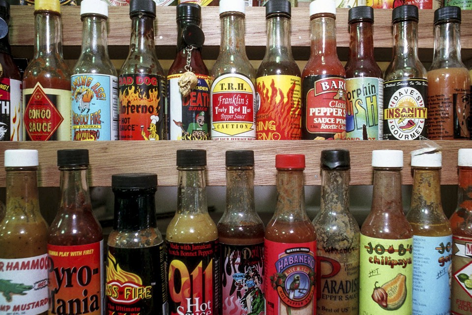
I would recommend utilizing thick lines, contrast, more basic fonts and symmetry
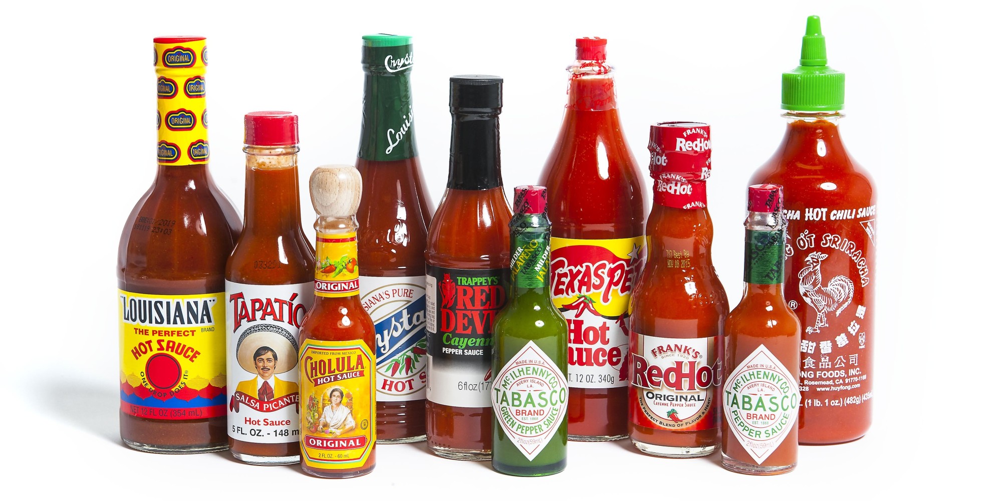
Here's some popular examples that I mean

I would recommend utilizing thick lines, contrast, more basic fonts and symmetry

I like it, but agree with this. Red instead of blue. You would probably have to get rid of the pepper with red smoke.Grass Snake said:Maybe turn down the smoke and go with regular red/orange fire. A blue flame is usually smokless so this looks unatural...
salsalady
eXtreme Business
Greetings and welcome to THP!
I like the basic concept and look. Agree that the logo as presented would not translate to B&W and small.
For general look, I feel like the whole thing should be compacted top to bottom. Move the pepper and lower text up. The whispy SMOKE gets lost. Not sure what program was used to create this, but it feels disjointed. Like there is a clip art chile pepper, basic font of "UP IN-SAUCE WORKS", blue flames and whispy smoke.
I'm also not sure about the wild west font. I get the whole up in smoke tie in...but the rest of the logo is not wild west. I think you could use another font that would tie in with the rest of the logo and everyone would still 'get' the wild west connection. If the whole logo was old west design, like an old newspaper theme, then sure with the old west font.
Good Luck and Have Fun getting all your ducks in a row going legit!!! It's pretty exciting, so enjoy the journey!
salsalady.
Considerations when designing a logo.
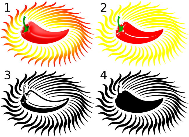
Normally you need to be able to reduce the colors in a logo. You need to consider how it will look when it's dropped to "low color" and to black & white.
As per the sample above.
1) Full color | This is for general usage.
2) Low Color | Normally kept at 4 colors in the given sample white is one of the colors. This is used for print when the number of colors is limited.
3) Black & White | Used when only black ink is available. It's best to avoid grey scales if you can.
4) Black & White Small | Used when the logo will scaled down a lot and details will be lost.
Transparency is also a consideration. In some circumstances you will want what's under the logo to show through in something other then the "box" shape of the image.
Vector vs Bitmap, The above samples source files are all vector. Because of this they can all be re-scaled to any size without quality loss. I.E you won't see blocky pixels, or blurry spots. To have bitmap images scale well you have to use very very large images.
I was just trying to stay away from the same old orange/red flames that are everywhere out there. Maybe I need to rethink though.tctenten said:I like it, but agree with this. Red instead of blue. You would probably have to get rid of the pepper with red smoke.
DaQatz said:Considerations when designing a logo.

Normally you need to be able to reduce the colors in a logo. You need to consider how it will look when it's dropped to "low color" and to black & white.
As per the sample above.
1) Full color | This is for general usage.
2) Low Color | Normally kept at 4 colors in the given sample white is one of the colors. This is used for print when the number of colors is limited.
3) Black & White | Used when only black ink is available. It's best to avoid grey scales if you can.
4) Black & White Small | Used when the logo will scaled down a lot and details will be lost.
Transparency is also a consideration. In some circumstances you will want what's under the logo to show through in something other then the "box" shape of the image.
Vector vs Bitmap, The above samples source files are all vector. Because of this they can all be re-scaled to any size without quality loss. I.E you won't see blocky pixels, or blurry spots. To have bitmap images scale well you have to use very very large images.
That is great information!! Thanks!
I think it's cool, and could use some refining. I don't like logos that are overly busy, that take away from the brand itself, or makes the brand confusing. Mine is very simple. I think yours is on the cusp of getting too busy, but I do like the creativity of it. I haven't seen the smoke feature on a bottle and think you're heading in the right direction with that in terms of differentiation
Not fond of the blue lettering at top, but other than that it looks like a very cool label rather than a logo. I think of a logo like I do a brand. Back in the day, a brand was an actual burning into an animal. Two colors, the brand and the skin. I think today a brand is typically a trade mark that you put on your label more than a label its self.
But I dont know a thing about marketing well. Heck, I dont much like my own logo.
But I dont know a thing about marketing well. Heck, I dont much like my own logo.


