Hey, y'all. Time for another label critique/suggestions thread for Texas Creek Salsa!
I need to streamline production for the salsa and maybe launch into some new markets. This salsa has been made and sold for about 20 years. The Chile Pepper Guy and Gal have been on the label since the very beginning. They were sketched by tattoo artist Tim Sconce with colored pencils on a plain piece of white paper. The original sketches were lost when the original print shop went out of business and pitched the hard copies. (a big regret of mine).
There are several things going on here so please bear with me as the items are addressed.
Here's the scenario-
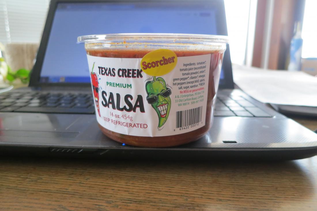
I have one basic label that is used on all salsa tubs and then each tub gets a flavor sticker with "Mild Medium Hot Scorcher".
Right now, the rectangular label is applied to every tub and then the Flavor dot is applied. I've looked at getting printed tubs (with a minimum of about 48,000) and that would only be for the basic label and each flavor dot would still have to be applied by hand....or do 4 runs x 48,000 for the 4 flavors..... ....[maybe next year~~~]
So I'm back to looking at getting printed labels that would be hand applied. 4 different label versions for the front panels and one label for the back which would have NIP, bar code, ingredients, contact, etc. I can get 5 separate labels printed fairly economically compared to doing a LARGE run of printed tubs.
Here's the basic label and the 4 flavor dots-
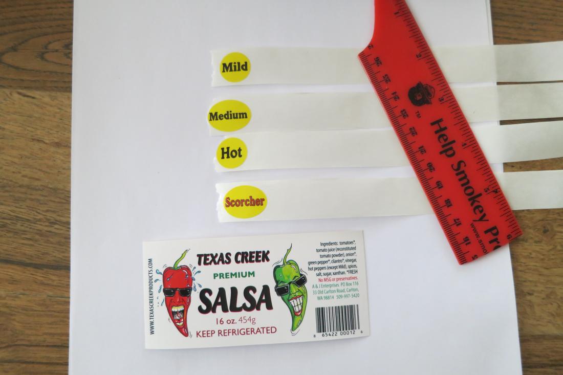
Because a rectangular label is applied to a tapered tub, it doesn't lay out even on the tub (the ends of the straight label curve up following the contours of the tub), but it is what it is.... the flavor dots are applied to the right of the main panel and covers the stem of the GreenGal chile.
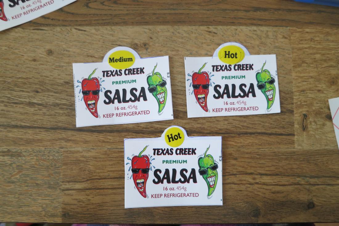
Basically, I'm looking at getting some custom die-cut labels which would have a camel hump top-center where the flavor graphic would be so I don't have to apply each individual flavor sticker on each tub. What you see below is mock-ups using my current labels. When I say Flavor Dots, it would no longer be a separate sticker applied by hand, it would be printed on the label.
My questions for y'all are----
The original flavor dots are round and oval. Should they stay round and oval as required by the length of the words or should they all be oval? Literal Cut-n-Paste examples- Oval Medium and 2 options for HOT, one original round and one oval-
Should the Flavors be aligned STRAIGHT atop the main panel or should they by slightly off-kilter like they all are on the hand applied dots that we've been doing for 20 years?
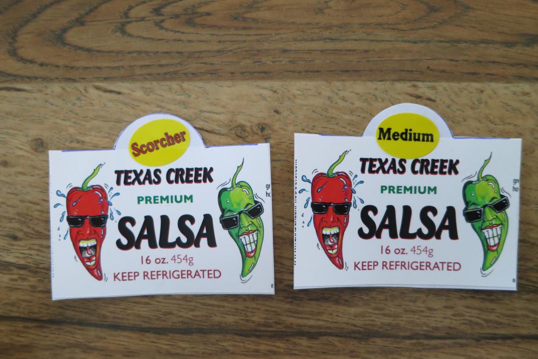
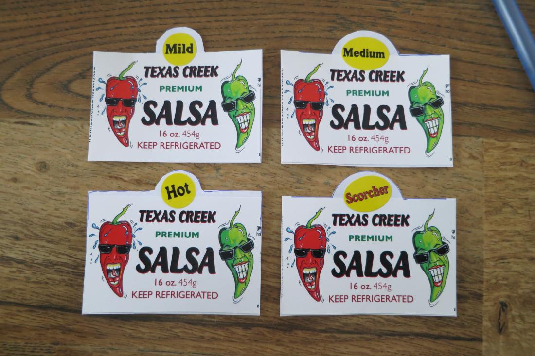
I remember about 15 years ago when my dad was helping label a batch and he was spending a lot of time making sure the flavor dots were all nice and straight and I told him to just stick 'em on there! I like that they aren't straight! It's part of the hand made thing~~~ but...that's just me~ If I print a run of several thousand labels with off-kilter flavor dots....will it fly or flop?
Recap-
should the yellow flavor dot graphic be oval and round or all oval?
should the flavor dot graphic be aligned straight with the rest of the text or can they be printed slightly off-kilter to make it look more like hand applied stickers?
The main logo graphics will be adjusted a liitle outward and shallower to accomodate the flavor dot at the top. All the other S-n-S (sheet-and-schtuff) will go on another label either on the back or the top. Haven't decided which would be faster for packaging. ~
Thanks for your opinions. Hope this makes sense.
I need to streamline production for the salsa and maybe launch into some new markets. This salsa has been made and sold for about 20 years. The Chile Pepper Guy and Gal have been on the label since the very beginning. They were sketched by tattoo artist Tim Sconce with colored pencils on a plain piece of white paper. The original sketches were lost when the original print shop went out of business and pitched the hard copies.
There are several things going on here so please bear with me as the items are addressed.
Here's the scenario-
I have one basic label that is used on all salsa tubs and then each tub gets a flavor sticker with "Mild Medium Hot Scorcher".
Right now, the rectangular label is applied to every tub and then the Flavor dot is applied. I've looked at getting printed tubs (with a minimum of about 48,000) and that would only be for the basic label and each flavor dot would still have to be applied by hand....or do 4 runs x 48,000 for the 4 flavors.....
 ....[maybe next year~~~]
So I'm back to looking at getting printed labels that would be hand applied. 4 different label versions for the front panels and one label for the back which would have NIP, bar code, ingredients, contact, etc. I can get 5 separate labels printed fairly economically compared to doing a LARGE run of printed tubs.
Here's the basic label and the 4 flavor dots-
Because a rectangular label is applied to a tapered tub, it doesn't lay out even on the tub (the ends of the straight label curve up following the contours of the tub), but it is what it is.... the flavor dots are applied to the right of the main panel and covers the stem of the GreenGal chile.
Basically, I'm looking at getting some custom die-cut labels which would have a camel hump top-center where the flavor graphic would be so I don't have to apply each individual flavor sticker on each tub. What you see below is mock-ups using my current labels. When I say Flavor Dots, it would no longer be a separate sticker applied by hand, it would be printed on the label.
My questions for y'all are----
The original flavor dots are round and oval. Should they stay round and oval as required by the length of the words or should they all be oval? Literal Cut-n-Paste examples- Oval Medium and 2 options for HOT, one original round and one oval-
Should the Flavors be aligned STRAIGHT atop the main panel or should they by slightly off-kilter like they all are on the hand applied dots that we've been doing for 20 years?
I remember about 15 years ago when my dad was helping label a batch and he was spending a lot of time making sure the flavor dots were all nice and straight and I told him to just stick 'em on there! I like that they aren't straight! It's part of the hand made thing~~~ but...that's just me~ If I print a run of several thousand labels with off-kilter flavor dots....will it fly or flop?
Recap-
should the yellow flavor dot graphic be oval and round or all oval?
should the flavor dot graphic be aligned straight with the rest of the text or can they be printed slightly off-kilter to make it look more like hand applied stickers?
The main logo graphics will be adjusted a liitle outward and shallower to accomodate the flavor dot at the top. All the other S-n-S (sheet-and-schtuff) will go on another label either on the back or the top. Haven't decided which would be faster for packaging. ~
Thanks for your opinions. Hope this makes sense.


