labels Tioze - Our label - would love some feedback

HI THP Gang!
 
We've recently managed to get into some stores here in the Vancouver BC area and before we grow into the larger retailers, I though I would ask you guys about our labels.
 
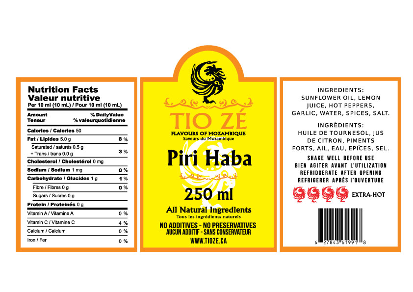
We have a Mild and Hot product, and the labels for both can be seen below.  Any feedback is welcomed. Would you change the mild to a green label, or a somehow make a clear difference between the two heats?
 
The green color went all weird on the uploads, but they are more natural green, like on our website.
 

Attachments

  • hot9925.jpg
    hot9925.jpg
    125 KB · Views: 111
  • mild9918.jpg
    mild9918.jpg
    124.9 KB · Views: 89
Oh, the other one had green leaves or something in the background.  That NIP panel is pretty big, I'm pretty sure you can get away with a smaller NIP, that might give you a few lines of "romance" on the left. Or maybe see if the bar code can fit with the NIP.  I like the softer look of the green back ground, but I understand the regulations.  Once the label is on the bottle, you won't see both side panels at the same time.  It might be worth seeing how it looks having the foliage on the right and keep the NIP/BC on the left when it's on a bottle.
 
If you can make these changes easily (doing them yourself?), I'd like to see a version with the green border, remove the lower squiggle, skootch the white rooster up so it's feet are out of the "Natural Ingredients" line, then shuffle the rest of the text up and down to balance out removing the lower squiggle.  There's probably enough room to enlarge Piri Piri and Tio Ze/Flavours.  I'd enlarge all of that so they are at least 25% wider.  That's the important text.  Reduce 250ml.
 
I can't decide if the HEAT peppers should be on both sides, or just one.  Or where else to put them.  Can you put "No additives/preservatives" on the side panel with "Shake Well"?  "All Natural" on the front pretty well sums it up and if people want more information, they'll look at the ingredients list on the side.   
If the No Additives goes on the side panel, the HEAT pepper could go in the middle where the lower squiggle is, All Natural gets skooched down, and the rest shuffled up and down to balance it out.  (Still want the rooster's feet not behind text.  :lol:  )
 
I'm not a graphics designer professional so take this with a huge grain of salt.  I'm sure there are ratios and equations for figuring out how much open space there needs to be, etc.  I dunno, I just go with what looks good and balanced.  :D


edit-to get rid of the rations of slat... :lol:
 
The size is still huge and sticks out... there's no point in screaming 250 ML!!!!! That should be tiny, the website size.
 
The Hot Pepper said:
The size is still huge and sticks out... there's no point in screaming 250 ML!!!!! That should be tiny, the website size.
Actually the size of the net weight statement is a regulatory compliance issue.

There's a thing on the FDA website about it being proportional to overall label size.

That's why the statement on a cereal box is huge. Huge box.

Hard to tell from the photos and I'm not an expert in the regulations, but you can't just make it tiny because it's obvious it's a big bottle. Still gotta have a proportional net weight statement. It's a Dept of Weights & Measures thing.
;)

To the label, I may be in the minority but I like the look of the original label (the one THP posted) - of the new versions the red outline is much easier on my eyes.

That yellow on green is hard for me to look at. While it pops, my eyes go all blurry and I can't read what's on the label. Readability is important. Yellow/green in those day glow colors is tough take in.

I like the cool rooster logo though.
 
wow my friend the label is awesome , but focus on the rooster a little more and try to make in a line a description  of your sauce  and what kind of pepper you are using because people who knows about piri piri ithey know is an amazing sauce and it is even better that you have the african "mozambique flavour" congratulation in your business and  i woud like to try your sauce how can i do to get a couple of bottles to ottawa...
 
this a constructive criticism and i am really serious to get a couple of bottles amzing for the summer time that is coming.
 
cheers
 
Great work, well done.

As previously said,I think the heat rating scale is a bit confusing.
For a layman like myself i find this heat rating scale the most easiest to understand.

Mild Sauce = Picture of 4 chillis (or Roosters) with 1 coloured Red.
Medium Sauce = Picture of 4 chillis (or Roosters) with 2 coloured Red.
Hot Sauce = Picture of 4 Chillis (or Roosters) with 3 coloured Red.
Extra Hot Sauce = Picture of 4 Chillis (or Roosters) with all 4 coloured Red..... as pictured in your # 24 post, but IMO the heat scale rating has to be on the front label of your sauce. If i was standing in a shopping isle i would want the rating clearley visable on the front, i would'nt want to be picking up and putting down every bottle of sauce and turning it just to read the scale till I found the right one.
 
Back
Top