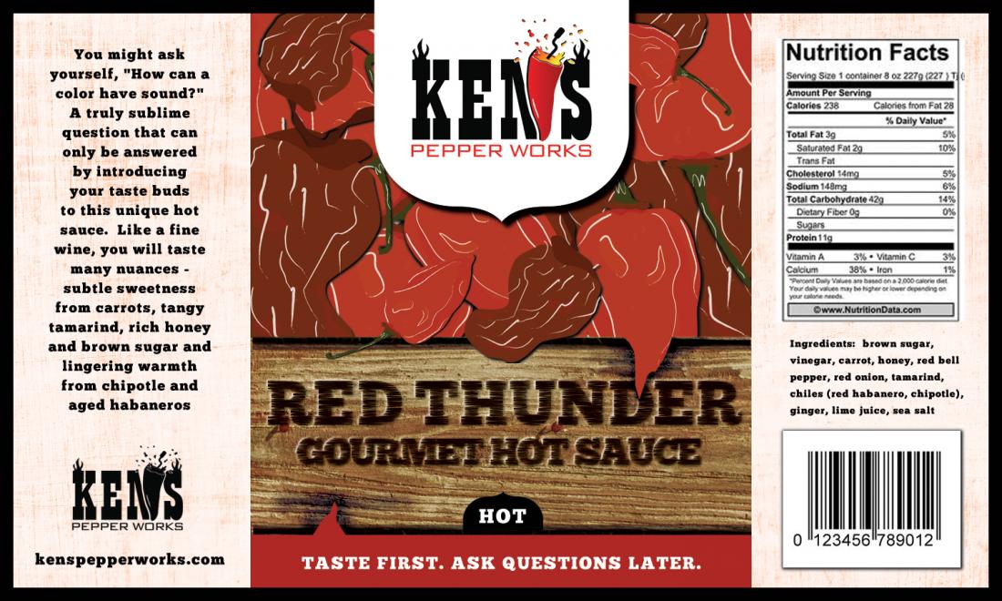
labels Need Help Critiquing Label

I just received the first draft of the Red Thunder label and would love some community input.  I have thoughts of my own but will hold off to see if others independently have the same.  Here it is.  Thanks in advance.
 
Ken
 
KPW_Label_Draft_1.jpg

 
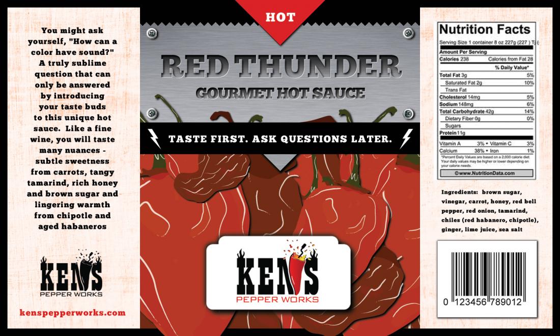
Oops.  I didn't realize there were more coming.
 
KPW_Label_Draft_2.jpg


I looked a couple of those sites last winter.  I was hoping to find someone I could build a relationship w/ rather than a bunch of one-time projects w/ different graphic artists.  I wil finish off this label and see how it goes. 
 
i would maybe make the name of the sauce look like its electric and if u touch it u'd get shocked by red electricity with maybe peppers in the background very shadowed and glowing red eyes coming out of the shadows
 
PepperDaddy said:
I like the "glowing red eyes coming out of the shadows".  Ominous.  Kinda like shining your falslight on a a rabid coon in the dark.
 
But that's not fitting of the name "red thunder". 
PepperDaddy said:
I looked a couple of those sites last winter.  I was hoping to find someone I could build a relationship w/ rather than a bunch of one-time projects w/ different graphic artists.  I wil finish off this label and see how it goes. 
 
That's just it though - you then work with the person to hone the label design, and if it was a positive experience you then build a relationship & work on future projects with them for other labels. Which adds the benefit of having all of your labels in a consistent "theme" or style of that artist. 
 
Yeah maybe it's a crapshoot. And now I see, the process may be anonymous so you never know who they are you just download the logo after you pick one, and pay the site.
 
Matanzima was happy with 99 designs, I wonder if he got the contact info.
 
Yes, you do get the contact info, and I've given more work to the guy who did my design.
 
Coming up for a fresh, unique look for a brand is hard, and I'd say most people who call themselves graphic artists are not very good at it. There is a big difference for doing the page layout of an ad or label, and coming up with the next Nike "swoosh".
 
99designs is a good way of getting the cream of the crop in terms of designers - much better than hiring blindly off craigslist imo
 
Lucky Dog Hot Sauce said:
 
But that's not fitting of the name "red thunder". 

 
That's just it though - you then work with the person to hone the label design, and if it was a positive experience you then build a relationship & work on future projects with them for other labels. Which adds the benefit of having all of your labels in a consistent "theme" or style of that artist. 
 
I didn't mean I like it for the label as much as I just like it in general because it gave me a chance to bring rabid coons into the conversation.
 
KingChile said:
red thunder comes from the electrified name, the peppers show its hot and the eyes make it seem mysterious....and u put it all together how does it not fit the name?
 
Because you have to put it all together. It's not intuitive. If I look at a logo and have to do long division and use a forked stick to divine the meaning, then you've failed as a company in clearly communicating with me. 
 
When I see "thunder" I think "rain" or "storm". OK, thunder and lightning - so I can see the electricity. That works. When I see peppers I think hot. However your thought process loses me at "the eyes".  Because "mysterious" is the last thing I think of with the eyes. I think "eyes", or "animal" or "beast" or "oh shit it wants to eat me" - but regardless of what color they're glowing, it still doesn't convey "thunder" to me by any stretch of my imagination. 
 
It would be cool imagery - for a sauce called "the electric savage beast". But Red Thunder and glowing red eyes?  That's a real stretch. 
Remember: as a brand, you have something like 1.6 seconds to communicate everything to your audience. 
 
As a consumer, I would not bother to figure out the calculus behind the name / imagery. I would simply move my gaze onto a less challenging product. 
 
The most successful branding is often the most simple. Personally I believe Ken's most successful branding is his "Ken's Pepper Works" logo - it's not perfect, and I still don't like the grinder since he's not selling a milled powder, but it's bold and simple and I know it's a spicy product company. I'd rather see a bottle of sauce with a "Ken's Pepper Works" label, with a small (non-branded) product name than a "Red Thunder" sauce (made by Ken's Pepper Works)

I find that far more effective in terms of branding.
 
Think of it this way - Kentucky Fried Chicken's logo is all over the box. They put on a little sticker that says "extra crispy" - one's the brand, the other the flavor/product. You are then mentally stamped with a red & white box, the silhouette of the Colonel and the "KFC" logo.  That's successful branding. 
 
One man's opinion.
 
its dark, hot and mysterious.......when u dont know what it is looking at u thru the glowing eyes that labels as MYSTERIOUS? lol

and not mention I never even said beast or animal eyes......I meant more like Demon eyes since when u think about demons u think about fire and HOT

they use black now and they also have packaging specially made for new items and certain items....KFC that is
 
KingChile said:
its dark, hot and mysterious.......when u dont know what it is looking at u thru the glowing eyes that labels as MYSTERIOUS? lol
 
uh....yeah. Branding fail. You've explained it to me twice and I still don't see it. 
 
lol
 
Check out Marlboro sometime. Great branding. (toxic product, but disregard that for a moment) - they have the same branding on every product. The only change between products is the color of the packaging and the small text that describes the flavor. 
 
Same with a lot of brands, including Matanzima's and mine. 
 
That's one approach. Some companies go with the "same but different" approach - where the Brand Name and slogan, the shape of the label art and other factors are the same, but the product imagery is different. Many hot sauce companies do this. I think it's generally less effective, but a few companies have been very good and even exceptional at this style. Heartbreaking Dawns is a company like that - they have the "flash art" style, all from (I think) the same artist, or in the least, in the same style. You can look at 6 of their products and know that they're the same brand. They use the same font for the company name, the same general label design, etc.and it's incredibly successful. 
 
With the drafts we've seen of "Red Thunder" so far, that's not going to be the case. The Hot Pepper touched on this several times - he didn't know if the brand was Ken's, Red Thunder, or what. That's a problem. And if he does make "Red Thunder" work for him, is the next flavor/branding going to be "Blue Mist"? "Green Slime"?  If not, where is the uniformity?  

Generally speaking, as a company you want to be able to put a new product on the shelf, and have consumers automatically associate that with your other (hopefully already successful) branding. That's not to say you need to take the Lucky Dog or Marlboro approach, but you need to have some means of tying together your product line. When building a brand you must consider the future implications. Making a great label is hard - and even harder is translating that across a product line. 

One company to check out is Jungle Heat - they've now won 2014 Scovies and 2013 Golden Chile and a few other major industry awards, all in the marketing categories. They have a great logo and consistent branding across several product lines from nuts, to lollipops to hot sauce to spice rubs. Very impressive. 
 
yea im a branding failure since ive done graphics for beyonce, paul wall, steven jackson from the spurs, lauren alaina plus many others lol.....im a complete failure dont listen to me
 
KingChile said:
yea im a branding failure since ive done graphics for beyonce, paul wall, steven jackson from the spurs, lauren alaina plus many others lol.....im a complete failure dont listen to me
 
I didn't say YOU were a branding failure. 
I said the glowing eyes were.  


Also I don't care who you've worked with - Am I not allowed to disagree with you? You're clearly defensive and not willing to engage in discussion. Have a nice day. 
 
Wow!  One day I'll make a sauce called "Rabid Coon Devil" and everyone will be happy  :P
 
For now, I think the only reason anyone is confused is because I mentioned at one point that I wanted to brand the Red Thunder name.  However, the customer does not know that.  I didn't tell them.  The brand is either Ken's or Ken's Pepper Works.  Either way, Red Thunder is just another stinkin' hot sauce...for now.
 
As for Jungle Heat, thanks for the info.  I'll have to do some research on their award and what they did specifically.  I looked at their labels a while back and really don't like them.  Not that I don't like a consistent label, I just don't like the graphics.
 
I sent in feedback today and hope to have another iteration by the weekend.  Thanks everyone.
 
Ken 
 
Back
Top