I saw some patterned clear glass plates which I thought were very pretty at the store, but I'm not sure how I would use them. I was wondering what you would use these for? What types of foods would look good on glass plates? Desserts come to mind, but I'm not quite sure what kind. Suggestions?
You are using an out of date browser. It may not display this or other websites correctly.
You should upgrade or use an alternative browser.
You should upgrade or use an alternative browser.
What food look good on clear glass plates?
- Thread starter Dilyida
- Start date
If they are truly clear and colorless, the question is not what looks good on them, but what looks good on what's under them. Food "looking good" is about contrast of color and value - not just light and dark, but also opposites on the color wheel. If you use placemats, think of them as the plate - what colors go with your placemats? If you don't use placemats, what color is your tabletop and, hence, what colors go well with your tabletop?
Edit - Also consider texture. If the glass is smooth, foods with a more "rough" texture will look better (typically) than foods that are also smooth.
Some opposites on the color wheel: red and green, blue and orange, yellow and violet. Think along those lines as well as lightness and darkness, and you're good to go. (I won't get into things like split complimentary or triad colors, but you can look those up if you have the desire.)
Plain white plates offer the best platform to present food. Clear plates need something under them.
I don't like glass plates of any kind.
Why?
Because they're GLASS!
Sure they look purty' n' all but they 're GLASS!
And they make screechy geechy noise when cutting on them.
mrs. blues has a set of blue glass plates that I loathe.
I have to baby that stuff, unlike my porcelain plates which are way cooler.
Why?
Because they're GLASS!
Sure they look purty' n' all but they 're GLASS!
And they make screechy geechy noise when cutting on them.
mrs. blues has a set of blue glass plates that I loathe.
I have to baby that stuff, unlike my porcelain plates which are way cooler.
I think desserts look best on Corelle, personally.
Hybrid Mode 01 said:
I think desserts look best on Corelle, personally.
HEY! THAT'S JAYT'S PLATE!
I'm telling...
What color is the plate?

The Hot Pepper said:

I love you pookie
Before I even opened the thread that was my thought also. saladD3monic said:When I think clear plate I think salad because at buffets a lot of times the salad plates are clear and textured
I love clear plates! But then again, I have a 70s porn tablecloth.
The Hot Pepper said:I have a 70s porn tablecloth.
FREE MUSTACHE RIDES!!
muskymojo said:HEY! THAT'S JAYT'S PLATE!
I'm telling...
Nope. Just his camera. Set to "'70s porno" quality.
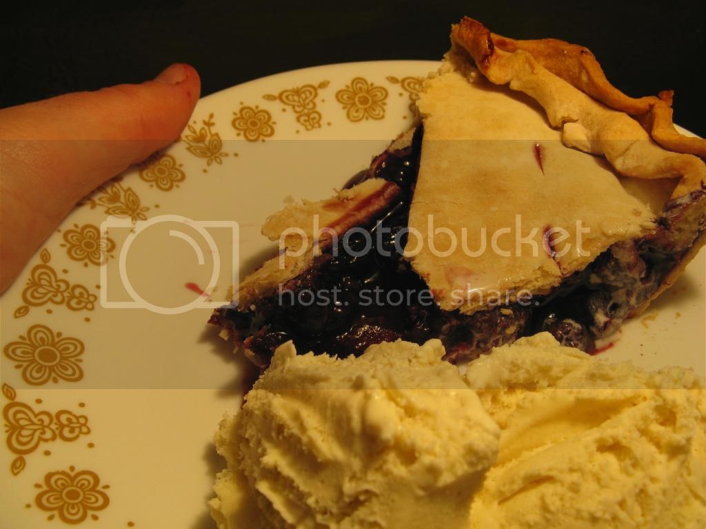
The Hot Pepper said:What color is the plate?
Right now it's pie and vanilla ice cream colored. Yeah, that's right. I put both of them on one plate. Maybe I should have avoided rocking the boat and put the pie in a separate bowl.
sicman said:Where did you get them plates from?
Those are from my wife's parents. She said they used to look really good in their dark yellow, orange and avocado colored kitchen back in the 70s.
The Hot Pepper said:I love clear plates! But then again, I have a 70s porn tablecloth.

....