• If you can't find a "Hot" category that fits, post it here!

D3 Pepper Products

D3monic said:
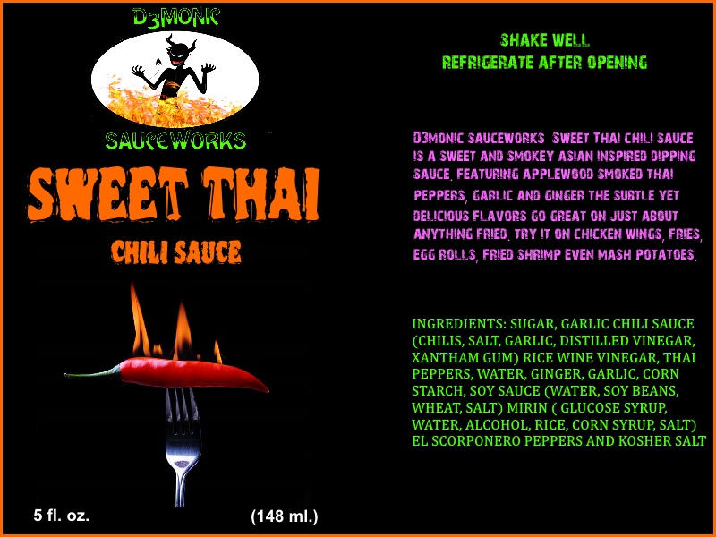
Still not sure about the logo, I think D3monic sauce works has a better ring to it though a limiting name.
 
You need to use what you like better. Sauceworks is not limiting, if you also had rubs, snacks, etc. it would work too. Many companies do this. Especially when they expand. Dairy Queen sells more than dairy. Burger King serves chicken. Hot sauce companies sell mild sauces.  ;) I could go on and on, but the best way to put it is... come up with a catchy name and it doesn't matter. It will become second nature to order spices at D3monic Sauceworks.
 
Here's a contemporary example. Dunkin is dropping the word Donuts. But didn't you already know they served coffee, bagels, and breakfast sandwiches? And did that look weird because of their name? No. You just have to own it. Do it well, and no one will even care about the name. :cheers:
 
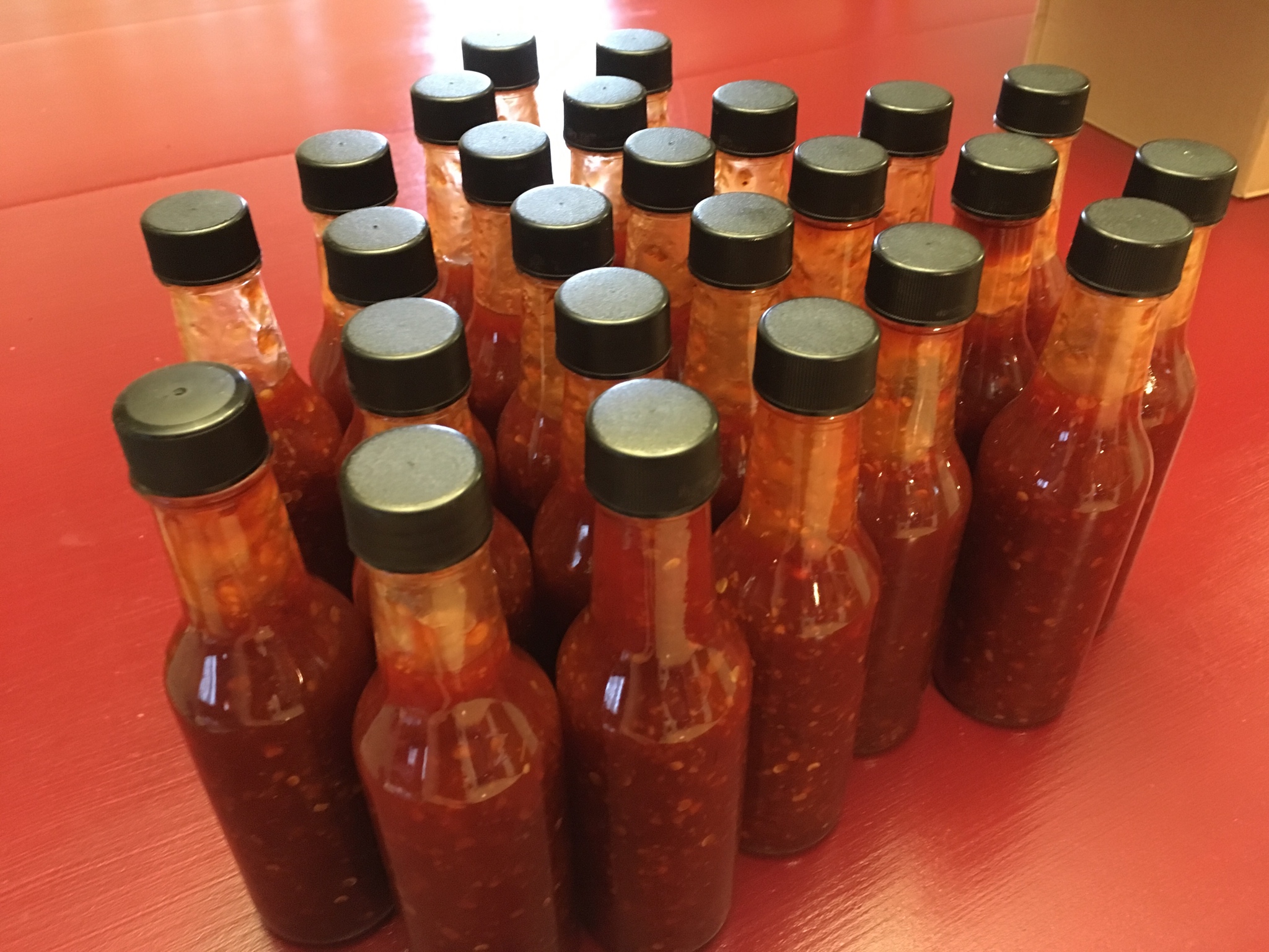
Made a few bottles of my sweet thai today. People been bugging asking for more for a while made about 25 bottles
 
Roasted some apple smoked thai peppers (large orange, reg orange, prik chi fa, garlic, ginger and a couple el scorponero yellow for a tad more heat. 
 
2vtk54Z.jpg

 
Blitzed them in the food processor with a lil soy sauce (mmm)
 
GMv0CLA.jpg

 
8 cups garlic chili sauce with a little mirin
 
GsLiNDx.jpg

 
12 cups sugar... yep 12 cups.... dissolved in 1 cup water
 
eto4sDB.jpg

 
other ingredients and voila. I ended up straining a bunch because of how seedy it was. Should of ran it through the foodmil. 25 bottle of pure diabetus 
 
VTyjg0u.jpg
 
hogleg said:
The IC in D3MONIC looks like a capitol K when your really high on the new label. Not sure I like the font..but like I'm really high.
 
shit, did I say that out loud???
 
 
:high:  :high:
 
Yea i'm still playing with fonts and colors. Not a huge fan of it that small. Looked good when it was blown up. The C in general with that font looks weird. I like the 3 being offset a little though. I need to finish my sterile room and maybe get some golden teachers or columbian rust going. 
 
When you are small time you need to scream your brand, not the flavor. When you become big and can be known for a swoosh, that is different. Right now it looks like:
 
 
d3monic
SWEET THAI
 
What about getting rid of the oval and flames but keeping the devil dude. Make him a lil bigger and a white silhouette on the black backround. Personally I'm drawn to white silhouettes on black backrounds. It's like a old film negative look.
 
 A couple fonts i'm playing with. I kind of like the bleeding cowboy,nosifer, devil net. Daughter likes creepshow. Woody might make for a nice sauce name though
 
Untitled.jpg
 
Bleeding Cowboys is THE MOST overused font please DO NOT use it!!!!!!!!!!!!!!!!!!!!!!!
 
I can pick out tons of companies using it. For example I can even recall one right now. This is not  a slight against the company, it's just to point out the font overuse!
 
deception_salsa_tease.jpg
 
The Hot Pepper said:
Bleeding Cowboys is THE MOST overused font please DO NOT use it!!!!!!!!!!!!!!!!!!!!!!!
 
I can pick out tons of companies using it. For example I can even recall one right now. This is not  a slight against the company, it's just to point out the font overuse!
 
Awe, that sucks
 
Back
Top