labels Draft for my labels.

lilcholo

Banned
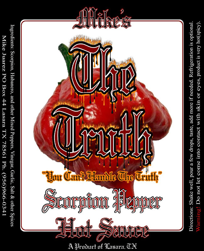
OK, let me have it but keep in mind this is only for family and friends and the ocassional "I heard it from a friend that you were selling some hot sauce" people.

It will be going on your average condiment squeeze bottle, maybe in the future on hot sauce bottles.

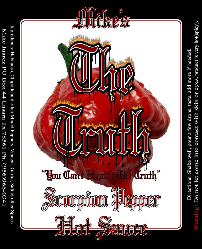
Anyway...let me know what you think...there are two different styles(all white and half white/half black) and I know I didn't change the text to match the ingredients but I can do that later...here they are:

MHS4.jpg


MHS2.jpg


Thanks to JuanHubero for helping me out on this one.
MHS3.jpg


MHS5.jpg


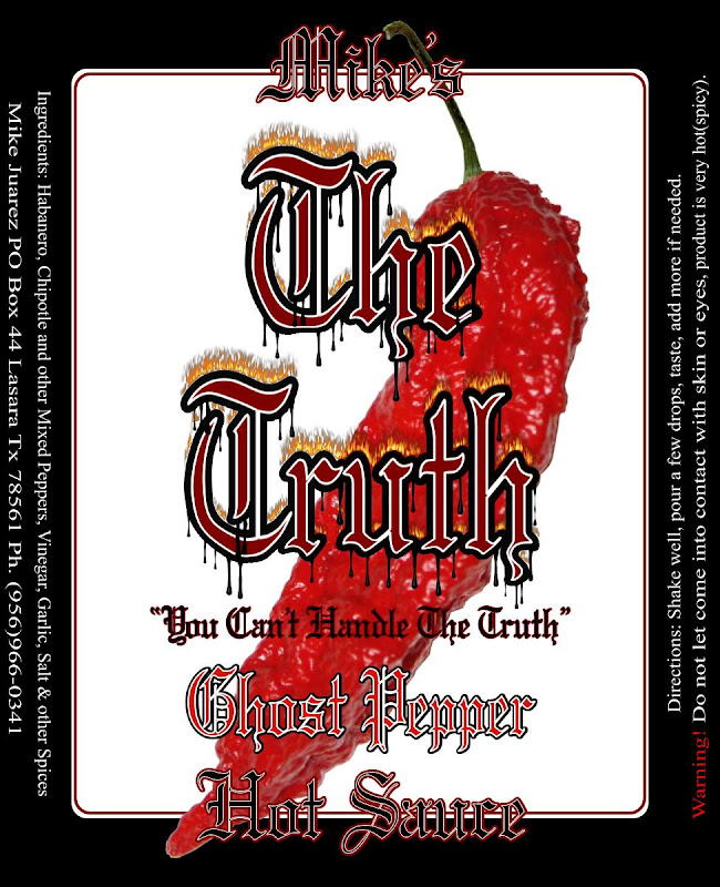
I forgot to add that there will probably a Jalapeno/Serrano label in the future as well.....maybe...add some green color.
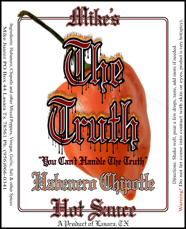
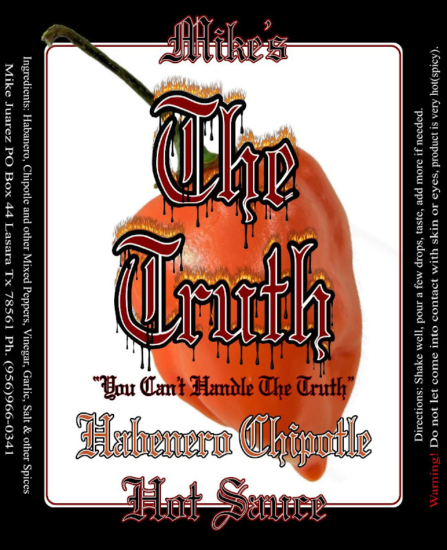
 
First impression - I like them.

I think I like the black border more as it adds some contrast and helps to frame the peppers.

the only thing I am not big on is the old English fonts - while they're kinda cool looking in the "this sauce will get midevil on your arse", they're also a little harder to read.

I think it works for The Truth, but I'm not sure it's good for the tag line, or description/hot sauce parts. That could be personal preference though.

One change I'd suggest is to change up the color of "The Truth" - on the orange habanero pepper the red font works. But the Red font over the Red pepper gets a little lost in the mix. Maybe orange on red to keep the fire-colors?

fun labels though - very stylish.
 
OK, so the half black looks like it will be part of the final draft.

LD, The colors on "The Truth" is like part of the logo so although you make a great point, I think I will leave it alone unless others make it a point as well. I was hoping the white inner outline on that part would help it stand out even against a background of similar color. If you notice, I did change the color of the flavor depending on the pepper that I will be using for that particular formula. I am kind of partial to Old English fonts and as a matter of fact, this particular one is called gargoyle. The part I do believe is the hardest to read is the "You Can't Handle The Truth" part. I find it interesting that nobody has mentioned that so far but I think I have a solution for that. I will still try what you advised me on for "The Truth" part but that was one part I wish I didn't have to change.

Anyhow, thanks for all the feedback from everybody thus far, it is very much appreciated.

~Mike
 
like the black border.... does it need "refrigerate after opeining"..... the "you can't handle the truth" in black on the scorpion is hard to read....like the use of different chiles for the different sauces, make sure the images you are using are not copywrited or something.... generally a nice looking hobby sauce label...

I understand the reference of "The Truth, you can't handle the truth", but it's kinda meh to me. Cliche. Also, putting "you can't handle it" on a sauce is a pretty bold claim, knowing the level of chileheads around here.


If you rework some items, post the new pics in a new post so we can see the difference to the original ones above. Have fun~
 
Looks great, more partial to the one framed in all white.

Thanks Blackboy. Keep in mind the label will be going on a clear squeeze bottle...which is somewhat white itself. At first I didn't have that thin black border going all around the all white label but since I added it, either one works for me...I can actually do half and half, etc.... However, if I ever do get to bottling this stuff in hot sauce bottles, I might tend to go with the half black label simply because I think the black cap and black shrink wrap will go much better with it. Then again, I could still do half and half.

~Mike

like the black border.... does it need "refrigerate after opeining"..... the "you can't handle the truth" in black on the scorpion is hard to read....like the use of different chiles for the different sauces, make sure the images you are using are not copywrited or something.... generally a nice looking hobby sauce label...

I understand the reference of "The Truth, you can't handle the truth", but it's kinda meh to me. Cliche. Also, putting "you can't handle it" on a sauce is a pretty bold claim, knowing the level of chileheads around here.


If you rework some items, post the new pics in a new post so we can see the difference to the original ones above. Have fun~


Thanks for your comments SL, they are much appreciated. I understand what you mean by the cliche thing but it's hard to come up with a new logo/name for a sauce that hasn't been used already. As for the "You Can't Handle The Truth" part....you have to understand that this sauce IS NOT meant for the minority that eat the superhots as if they were candy so in reality, many people can't handle the heat of this sauce. I like to think of habaneros as the high point when it comes to the heat that "MOST" people can handle. Then of course, when it starts getting to the Ghosts and Scorpions, the amount of people being able to handle it will go down considerably so of course they will not be able to handle "The Truth".

I am reworking the "You Can't Handle The Truth" part to make it more readable.

As a hispanic, I live in a part of the world that eats lots of pequin, tepin, jalapenos, serranos, and habs...moslty those first four that I mentioned so I like to think that I have a general idea of what people around here can handle as far as heat goes. Once you mention habanero, people start thinking twice about it but they are coming around. Not too many are familiar with the real superhots and even less will want to try it because although they might not have ever seen a superhot before, the name and reputations precede them. Some of us hispanics are stuck in our ways and don't like to stray from them that much...I happen to be one that likes new things and try new things all the time but I am in the minority. Heck, there are still many hispanics that won't try sushi because they think it's all made of RAW fish.

Anyhow.....You Can't Handle The Truth! LOL! J/K!

Oh, nice catch on the refrigeration part....I guess i didn't mention it on the label because it doesn't need it but I'll try to accomodate it on the label somewhere.
 
Very nice looking label. One small point (I can't help myself because my day job is editing), on the right side, put a space between hot and (spicy).

So it would be hot (spicy), not hot(spicy).

Great job!
 
OK, so I made some tweaks here and there taking everyone's advice into consideration and I guess now I want to see if they make a difference. I would especially like another take from LD and SL to see if the tweaks that I made were good enough....or not.


MSPHS2.jpg


~Mike

Very nice looking label. One small point (I can't help myself because my day job is editing), on the right side, put a space between hot and (spicy).

So it would be hot (spicy), not hot(spicy).

Great job!


Thanks kentishman. I was always under the assumption that things like "one(1)" were always like right next to each other without the space like you mentioned which would make it "one (1)". It seems like it makes it two different things to me. I guess I have been wrong all these years but aren't we all usually caught in something that we've been doing wrong for many years only to find out many years later in life that we were indeed wrong? LOL! Although I know you said you are an editor or you are in editing...I will have to research this point a little further. I don't like to find out I've been doing something wrong for so many years. ; ) Dammit, see what you've done....LOL!

~Mike

Well kentishman, after doing some research, you were right, never should have doubted you. :banghead:
 
I think that improved it 1000% - i can read the "you can't handle the truth" now, whereas I really had to squint & look closely before.

Nice job overall. I don't know if you need your address & phone number on the label since as you said it's only a hobby sauce?

Also ingredients are typically listed most prominant to least, but again if you're not selling this commercially you don't need to worry about technicalities there.

But I really do like the yellow outline as it makes it stand out - if that's your slogan, you want people to be able to read it. it helped with the main name too where you have red/red.

Nice job - would need a lot of work to make this a commercial label, which I'll be happy to tell you about if you're interested at some point. since I just went through that process I can relate the painful experience I went through.
:cheers:

Thanks LD!

As for ingredients being listed from most prominent to least...Hmmmm, I thought that's exactly what I was doing. Peppers, vinegar, garlic, spices. I put more peppers than vinegar, and if it's Scorpion as the one I usd for the last example, then Scorpion Peppers will be most prominent followed by Habs and other mixed peppers, the thing I use second most is vinegar, then garlic, salt and spices in that order.

As for the name and phone number, not sure if I mentioned this but this will be an exclusive at a local bar and grill and since many people know me but not everybody knows I'm the one making it...catch my drift? ; )

But many thanks for the overall advice, again, it is much appreciated. I know that for commercial puposes one has to add the Nutri Facts but instead of adding the actual info...I think I'll just put: You won't eat enough of this for it to matter. ; ) LOL!

~Mike

well, as long as you're working at said bar/grill as an employee, then it should all be covered ...as you are an employee and any product being sold will be property of the bar/grill.


Liquid is heavy - I'd be extremely surprised if your peppers outweigh your liquid (vinegar)
Hmm, by weight or by VOLUME? The chiles can totally be ahead of vinegar. We don't know enough about the recipe to make that determination.


I guess I'm the minority here I don't like them at all.

It's a hobby sauce, Boss. The labels are meant for friends and familty, not for a commercially produced sauce.

There's a ton of things that would raise flags for a commercial sauce, but it's a hobby sauce. Right, Mike?
 
It's a hobby sauce, Boss. The labels are meant for friends and familty, not for a commercially produced sauce.

There's a ton of things that would raise flags for a commercial sauce, but it's a hobby sauce. Right, Mike?

That doesn't make me like them. No offense, but I just don't. The colors, fonts, layout, etc.

Just my opinion, and that's why he posted.
 
Well, you are right about that.

It doesn't matter if it's a hobby product or commercial product, a donut or a car, ...if you don't like the label... you don't like the label! :)
 
Back
Top