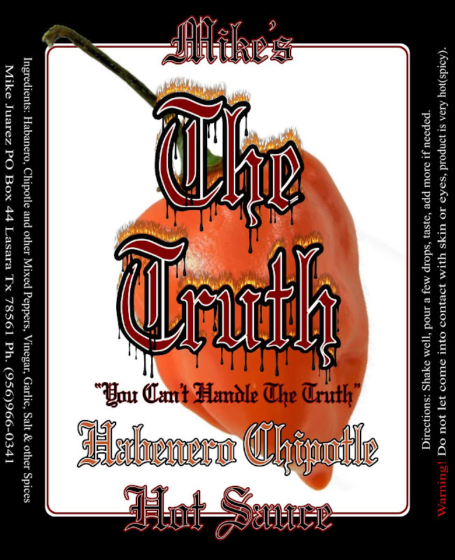
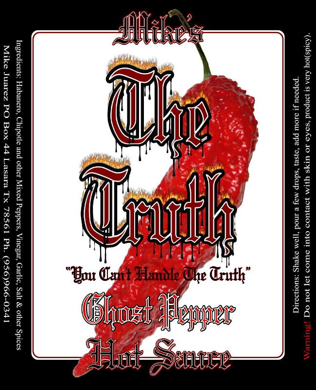
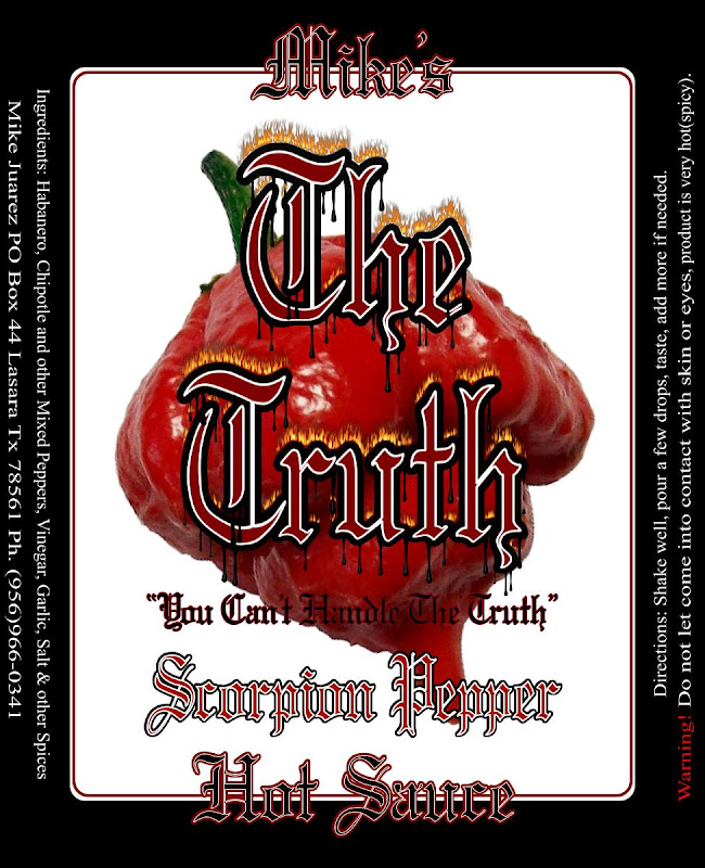
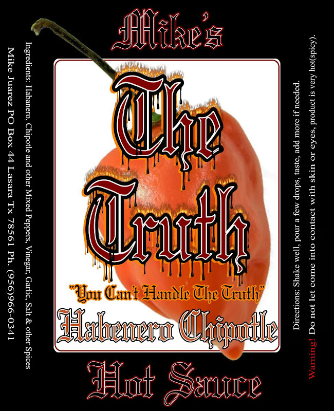
labels Draft for my labels.

lilcholo

Banned
OK, let me have it but keep in mind this is only for family and friends and the ocassional "I heard it from a friend that you were selling some hot sauce" people.

It will be going on your average condiment squeeze bottle, maybe in the future on hot sauce bottles.

Anyway...let me know what you think...there are two different styles(all white and half white/half black) and I know I didn't change the text to match the ingredients but I can do that later...here they are:

MHS4.jpg


MHS2.jpg


Thanks to JuanHubero for helping me out on this one.
MHS3.jpg


MHS5.jpg


I forgot to add that there will probably a Jalapeno/Serrano label in the future as well.....maybe...add some green color.
 
Well, I'm a new guy around here, but I'll chime in. I like the layout and concept. I don't like the choice of font, unless you are a biker, in that case it's perfect. :cheers:

Thanks, new, old, long time member, has nothing to do with commenting on graphics which is like art....not everybody sees it for what it is, some just like what's there but have no idea what any of it signifies, some plainly just don't like any part of it, etc...

Thing is, I can handle criticism when I'm told what one thinks I did wrong or what you don't like about it but when someone just says I don't like it and doesn't say why....well, I best not say what I think about those types or I'll probably get kicked off this site. ; )

I do have over 1000 fonts to choose from but I am and have always been very partial to Old English style fonts. I know it's not everybody's cup of tea but then again...what is, right?

Although I don't condone tagging, me thinks lots of it looks great because many of them are unique styles of fonts and I think of it as an art, not just some guy breaking the law.

I appreciate everyone's honesty...atleast those that took the time to give actual criticism.

Liquid is heavy - I'd be extremely surprised if your peppers outweigh your liquid (vinegar)

I use 1 quart of vinegar for every 4lbs of peppers. Some of those peppers are dry so I'm sure when they reconstitute, they weigh a bit more. I'm sure technically, like with the human body, water makes up the majority of it otherwise it'd be a dry product but since we're called humans and not walking bodies of water, well, we call them peppers and I'll say the majority of it is.....peppers. ; )

By the way, not really sure how much vinegar weighs but I do know water is 8lbs per gallon so if vinegar is nearly the same, 1qt would weigh about 2lbs. Since both water and vinegar evaporate during the cooking process, etc, etc, etc.... Dammit, do we have any rocket scientists in here to figure all this mess out? :banghead:

I know, how about we say 50/50 and call it a draw?

One last note, though, I have tasted many a sauces where you can really taste the vinegar, not so with mine. I mean you can taste it, kind of hard to hide the taste of vinegar, especially the plain white kind but it's not as prolific as in many others. I use apple cider vinegar which kind of helps hide some of the taste of it. Let me know where they sell sample bottles and I'll send ya a sample and let you be the judge. It's kind of hard to taste things over the internet.

~Mike
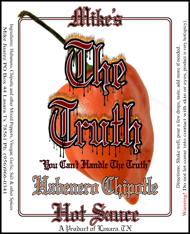
 
I'd actually make the Mikes Hot Sauce portion a separate part and a bit larger so it stands out a bit more and have the white label piece the only part that changes between the sauces -- that way it ties the entire line together as "Mikes Hot Sauces" and makes creating new labels easier as you only adjust the one portion and instead of having the Mikes Hot Sauce be cut in two by the background -- something like below for example (Note : I only made a quick adjustment since I did not have the proper text font so text is a bit Fuzzy) and would also adjust the black inner portion to some other color to make it stand out on the black label (did not adjust this for the example)

sample01.jpg
 
I think JDfan nailed it in terms of improving the existing design - that was one of my earlier comments - hard to read...separating the text helps.

I still hate the old English fonts though. Looks like an Ed Hardy shirt. Blah.

Lilcholo - u don't need to post your recipe...and as you mentioned, it's not a commercial sauce so it doesn't really matter anyway.

Last comment - I mentioned it earmarked but without detail. It'll take a lot of work to adapt this to commercial if you choose to go that route at some point. No room for nutrition panel, that's huge. No "romance panel" while while optional, helps the comsumer to learn about the product. Fl Oz (net weight) on the front, etc.

Also, along those lines, what size bottle are you using? I think it'd look funky on a 5oz woozy with the wraparound. On a bigger bottle not as problematic.

My $.02
 
I'd actually make the Mikes Hot Sauce portion a separate part and a bit larger so it stands out a bit more and have the white label piece the only part that changes between the sauces -- that way it ties the entire line together as "Mikes Hot Sauces" and makes creating new labels easier as you only adjust the one portion and instead of having the Mikes Hot Sauce be cut in two by the background -- something like below for example (Note : I only made a quick adjustment since I did not have the proper text font so text is a bit Fuzzy) and would also adjust the black inner portion to some other color to make it stand out on the black label (did not adjust this for the example)

sample01.jpg


You might be on to something there. But I'll be honest, with the graphics program that I Use, changing labels, etc...is very easy. The layering part is 100 times esier than PS's, as a matter of fact, no extra pages are needed, just import an image and place it exactly where you want it and arrange it where you want it in terms of front to back or back to front, etc... Every part (image or text) you put in, begins as the top layer but after placing it where you want it on the main background, you then have the option of moving it behind other things, etc... It takes seconds. The part that is the hardest is when using plugins...and it's not so much hard as it takes more time because of the memory it uses.

Another example is, changing the pepper on the label. all I have to do is click on it, move it to one side, import another pepper image, place it on the page exactly where I want it to be, then put it behind the text, etc... Super easy program..it's called Xara Designer Pro 7, they just came out with 8 or 9.. Only thing it doesn't have is a good eraser plugin. That's why I had to ask JuanHubero for help on that. You can export your files in a wide variet of formats. Vector being one of them

Mike

I think JDfan nailed it in terms of improving the existing design - that was one of my earlier comments - hard to read...separating the text helps.

I still hate the old English fonts though. Looks like an Ed Hardy shirt. Blah.

Lilcholo - u don't need to post your recipe...and as you mentioned, it's not a commercial sauce so it doesn't really matter anyway.

Last comment - I mentioned it earmarked but without detail. It'll take a lot of work to adapt this to commercial if you choose to go that route at some point. No room for nutrition panel, that's huge. No "romance panel" while while optional, helps the comsumer to learn about the product. Fl Oz (net weight) on the front, etc.

Also, along those lines, what size bottle are you using? I think it'd look funky on a 5oz woozy with the wraparound. On a bigger bottle not as problematic.

My $.02

Great points...as for the extra room for Nutri facts, etc....that's the easy part. As I was telling JD, the graphic program I use is hard to beat as far as easiness of use and the user platform is hard to beat, especially at the price it sells for. I tried PS and it's more work to do the exact same thing that I do on Xara in about 10 times less amount of time.

I don't ever think I will be going commerical with this...I hate it when Uncle Sam gets involved in my business. ; )

This is something my friends and family will be able to say, I tasted something many others never will be able to and it's damn good at that. Commercial stuff is mostly overrated anyway. I do however, think it would be cool to put some of this stuff in those bottles you were talking about. They would make great gifts and stocking stuffers, etc...

Only $ .02? Cheapskate. LOL! J/K!
 
You might be on to something there. But I'll be honest, with the graphics program that I Use, changing labels, etc...is very easy. The layering part is 100 times esier than PS's, as a matter of fact, no extra pages are needed, just import an image and place it exactly where you want it and arrange it where you want it in terms of front to back or back to front, etc... Every part (image or text) you put in, begins as the top layer but after placing it where you want it on the main background, you then have the option of moving it behind other things, etc... It takes seconds. The part that is the hardest is when using plugins...and it's not so much hard as it takes more time because of the memory it uses.

Another example is, changing the pepper on the label. all I have to do is click on it, move it to one side, import another pepper image, place it on the page exactly where I want it to be, then put it behind the text, etc... Super easy program..it's called Xara Designer Pro 7, they just came out with 8 or 9.. Only thing it doesn't have is a good eraser plugin. That's why I had to ask JuanHubero for help on that. You can export your files in a wide variet of formats. Vector being one of them

Mike

Yeah if you have a program that has everything as separate layers it is very easy to move things around change things -- I use PS and it makes it very simple ( as long as you have the layered image file) -- without the layers it is a bit more work which is why the example I provided has the text a bit fuzzy as I just used the eraser tool to remove the background out of the text and a few other tools to move things around a bit. I'd definitely clean it up if using it but as you mention for you to make the adjustments using the layers only takes a few seconds -- Main point was that having the white background and outline for the box go through those portions of text made the name harder to read so making the white box a bit smaller so that the text is all in the black portion and making the name a bit larger font cleans it up a bit and makes it easier to read while also tying the product line together as various types of "Mike's Hot Sauces"

One other suggestion would be on the "You can't Handle the Truth" line (I know the reference) but telling your users they can't handle the product might have some not use it -- Perhaps instead use "Can you handle it ?" -- also might want to include some sort of heat scale for the various varieties so users can decide which variety to use if they have a choice (Since not all of them will know which pepper is hotter than the other by name )

Again just my opinion - feel free to use it or ignore it as it is your label.
 
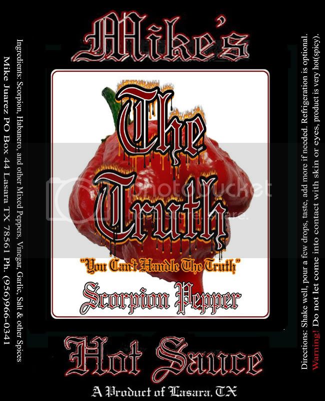
Taking JD's advice into consideration, this is what I have....now, although I haven't moved the directions and all that other stuff around....I can if needed, put it all on one side and then add the Nutri Mumbo Jumbo on the other side, etc.... I really hated to leave the "A Product of Lasara" off the bottom part but oh well....

MHS7.jpg


Once again, thanks to those that gave their constructive criticism...that is how the world becomes a better place.

~Mike
 
Back
Top