labels Gemini Crow Labels: The Last Labels

Greetings all!
Long time no chat.
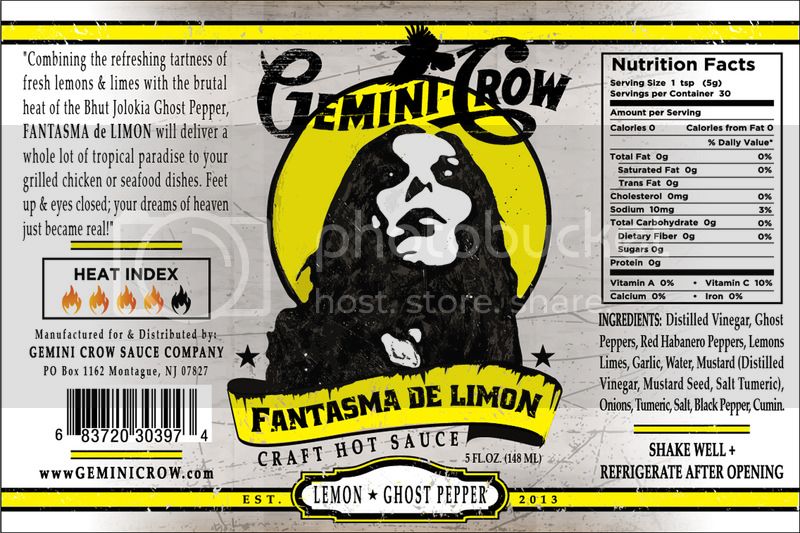
Anyone who has been following me for the last 4.5 years know my OCD/Major issues and frustration with my hot sauce labels. I won't go into it any further; that's for my therapist to figure all out....LOL
 
Anyways, Worked with a hot sauce peer this time around who does graphic design for a living and we have worked together for the last several months on my latest and what will be the final re-design of my labels.  I love them. I have spent hours pouring over them and making tweaks. I'm at the point where I don't see any tweaks or corrections left to make, so I put it in your hands. Cosmetically I love it. Welcome any thoughts and or criticisms, good or bad. Mainly looking for any critical errors I may have missed. The labels will look the same through all the sauces with the main difference being the color scheme.
 
Looking to go to print before the end of the month. Won't do em all at once as I want to go through what I have left. Hope for a full re-launch by Feb/March 19 with all sauces being under this new look.
 
Have at it & Thanks!
 
   
IMG_2228.jpg


You are missing a dot after www.
I would remove www altogether anyway. It's a bit old school, most websites lose it...
amazon.com for example
www.amazon.com just looks weird
 
You need a comma after Lemons, it reads as Lemons Limes.
 
The Hot Pepper said:
You are missing a dot after www.
I would remove www altogether anyway. It's a bit old school, most websites lose it...
amazon.com for example
www.amazon.com just looks weird
 
You need a comma after Lemons, it reads as Lemons Limes.
 
 
Wow....those are some of the things your eyes just don't pick up no matter how much you go over it...
 
as for the website, the idea of the label was a little more old school tethered look....
actually debating throwing the  http:// before it all....lol
 
One more thing, in keeping with consistency, you may want to choose between FANTASMA de LIMON (in description) and FANTASMA DE LIMON (in title). It is understandable when someone writes the product in a review or such they will not use all caps (Fantasma de Limon) but you have a mix of all caps, and all caps minus the de. I would keep these consistent, or, write it out like I did in the written manner in the description, because the "all caps" in the description looks branded but is not consistent with the "DE". Does that make sense?
 
If this wasn't a hot pepper forum
My first guess by only looking at the picture would have been some kind of label for beer
 
But seconds into it, it's clear that it's a hot sauce label.
 
I do like it! It will stand out from other hot sauces 
 
I hope this is just me
 
The Hot Pepper said:
One more thing, in keeping with consistency, you may want to choose between FANTASMA de LIMON (in description) and FANTASMA DE LIMON (in title). It is understandable when someone writes the product in a review or such they will not use all caps (Fantasma de Limon) but you have a mix of all caps, and all caps minus the de. I would keep these consistent, or, write it out like I did in the written manner in the description, because the "all caps" in the description looks branded but is not consistent with the "DE". Does that make sense?
 
it does....
i'm gonna let this thread live for a few days, then go over it with my designer and implement some of the stuff.....this is exactly the kind of feedback i was hoping for! :)
 
Check spelling for tumeric...Turmeric.


Might be the same thing as what is in the mustard might be different.


Where does the astrick.at the start of description cone from?
 
Male image .... Is it the image from The Crow?...Is it legal to use? What happened to the other crow images used on previous labels?

Glad to see you still going forward and working on new life labels.

Cheers, mate!
 
I see the astrisknis quote marks. Who are you quoting? No quote s... Sorry for the disjointed posts .
 
The tartness of lemon and lime combined with the brutal heat of bhut jolokia peppers and {some kind of sweet} gives fantasy de limon a tropical balance to chicken and seafood dishes.
 
Not rewined yet...Just typing on the phoane...
 
Lol... Finally figured out they were quote marks not astricks. ....
 
I know. They looked like asterisks on my stoopitphoane.


Might be something to consider. But then again....Why are there quote marks?
 
Perceived value.
 
Best movie of the year
 
"Best movie of the year!"
 
#2 makes it look like someone reviewed it. When in fact you could simply be stating this yourself, with quotes. Old marketing trick.


Back
Top