• If you have a question about commercial production or the hot sauce business, please post in The Food Biz.

Hot sauce label is finished, need feedback

Ok so I finished the label for my hot sauce. I had to change it from "weapons of ass destruction" due to the name already being used. So I changed it to "total rectal failure". Give me some feedback on the label.
1d1f850077520f0e8df8610fdd76b5ae.jpg
 
~dirt, I like those clean label looks. But, when I first looked at the first picture, the thing that jumped out is that there's a Hab on the Hab sauce and a Hab on the jalapeño sauce. It should have graphics of the appropriate pepper.
 
I don't purchase super hot sauces and such from stores really, mainly due to a wall of gimmicks and flashy labels. I'm a human, not a fish, I don't need flashy things to make me bite.  I tend to agree with others on here,  I would rather see a minimal yet classy label rather than a bunch of hype.  "Burns more on the way out", instantly turns me off of a sauce.  I would buy a sauce for taste with my mouth, not burn for my butthole. 
 
salsalady said:
~dirt, I like those clean label looks. But, when I first looked at the first picture, the thing that jumped out is that there's a Hab on the Hab sauce and a Hab on the jalapeño sauce. It should have graphics of the appropriate pepper.
 
Was gonna say maybe that's their logo but on the Chipotle sauce they have a rooster. Someone was drunk during label design.
 
That confused me also, what's the brand name?  Who is Heatonist and why are they "presenting" Homeboy's sauce?  Oh Well, back to Ghosts of Reapers Past
 
Heatonist is a Brooklyn hot shop, they also have Steve's GE sauce, only place that has it.
 
They silk screened XXX# of sauce bottles for a sauce maker and a hot sauce shop co-op venture?  Interesting~
 
You guys are pickier than some creative directors I've worked with :)
 
The Hot Ones sauce was made for an online interview series in which celebrities are asked questions while eating wings. Each question corresponds to a wing dressed in a different sauce and increase in spiciness. That explains the chicken, and I'm not sure how Heatonist got involved but it's a very Brooklyn seeming idea for a show.
 
Don't know how to embed movies on here, but the episode with TJ Miller is hilarious:

https://www.youtube.com/watch?v=I3RUflwPlH8
 
ilikedirt said:
Sup was bored at work what do you think?
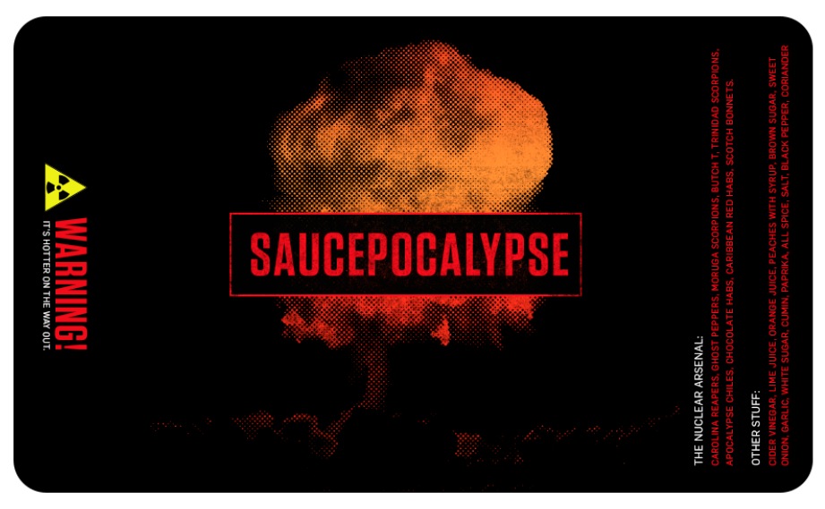
 
4VtrXgl.jpg


lWbrN48.jpg
Sorry I'm late to the party - usually these posts are in the business "packaging & marketing forum". ;)

I like the less is more philosophy, but I think you need a different mushroom cloud here. At 1st glance I had no idea what that was - thought it was a hot air balloon.

But yeah - in general a simple concept well executed is going to have a more dramatic impact on the viewer.

Didn't have time to go through this whole topic so wasn't sure if this is for hobby or commercial use?

If the latter, good idea to check to see if anyone's already used this name/concept.
:cheers:
 
rebman2005 said:
Ok so I finished the label for my hot sauce. I had to change it from "weapons of ass destruction" due to the name already being used. So I changed it to "total rectal failure". Give me some feedback on the label.
1d1f850077520f0e8df8610fdd76b5ae.jpg
 
This is without a doubt, the coolest hotsauce label I've ever see, or am likely to ever see. 
 
Scoville DeVille said:
Novelty. At best.
 
Sauce makers putting out a good product, and that are proud of it, don't try to sell it with outrageous names and graphics but, informative labeling.
 
I wouldn't buy it. I see labels like that and I already know what it tastes like.
 
Please don't take this as being snarky, it's just my 2¢
I totally agree with scovie on this one. The name is kind of a turn off and not something I would ever market to the general public. Maybe it is just the association of ass matter and a food product as the name.
 
rebman2005 said:
Ok so I finished the label for my hot sauce. I had to change it from "weapons of ass destruction" due to the name already being used. So I changed it to "total rectal failure". Give me some feedback on the label.
1d1f850077520f0e8df8610fdd76b5ae.jpg
 
If you aren't selling the sauce then I suppose this would work :)
 
However if you are going to sell it, there's quite a few things that would not pass such as:
 
Needs to specify that it is a hot sauce
Needs to have net weight and metric weight (like grams)
Needs to have Manufacturing Address
A company name
Barcode not required but you would want this long term
Bottle would need bottled date and lot code/batch number stamped on the bottle or label.
Probably some other things I'm missing.
 
The good news is once you get a template down, the next label is easy :)
 
Coming from a sauce maker that is in over 320 retail locations. Listen to Ann. You do need to list your ingredients from the heaviest to the lightest. It is a good habit to form. I am OCD and the label having ingredients in two places bugs me.

That is my 2 cents.
 
rebman2005 said:
Ok so I finished the label for my hot sauce. I had to change it from "weapons of ass destruction" due to the name already being used. So I changed it to "total rectal failure". Give me some feedback on the label.
1d1f850077520f0e8df8610fdd76b5ae.jpg
Does the lime flavor come out any or this just heat batch and no real flavor

Sent from my SAMSUNG-SM-N900A using Tapatalk
 
rebman2005 said:
I have pretty much revamped the entire label. Did research on how food labels are made up... Kept the font but trying to come up with a different color scheme. Thinking up a different graphic for the background. I'm using Avery.com so the choices are limited. I may play around with Microsoft word. I'll post a new draft this evening... Thanks for all the feedback
Adobe photoshop the one I used

Sent from my SAMSUNG-SM-N900A using Tapatalk
 
ilikedirt said:
1zoHkqw.jpg


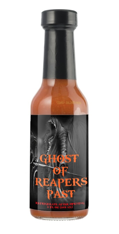
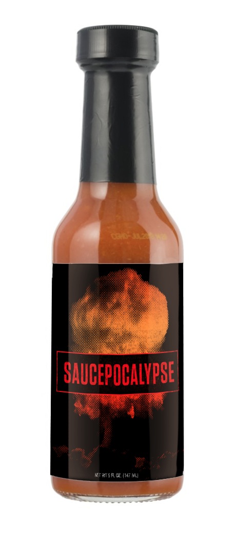
Made a mockup on a bottle for you to give you an idea.
 
I think the text might not be perfectly centered... maybe check to see if there's an extra space after 'ghost'
 
 
sorry to dig up an old thread, but if you were to put the grim reaper graphic just right of center  and put a brilliant a fireball in his hand. that would put  the reapers body, the sythe, the hand that holds it, and the fireball in the proper position to take advantage of the rule of thirds  also you could  have the main text fade from that orange into a deep red from top to bottom almost fading into black.  
 
A cheesy after thought.   several strung pepper necklaces around his neck.  it says I bring you the gift of fire, and I study under the order of the chili
 
http://digital-photography-school.com/rule-of-thirds/
 
sorry just thinking out loud on the interwebes
 
Back
Top