-
✅ Expert and friendly hot pepper grow advice.
✅ The latest information on hot pepper varieties.
✅ Reliable seed trading.
✅ Hot sauce recipes and food safety guidance.
✅ Hot sauce business tips for startups.
🌶️ And more!
It's all here, at The Hot Pepper! The Internet's original hot pepper community! Est. 2004.
You are using an out of date browser. It may not display this or other websites correctly.
You should upgrade or use an alternative browser.
You should upgrade or use an alternative browser.
labels-artwork Label Design Critique
- Thread starter DETurbine
- Start date
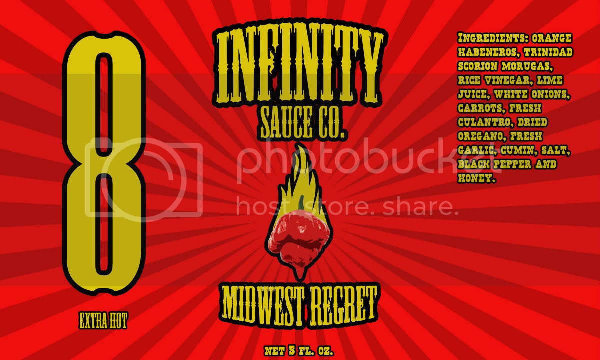
Words look too blurry, it hurts my eyes
+1... I need sunglasses to look at it, or squint really hard to make out what it says.
I really hope people wouldn't expect there to be infinity peppers in there because of the name. thanks for the comments and advice. altered it after a few peoples suggestions and am happy with it. Think I am going try and print these to see how they turn out. If I ever decide to go father than a hobby sauce I will put a lot more time and effort into it.
Father = further, sorry about the spelling. replying with my mobile
Father = further, sorry about the spelling. replying with my mobile
I honestly don't think you have enough contrasting colors in there. It's like red on red on orange on red - either/both versions posted here. The flaming pepper looks great in your profile image - because it contrasts so well against that striped blue background. You might want to try some variations to see if it looks better.
You're probably getting more "help" than you wanted, but just one more comment...inspired by a previous post...
When envisioning the computer screen image shrunk down to bottle size, the ingredients will probably get really hard to read. Maybe try the ingredients font in solid black, no outline, and not bold (not sure if it is bolded or not, I'm not familiar with the font on the label).
Anyway, it's your label, make it the way you think best. And like I said.....HAVE FUN!
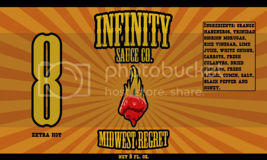
The scaling down of the 8 looks way better. Orange is one of my favorite colors, especially on a Dodge Challenger, but really, orange sticks out. If this label was on a store shelf it would catch my eye faster than most. I like the simplicity of the design. It is not too busy.
I Like the label, but I would decrease the font on "sauce co." and make the picture of the pepper much bigger. Also do you really need the number "8" on the label? I would get rid of the number and put a few sentences about the flavor profile of the sauce and what it could be used on.
huh. Maybe a horseshoe around the pepper to tie it all together. 
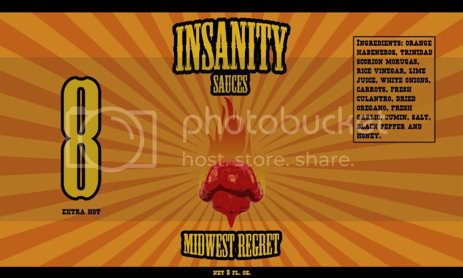
Thanks for the comments. I have been looking at the logo and thinking the same things in which it should be larger and the text a little smaller. I am not sure if I can part ways with the big 8 as that is a concept I have always wanted to do. I will take some of your guys suggestions and make some changes to it. I do however think people are forgetting that this is my hobby sauce. It will not be sold, just handed out to family and friends for gifts. Lucky Dog, I do love your design, but think our designs are completely different minus the sun burst backing, but then again I have seen a group of sauces with the same sun burst design.
Here goes an update. Font decreased and logo enlarged. Should I put a border around the logo like I had in the previous versions or are there any other suggestions for it?
Here goes an update. Font decreased and logo enlarged. Should I put a border around the logo like I had in the previous versions or are there any other suggestions for it?
That's the best yet. Simple. Clean. It will really pop with a dark sauce in the bottle. If the sauce is yellowish however this will not work.
What I find very cool is that there's an optical illusion if you scroll up & down while looking at the pepper - the sunburst appears to move either downwards if you're scrolling up or upwards if scrolling down. Kinda trippy.
I think the flames of the pepper get kinda lost in the background, but I agree with THP it's the best version yet.
I think the flames of the pepper get kinda lost in the background, but I agree with THP it's the best version yet.
I am missing how a burning pepper is anything like ldhs dog head with a horseshoe?
My first design was completely different than Lucky Dogs label minus the sunburst backing which I am sorry to say isn't anything unique or new to the hot sauce world. My focus resolved around the large font rather than my logo where as ldhs is all focused on his logo and small font. I still am not sure how my burning pepper is anything like a large dog head with a horseshoe around it.
I came on this forum seeking a critique and that is exactly what I received thanks to everyone, but with critiques came suggestions on what I should change and adjust and that is exactly what I did such as toning down the colors so they weren't as bright, slightly reduced the text size and increased my logo a little like everyone had suggested.
Oh and I am not trying to promote anything. I have always liked working with photoshop and ever since I decided to make a hot sauce for my friends and family I figured I would make a label for it. I simply came on here to hear everyones comments and suggestions about it before I got it printed. This sauce will be going out to 20-30 people at most, so wouldn't make sense for me to pay for a professional to do this for me. Trust me if I for some reason decide to mainstream a sauce of mine I will put the money and effort into making it one of a kind.