-
✅ Expert and friendly hot pepper grow advice.
✅ The latest information on hot pepper varieties.
✅ Reliable seed trading.
✅ Hot sauce recipes and food safety guidance.
✅ Hot sauce business tips for startups.
🌶️ And more!
It's all here, at The Hot Pepper! The Internet's original hot pepper community! Est. 2004.
You are using an out of date browser. It may not display this or other websites correctly.
You should upgrade or use an alternative browser.
You should upgrade or use an alternative browser.
labels-artwork Label Design Critique
- Thread starter DETurbine
- Start date
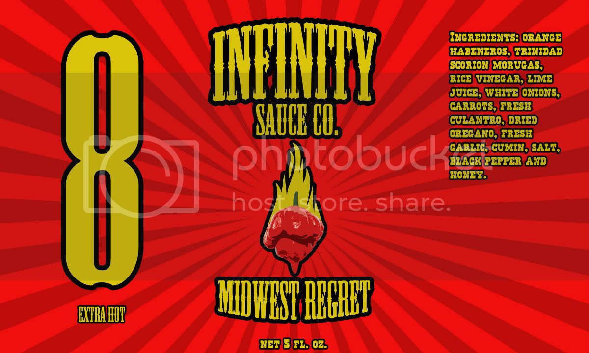
You're still missing the "p" in Scorpion.
Other than that, I dig it. Great job!
Other than that, I dig it. Great job!
I like the first label the best as far as colors go...if you really want to hurt someone's eyes and get their attention, change your company name to a lime green font...something like this...I am no longer in business by the way but this was my "sign"... (get it? Where's your sign?.............  )
)
not the best picture but you will get the idea
)not the best picture but you will get the idea
Ooops! "Culantro" is actually spelled "cilantro"!
But I like the bright label!!!!")
edit: Sorry, I just got caught up! "Culantro" it is!! hahaha Learn sumpthin' new every darn day!!!!!
But I like the bright label!!!!
edit: Sorry, I just got caught up! "Culantro" it is!! hahaha Learn sumpthin' new every darn day!!!!!
I've been mostly busting chops subtly about it for 2 pages because you're not a commercial hot sauce brand and I honestly don't care, though I'd be interested to hear more about this hot sauce you say you're making. Besides, it was more fun to crack wise than go off on a rant like Scovie, but really? You don't see any similarity?I am missing how a burning pepper is anything like ldhs dog head with a horseshoe?
That you used the exact colors of red for your original red label sunburst as my flagship hot sauce which has a red/light red sunburst background doesn't strike you as the least bit similar?
Then you changed to an orange label sunburst, when I also have an Orange label sunburst also didn't occur to you? The whole style of a sunburst with gold fonts and a centered logo? No? Not ringing a bell? I'm really not mad and don't care about drama, but come on dude. Keep it real at least.
My first design was completely different than Lucky Dogs label minus the sunburst backing which I am sorry to say isn't anything unique or new to the hot sauce world.
Actually, it is pretty unique. I looked at hundreds of hot sauce labels to make sure I wasn't biting anyone's style. If you google "sunburst hot sauce" you get the following: http://www.google.com/search?hl=en&q=sunburst%20hot%20sauce%20label&gbv=2&um=1&ie=UTF-8&tbm=isch&source=og&sa=N&tab=wi
Notice how you see all 3 of my labels in the search results. No other hot sauce in the results uses a sunburst, except now your label is there like 1.5 pages down. Again - not trying to start drama, but your over the top denial here is a little hilarious when put into perspective. Good luck with your gift sauce. I'm sure it will look great. Would love to hear more about it when you make it.

First this is a hobby sauce. I am not mainstreaming my sauce and if that ever happend as stated above I will make sure my label is completely different and unique, so there is no need to get bent out of shape about this. Second, yes I do have the sunburst backing like you, but sorry that is a design that has been around for quite some time and it's one that I liked and is preinstalled in photoshop, so that's the main reason I chose it. I didn't even remember your design until I looked it up after it was brought up in this thread. Also yes you center the logo using the sunburst design, everyone does it. Look at about every sauce label out there and you will find that about every labels main color scheme is either red, orange, yellow or black. My background was red, but a completely brighter and different shade than your sudle one and I chose that simply because my logo is red, so please inform me with what color I should have used?
Your text is small as mine is large with a completely different font using a bold black outline and was originally yellow, but majority of the suggestions was to tone down the colors, so I did by choosing a orange background (again not to many colors that go well with a red logo) and using a more sudle orange font. You dont have to worry this sauce is not going mainstream just to my friends and family.
Your text is small as mine is large with a completely different font using a bold black outline and was originally yellow, but majority of the suggestions was to tone down the colors, so I did by choosing a orange background (again not to many colors that go well with a red logo) and using a more sudle orange font. You dont have to worry this sauce is not going mainstream just to my friends and family.
er lucky, you don't have a monopoly on sunbursts... it's a pretty common graphic design technique, used in thousands of logos, food and otherwise
Never said I did, nor did I try to make it a big deal - scovie's rant caused a denial though which I found amusing.
I dont care that it's the EXACT color sunburst/style of my label, really. Imitation is the greatest form of flattery.
so there is no need to get bent out of shape about this.
You need to learn to read dude. I explicitly said I don't care. Twice. I also said its not a big deal.
Read, then post.
Nor am I. I just came on here to have a critique and get some suggestions, not be accused of stealing anothers label design. I was not trying to argue with you in my last post, just simply defending myself with your multiple paragraph posting in which you listing the order of how I stole your design. Again, I'm sorry if it appears that I stole your concept, but that was not the intention and I believe they are two completely different sunburst labels.
Ok, whatever.
Like I said - I look forward to seeing you post about the sauce itself - maybe on the making sauce forum.
Like I said - I look forward to seeing you post about the sauce itself - maybe on the making sauce forum.
I personally like the second image better as a whole. However, the first image pops out more but the colors make the words harder to read, maybe if you just changed the color of the words in the first one and meet some where in the middle. Other than that the labels look great!!
Good Luck to you!
xo Nicole
Good Luck to you!
xo Nicole
I like the new version. It's better than most of the labels on commercial sauces I see nowadays. I'd buy this if I saw it on the shelf.
hey this sauce has a green sunburst


I've been mostly busting chops subtly about it for 2 pages because you're not a commercial hot sauce brand and I honestly don't care, though I'd be interested to hear more about this hot sauce you say you're making. Besides, it was more fun to crack wise than go off on a rant like Scovie, but really? You don't see any similarity?
That you used the exact colors of red for your original red label sunburst as my flagship hot sauce which has a red/light red sunburst background doesn't strike you as the least bit similar?
Then you changed to an orange label sunburst, when I also have an Orange label sunburst also didn't occur to you? The whole style of a sunburst with gold fonts and a centered logo? No? Not ringing a bell? I'm really not mad and don't care about drama, but come on dude. Keep it real at least.
Actually, it is pretty unique. I looked at hundreds of hot sauce labels to make sure I wasn't biting anyone's style. If you google "sunburst hot sauce" you get the following: http://www.google.co...=og&sa=N&tab=wi
Notice how you see all 3 of my labels in the search results. No other hot sauce in the results uses a sunburst, except now your label is there like 1.5 pages down. Again - not trying to start drama, but your over the top denial here is a little hilarious when put into perspective. Good luck with your gift sauce. I'm sure it will look great. Would love to hear more about it when you make it.
hey this sauce has a green sunburst
Good thing I don't hold a trademark on the Sunburst huh?
I've never heard of any of those sauces - Berlin? lol.
Thanks for posting - like I said, *I* had never seen one before despite searching, whereas my labels are plastered all over THP.
Guess I should have asked you first thegreenman.
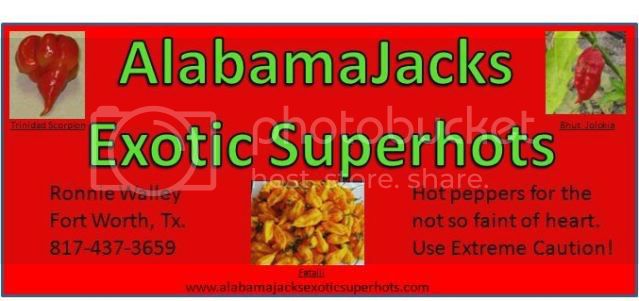
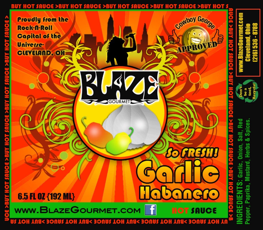
Those other two labels are interesting in that they lack nutritional content usually required for commercial sauces. The blazegourmet looks good - I'll have to order some, thanks for posting.
The Green one's website is http://www.360training.com/? Funny - there's no hot sauce for sale there. Weird, huh?

[background=rgb(237, 237, 237)]Corporate Solutions
[/background]
You should really read more closely there dude - it's not hot sauce, it's TRAINING COURSES. So congrats - you found 2. One in Germany.
Regardless, I was never mad, I never made an accusation (though someone else did) I just commented that it was similar to mine since not only did he use a sunburst, but also my same colors, twice.
I never intended to make a federal case about it, so everyone can relax. Seriously - tempest in a teapot here. It's a home-brewed hotsauce that isn't for sale (as as far as I can tell there's no actual sauce, just a label) and I truly do not care either way.
I just thought the label looked very similar to mine. Some others on this site PM'd me to say the same. I've not made a big deal of it, nor do I intend to. I just think it lacks originality. That's it.
Thanks for posting the labels though - I'll ask my brother in Berlin to send me some of the Berlin Hot Sauce, and if I need "Smokin' Hot Training", now I know where to go.
I've never heard of any of those sauces - Berlin? lol.
Thanks for posting - like I said, *I* had never seen one before despite searching, whereas my labels are plastered all over THP.
Guess I should have asked you first thegreenman.
Those other two labels are interesting in that they lack nutritional content usually required for commercial sauces. The blazegourmet looks good - I'll have to order some, thanks for posting.
The Green one's website is http://www.360training.com/? Funny - there's no hot sauce for sale there. Weird, huh?
[background=rgb(237, 237, 237)]Corporate Solutions
[/background]
You should really read more closely there dude - it's not hot sauce, it's TRAINING COURSES. So congrats - you found 2. One in Germany.
Regardless, I was never mad, I never made an accusation (though someone else did) I just commented that it was similar to mine since not only did he use a sunburst, but also my same colors, twice.
I never intended to make a federal case about it, so everyone can relax. Seriously - tempest in a teapot here. It's a home-brewed hotsauce that isn't for sale (as as far as I can tell there's no actual sauce, just a label) and I truly do not care either way.
I just thought the label looked very similar to mine. Some others on this site PM'd me to say the same. I've not made a big deal of it, nor do I intend to. I just think it lacks originality. That's it.
Thanks for posting the labels though - I'll ask my brother in Berlin to send me some of the Berlin Hot Sauce, and if I need "Smokin' Hot Training", now I know where to go.
Good thing I don't hold a trademark on the Sunburst huh?
I've never heard of any of those sauces - Berlin? lol.
Thanks for posting - like I said, *I* had never seen one before despite searching, whereas my labels are plastered all over THP.
Guess I should have asked you first thegreenman.
Those other two labels are interesting in that they lack nutritional content usually required for commercial sauces. The blazegourmet looks good - I'll have to order some, thanks for posting.
The Green one's website is http://www.360training.com/? Funny - there's no hot sauce for sale there. Weird, huh?
[background=rgb(237, 237, 237)]Corporate Solutions
[/background]
You should really read more closely there dude - it's not hot sauce, it's TRAINING COURSES. So congrats - you found 2. One in Germany.
Regardless, I was never mad, I never made an accusation (though someone else did) I just commented that it was similar to mine since not only did he use a sunburst, but also my same colors, twice.
I never intended to make a federal case about it, so everyone can relax. Seriously - tempest in a teapot here. It's a home-brewed hotsauce that isn't for sale (as as far as I can tell there's no actual sauce, just a label) and I truly do not care either way.
I just thought the label looked very similar to mine. Some others on this site PM'd me to say the same. I've not made a big deal of it, nor do I intend to. I just think it lacks originality. That's it.
Thanks for posting the labels though - I'll ask my brother in Berlin to send me some of the Berlin Hot Sauce, and if I need "Smokin' Hot Training", now I know where to go.
I think that 360 training one was for a promotional sauce, I've seen stuff like that before, hats, tshirts, bottle openers, sunglasses and now hot sauces with corporate logos, I have a promo wine from a real estate agency that i'm not gonna bother to open up. Just a white-label marketing gimmick.
FYI I know almost nothing about this hot sauce labeling stuff, I just have a black belt in google fu.
I'm not taking sides on the label design "borrowing" or whatever the conflict is about. Just showing you there is similar art out there.
No conflict.
Thanks for using your google fu for the powers of good?
Thanks for using your google fu for the powers of good?