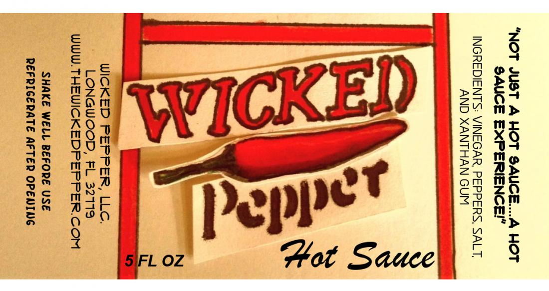
Even though I'm pretty sure that this label design I'm going with, I figured I would get some feedback and thoughts from the expertise of THP members. Thanks for your responses.
-
✅ Expert and friendly hot pepper grow advice.
✅ The latest information on hot pepper varieties.
✅ Reliable seed trading.
✅ Hot sauce recipes and food safety guidance.
✅ Hot sauce business tips for startups.
🌶️ And more!
It's all here, at The Hot Pepper! The Internet's original hot pepper community! Est. 2004.
You are using an out of date browser. It may not display this or other websites correctly.
You should upgrade or use an alternative browser.
You should upgrade or use an alternative browser.
labels-artwork Label Design, Feedback
- Thread starter Wicked Pepper
- Start date
Thanks for the clarity on that. I originally thought it wasnt needed based upon the University of Florida publication of marketing processed foods in FL.-salsalady said:Looks good-
folks would be interested in what KIND of peppers are used,
Metric (mL) required along with oz.
"Net Weight: Labels must include an accurate statement of the net contents in avoirdupois pound and ounce for weight, and in U.S. gallon, quart, pint, and fluid ounce for fluid measure. Metric values for net contents may also be declared but are not mandatory. "
I also did some looking around at the supermarket and found items that didnt list metric values. After your response, I did find FDA statement that both are needed. Thanks.
I decided to go with a 4 x 2 instead of the norm, but i'm also going to use a 1 x 2.5 along back of the bottle where I'll name the particular sauce and the romance panel.salsalady said:Looks good-
folks would be interested in what KIND of peppers are used,
Metric (mL) required along with oz.
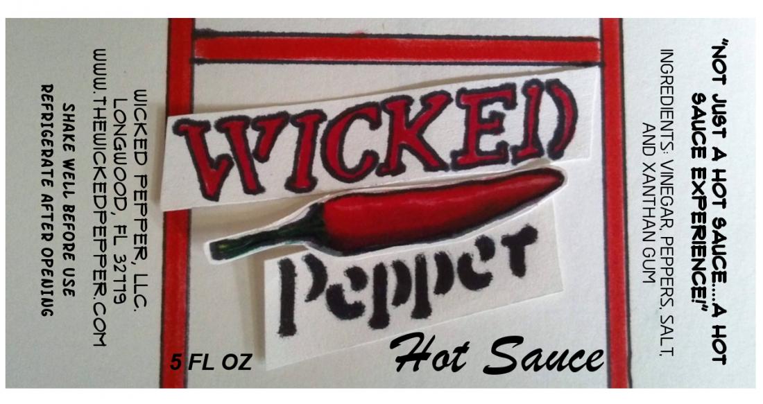
Looks like you used markers and scissors, and took a picture of the logo with a camera instead of scanning. It will never be sharp. You can hand draw stuff but you need a hi-res scanner and drop it into Illustrator. This camera-taking technique will never look professional, imo.
The drawing itself it a bit crude. The letters are not sharp at all, the markers have soaked into the paper. There are lines that are not straight.
Or wait. Was this a cut-out mock-up? To show us what it would look like?
The drawing itself it a bit crude. The letters are not sharp at all, the markers have soaked into the paper. There are lines that are not straight.
Or wait. Was this a cut-out mock-up? To show us what it would look like?
Some stores will require a UPC. It would help to see the full layout w/ the romance panel. Hard to picture how it would look w/ sauce name and romance panel on back. Seems backwards to me, at least for the sauce name. I don't mind the cutout pictures and text. It gives it a homemade and simple feel. That could be good and bad.
Also, I don't see anything "Wicked" about it. Doesn't really scream hot sauce. Not that you need skulls and flames, but something more. Maybe a heat scale. Not sure what the red lines in the background are. Looks like part of a ladder. Is there a hot sauce name to work with?
Also, I don't see anything "Wicked" about it. Doesn't really scream hot sauce. Not that you need skulls and flames, but something more. Maybe a heat scale. Not sure what the red lines in the background are. Looks like part of a ladder. Is there a hot sauce name to work with?
THP-Your assessment is spot on. Like Pepper Daddy stated, I was looking for something more homemade and simple, but I do agree that it is a little blurred and lacks some sharpness to it.I never did think of scanning it though. Thanks for the input.The Hot Pepper said:Looks like you used markers and scissors, and took a picture of the logo with a camera instead of scanning. It will never be sharp. You can hand draw stuff but you need a hi-res scanner and drop it into Illustrator. This camera-taking technique will never look professional, imo.
The drawing itself it a bit crude. The letters are not sharp at all, the markers have soaked into the paper. There are lines that are not straight.
Or wait. Was this a cut-out mock-up? To show us what it would look like?
PepperDaddy- For my initial plans, the UPC won't be needed. I thought of flames or something like that but I thought the logo stands well on its own. The red lines was something I put in to help the logo stand out a little more. I was going for a more plain look, but I hear you and maybe it could use a little more something. Here is a real rough idea of what i was thinking for the romance label. I was also thinking of a "Wicked Scale" to go on it as well.
Attachments
If you plan to print and apply these yourself, which it looks like you are, and you don't plan on selling in stores, then you have time to tweak and your label can be a work in progress. It's when you are going to a label company and printing 5K labels that you have to have it all figured out. You may want to continually revisit the design and get feedback from customers at farmer's markets and go through an iterative process until you are ready for the next level. But that could be what you are doing anyway 
I find it annoying to look at with the text being originated differently on the sides. The front of the label is right side up and everything else, you have to turn the bottle.
Its a small thing for sure but it doesn't please my eyes. As someone who has hand labeled a ton of bottles I think you'll want to cut down the time involved and go with a single label.
That being said, you mentioned that this is what you've decided to go with so go for it. Its your vision after all.
Funny, I just went looking for what other labels do for sideways text, and here's a couple I found.
Most of our current Texas Creek labels have the romance and ingredients info sideways. The text can spread out more, making it easier to read as a paragraph. People have to pick up the bottle to look at the ingredients anyway, it's not that big of deal to turn it sideways. Also, most of our labels have the main front panel on the left of the label with all the romance and text on the right. Most people try to split it and put the panel in the middle, sometimes it seems to make it harder to deal with all the info that needs to be on the label.
When the bottle is on the shelf, you only see that front panel anyway.
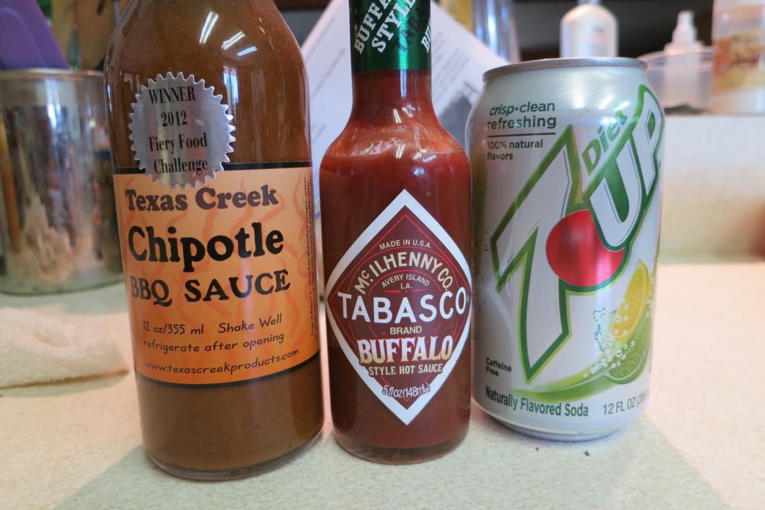
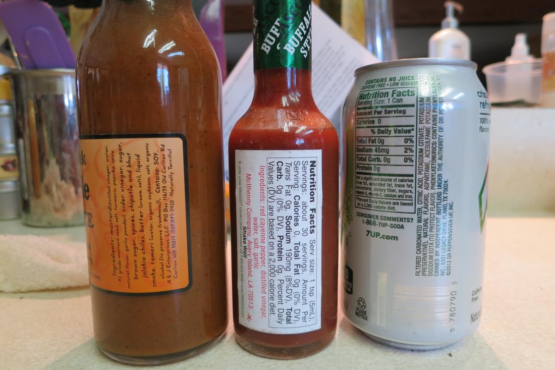
Our first hot sauce labels had the main panel in the middle and text on both sides. Those actually have the side texts going in opposite directions so the bottle has to be turn 2 times to read it all. That was a mistake. Here's What Not To Do.
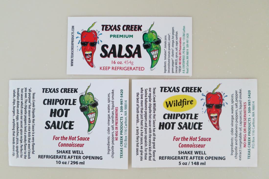
Most of our current Texas Creek labels have the romance and ingredients info sideways. The text can spread out more, making it easier to read as a paragraph. People have to pick up the bottle to look at the ingredients anyway, it's not that big of deal to turn it sideways. Also, most of our labels have the main front panel on the left of the label with all the romance and text on the right. Most people try to split it and put the panel in the middle, sometimes it seems to make it harder to deal with all the info that needs to be on the label.
When the bottle is on the shelf, you only see that front panel anyway.
Our first hot sauce labels had the main panel in the middle and text on both sides. Those actually have the side texts going in opposite directions so the bottle has to be turn 2 times to read it all. That was a mistake. Here's What Not To Do.
I'm ok with sideways text.
I'm not a fan of the cutout style - it could be quaint or crafty in theory but in practice it comes off looking a bit sloppy which as a consumer would give me pause about the quality of sauce in the bottle.
Just as a knee-jerk reaction.
I'm not a fan of the cutout style - it could be quaint or crafty in theory but in practice it comes off looking a bit sloppy which as a consumer would give me pause about the quality of sauce in the bottle.
Just as a knee-jerk reaction.
Wicked are you planning on changing the label for other sauces? The problem I see is that this could be your logo but where are you going to put the sauce information for different sauces? For example, Salsa Lady has her "logo" (The name and the peppers) but the name of the sauce changes. Are you taking that into consideration?
The Hot Pepper said:Looks like you used markers and scissors, and took a picture of the logo with a camera instead of scanning. It will never be sharp. You can hand draw stuff but you need a hi-res scanner and drop it into Illustrator. This camera-taking technique will never look professional, imo.
The drawing itself it a bit crude. The letters are not sharp at all, the markers have soaked into the paper. There are lines that are not straight.
Or wait. Was this a cut-out mock-up? To show us what it would look like?
I believe it should be 300 DPI minimum for the design resolution, many programs default to 72 or 100...
Wicked Pepper said:THP-Your assessment is spot on. Like Pepper Daddy stated, I was looking for something more homemade and simple, but I do agree that it is a little blurred and lacks some sharpness to it.I never did think of scanning it though. Thanks for the input.
PepperDaddy- For my initial plans, the UPC won't be needed. I thought of flames or something like that but I thought the logo stands well on its own. The red lines was something I put in to help the logo stand out a little more. I was going for a more plain look, but I hear you and maybe it could use a little more something. Here is a real rough idea of what i was thinking for the romance label. I was also thinking of a "Wicked Scale" to go on it as well.
If you are into graphics, make a layer with the "cutout" and create a drop shadow to appear hovering... like a postit note, for example:


