artwork Label feedback

Be gentle, I'm a programmer, not a graphic artist 😰

These are the front of a fold-over label for bags of dried peppers. I have verified that they are acceptable on the legal side (dried peppers are considered farm product so no specific requirements)

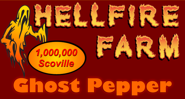
ghost-label.png


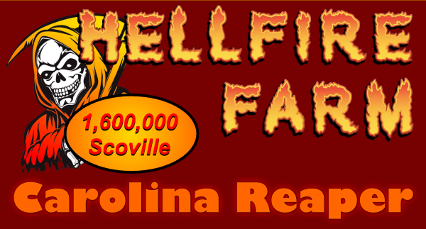
reaper-label.png


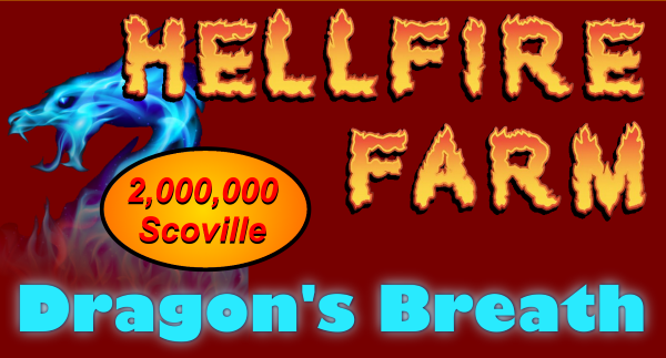
dragons-breath-label.png


I followed some examples on the market with the "scoville" bit but I'm having second thoughts about it.
 
Wow, lots of great feedback, thanks!
@salsalady is really good at these critiques but she never comes when I call lol
I think she's been busy trying to catch up to your calls lately 🤣
Welcome Hellfire Farm!

<...>

You mentioned it is a farm product and is exempt from normal labeling requirements like weight, etc. Depending on where you are selling, consider adding weight somehow. Either a hand written or 'average ounces'.
The packages are by count. Maybe I'll put something like that on the back.
Regarding SHU... when you put a SHU listing on the label, customers will expect the peppers to be that shu, which doesnt happen. The listed shu of peppers are for the registered max shu of that specific pepper, not necessarily the shu of the peppers you are selling. So many factors contribute to the peppers' shu, you cannot guarantee what you are selling is actually that shu.

I strongly discourage putting shu claims on anything being sold unless it can be proven. Maybe put something like 'scorpion peppers average 1.8mil shu'.
I was thinking about adding "average", or something else like that. I have a note on the back about natural products and so on. But I see your point.
If this is the front label of a fold-over, what is on the back?
I'll get that up in a bit. Stuff like "suggested use" and "Hey this is REALLY HOT", and the website URL. Address is not needed for these but it seems SOME contact info is just right.

Again on the shu's-
Ghost peppers average about 600,000 to 800,000 shu. The record, in the early 2000's, was 1.2mil shu. A couple other peppers got Guinness records as One Offs. Since then, Guinness has revised their testing requirements.
Interesting, that's not the average for ghost I found when looking it up recently.
On another note, though, I wonder if that's why DB hasn't been certified?

I was already a little shaky on the "scoville oval" (that's the layer name) already. Looks like a little more thought needed there. I definitely want SOMETHING.

After a couple looks, i like the reaper and dragon labels better than the ghost. I like how the reaper and ghost are behind the letters. Maybe revisit the ghost image, make it larger as the other ones, white or silver highlights, slightly behind the upper left letters...
I can see that.
This is a theme you can carry thru to tons of product.
That was the idea!
Although some of the powders I want to sell won't quite work with "hellfire", but I think that's ok (habanada in particular)
And it looks like the logo.HELLFIRE FARM is not the same width in each label. May not be an issue? And knowing these are work ups...
I think it's an optical illusion. They're all generated from a single file, just by showing different layers. But comparing the ghost & reaper they DO look like they're not the same size.
Ps...i am an electrician and sauce maker, not a grapfic designer. Take everything with a huge grain of salt.
:cool: SL
NP, I'm not selling only to graphic designers!
 
Couldn't agree more on the changes to color schemes recommended! Great critiques! Totally lose the Scovilles.. My first thought when I read that was, "yeah, right!"

I think maybe I can help with the pitchfork a little.. Instead of using standard font, use something in the italic flavor, so the 'm' can be at a sweet angle to have the pitchfork coming in from the side at more of a 45 degree angle.. Like someone threw it at you. I think that would take those letters to a whole new level too, as they look a little.. Soft, like Looney Tunes, where you could be more like Heavy Metal.
Pretty sweet work, all the same.. Love the dragon image!
 
I think it just LOOKS better with something there, especially the reaper (so he's peeking out from behind). Any suggestions?
How about an image or graphic depiction of the pepper(s) highlighted in each product? Maybe not that original in itself, but it catches the eye, and is a good representation of your product.

Edit: Not sauce..
 
Last edited:
If you really want the characters peeping from behind something, lose the oval, move the word Farm to the left (but not all the way) so they are peeping from behind it, and to the right of it, in that space, write Dried Peppers in a standard font.
 
I'm guessing the product will be packaged in clear cellophane bags so the dried peppers can be easily seen. Lose the oval, move farm to the left, put a heat indicator on the right...???
 
Last edited:
For the back label I'm putting some text. I have this so far but not happy with it:
WARNING: These peppers are EXTREMELY HOT! They are not intended for direct consumption. These peppers, or their powder or dust can cause extreme pain and distress. Wear gloves and wash hands thoroughly after handling.

SUGGESTED USES: Crush and sprinkle LIGHTLY over food. Add whole or crushed pepper to chili or hot sauces.

Appearance will be like this (I dropped the "note" since I also dropped the scoville on the front)

back-label.png


Like I said, though - not happy with the text.
 
Last edited:
Wow, these have really improved. If you still want an oval in the "missing space," tell us why your product is better than all the others on the shelf. Think about that one, and try to put that there. For example some things that might stick out if I were looking at peppers are Superhot Peppers, Sun Dried, Organic, Family Farmed, Product of USA, Charities, etc. You get the idea. Not saying any or all of that applies, just trying to explain what I mean. If your peppers are next to the all the others, ask yourself, what makes yours different?

I think bringing the oval back would work in that case and would also help fill that space.
 
A work in progress, and looking good!


Don't worry about all the text on the back, You have the right idea, just wait until everything is sussed out for the text on the back.

For the front labels.....

I don't like the black and white Reaper with a gradient orange scythe handle. i like the full other colored Reaper better, but maybe mess with the colors so they are a little different than the letters. Add heavier red, or a dark outline of the image?

Letter Spacings... The 3 lines of..

Hellfire
Farm
Pepper Variety

My suggestion is to elongate (elongate is maybe not the proper word, I'm looking for something to stretch Top to Bottom) Hellfire and Farm...and PEPPER Variety so they are mostly the same height. Move them so they have the same spacing between the lines to make it look happy top to bottom. That will fill in most of the emply space from the deleted oval.

I like the BW ghost color, but still think the ghost should be bulky-ier. I don't like the BW reaper, i like the colored version better.

Maybe make the ghost whispy like the dragon??? Whispy ghost? Whispy Reaper???? Whispy ghost that is larger, behind the letters?

that might be the ticket to tie it together. ????
 
Last edited:
Aight, I definitley like the yellow/orange ghost from the original design. And definitely like the yellow/orange of the reaper instead of the BW with yellow staff. hope this helps~
 
I like the new reaper, but I might give him the glowing gradient on face and hand. Also like the white ghost. Helps the label pop.
 
I have a compromise for the ghost though. At the ends of the arms where you see the black, and eyes, mouth, try that glowing gradient there, so it looks like the ghost is on fire INSIDE.
 
Well now the feedback is contradicting so I gotta make choices :) Damn you guys making me actually have to THINK!

I was already thinking about "thinning" the ghost more. Don't know if you noticed but I faded it a bit already, at the tips. I WISH I could find a ghost and reaper similar to the dragon - that dragon was pure luck that I stumbled across it. But that particular artist is very partial to dragons, so not much else available.

I think I like how things stand out now better. Probably will play with the placement & size of the letters as suggested, I can see the point there. Might help fill that empty space in the middle some better too.

As for bulking up the ghost, I was thinking the same but not sure how much more I can go with it - not much vertical room left so all I really have is wider. But it's free to try, so let's see how it works.
 
Back
Top