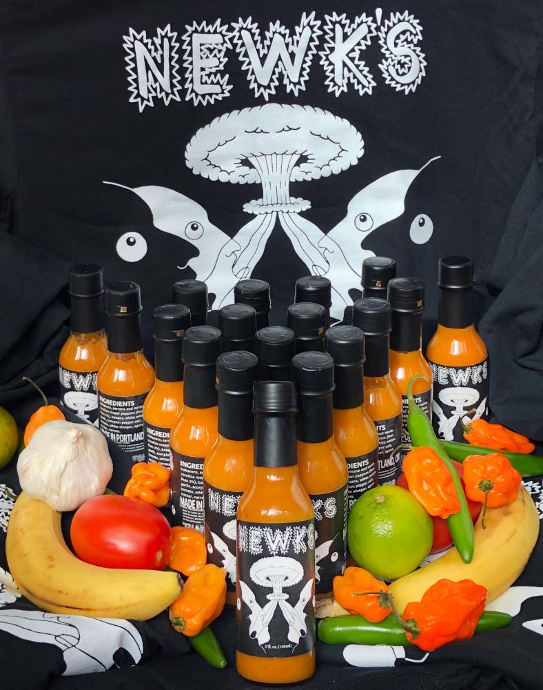
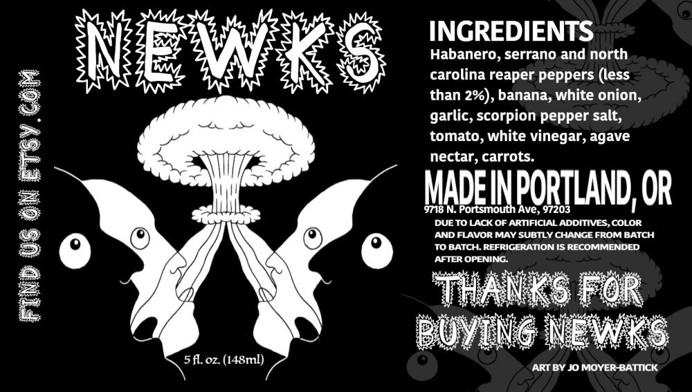
Hi! I am new. This is my 3rd batch of hot sauce I have made. I have finally nailed down the label, recipe and am beginning to figure out the process of getting it tested at a lab and sent to a process authority. I won't post my recipe, but I am glad to say it is all 100% natural ingredients, including mostly habaneros, serranos and only ONE north carolina reaper pepper (dehydrated). I have enjoyed sweetening my hot sauce with bananas and agave nectar. It is organic and vegan, which also feels good for my own personal views. What do you think of the look and label? My friend did the artwork and I did the graphic design. Thanks so much and I am loving this forum - very educational and inspirational!


-
If you have a question about commercial production or the hot sauce business, please post in Startup Help.
You are using an out of date browser. It may not display this or other websites correctly.
You should upgrade or use an alternative browser.
You should upgrade or use an alternative browser.
NEWKS Hot Sauce (Rate my label)
- Thread starter Newks_Hot_Sauce
- Start date
Yes.ADRUNKK said:I like the label a lot. It's got a psychedelic vibe to it, or maybe a brain washing vibe to it. Try it once and your hot sauce becomes their religion.
I'm a word nerd, so take this as you like.
"north carolina reaper" should be simply "carolina reaper"
"less than 2%" should be removed completely
Add a heat meter as Salsa Lady suggested
Remove the "find us on etsy" and replace with a direct link, or even better put up your own webpage and print that link
Shrink the "Thank you for buying NEWKS" down to the same size as your ingredient list
I really like the logo art work. All I'd suggest there is a thin white border - kind of a square or rectangle border on the label - that serves to frame the black faces of the label from the rest of it. Right now everything is black but a small thin white border would highlight those faces.
Best of luck, and welcome to THP
Alongside with what SmokenFire said, maybe even add a QR code for the link.
Against what he said, I'd actually suggest against the white border. Unless done artfully, such borders on monochrome often make it look more like you just whipped it up in MS Paint. If you cocked it 45 degrees, like Tabasco, where the points of the square are at the top, bottom, and off to the sides - that could work.
That being said, I'm not a fan of the art, and the NEWK'S label looks rather busy with all of the spikeys around the letters. This can work... but part of my problem is that this feels like it clashes with the art; the art is more flowy, whereas your title is more like what you'd see on a chalkboard.
The artwork itself could work. I'm not a fan, but others are. That's okay. You'll never please everyone, so don't try. Personally, I think it's the addition of the tongues that weirds me out the most, and the fact that their eyes are circles with tiny irises like they're incredibly surprised, but not screaming - just exhaling. I mean, make that face yourself (especially with the tongue) and see how weird it feels. That's the feeling I get from the art, which was weird when I actually just tried making the face and was like "holy crap that's it, that's the feeling."
Also the noses. I know some people like to draw them that way, but that style of drawing noses has always weirded me out. Noses don't look like that. That additional curve adds unnecessary detail that draws the eye to the people instead of the mushroom cloud, which is what you want people thinking about. The heat. Not the creepy dudes. (This is also probably true of the tongue).
