You are using an out of date browser. It may not display this or other websites correctly.
You should upgrade or use an alternative browser.
You should upgrade or use an alternative browser.
labels Trying to finalize label designs
- Thread starter BigNugg
- Start date


they look good to me. simple and clean. the first thing i do notice is that some of the black and red strips seem to not line up on the edges. close, but off by a hair or two. cutting the labels out once they are printed will solve that without a doubt, just make sure the trimming is even so the logo doesn't get off center.
have you tried making the sauce labels like the rub labels in that they have a white space below the black and red lines? you could also put a circle there as well and put a little short phrase in there.
the placement of the text does seem a bit random in contrast to your very structured template. also, there are a couple with chipotle written in a different font. have you tried writing that out in the graffiti style lettering? i think it might make it a little more uniform. seems like the letters have different thicknesses on different labels. maybe it would be better for consistency to have them all the same?
the only other thing i could think of is for the first four, have you tried putting both words in a straight line? instead of having them apart in different spots?
edit..yea, i didn't even think about maybe having an illustration for the q sauce. would require a small drawing, or scaling back the q sauce logo. with the drips, it almost acts as an illustration of it's own on the other hand.
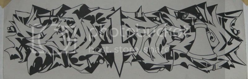
i like the graffiti style handwriting. i swear i posted some of this stuff around here..couldn't find where though after going back through the pages in the lounge.
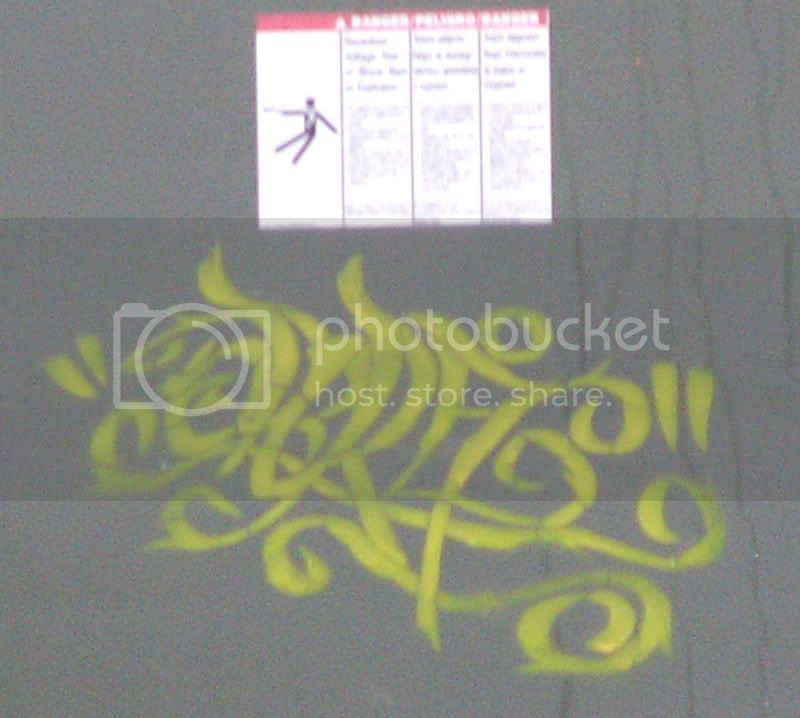
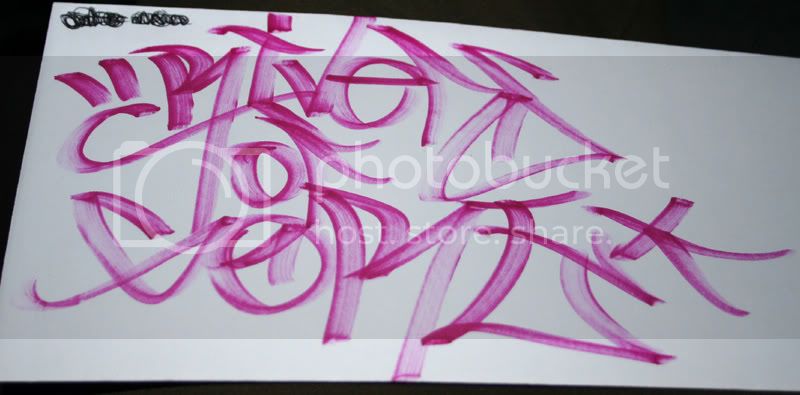
a couple handstlyes..well the first is a stencil i added to after doing a simple tag.
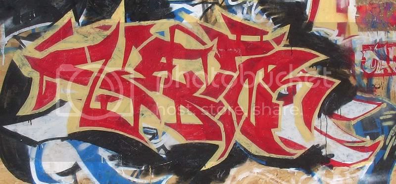
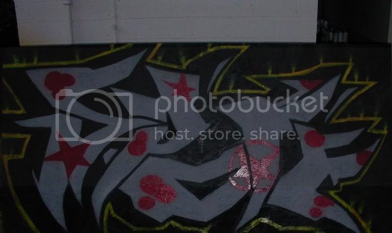
a couple pieces..paper then paint.
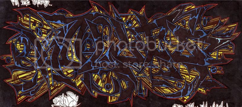
for someones tattoo
for a friend
have you tried making the sauce labels like the rub labels in that they have a white space below the black and red lines? you could also put a circle there as well and put a little short phrase in there.
the placement of the text does seem a bit random in contrast to your very structured template. also, there are a couple with chipotle written in a different font. have you tried writing that out in the graffiti style lettering? i think it might make it a little more uniform. seems like the letters have different thicknesses on different labels. maybe it would be better for consistency to have them all the same?
the only other thing i could think of is for the first four, have you tried putting both words in a straight line? instead of having them apart in different spots?
edit..yea, i didn't even think about maybe having an illustration for the q sauce. would require a small drawing, or scaling back the q sauce logo. with the drips, it almost acts as an illustration of it's own on the other hand.
i like the graffiti style handwriting. i swear i posted some of this stuff around here..couldn't find where though after going back through the pages in the lounge.
a couple handstlyes..well the first is a stencil i added to after doing a simple tag.
a couple pieces..paper then paint.
for someones tattoo
for a friend