labels Nope, not another label critique thread!

This time, I want you guys to glance over my new website.....
 
Notes before hand: The design aspect hasn't really bean yet....Background / color theme and all that stuff...Still going over that with my designer.....
 
Thinking more content wise, and stuff....What else should be included? More pages? less pages? condense pages?
 
I have bookmarked and have gone through 20-30 different hot sauce websites that I took bits and pieces and ideas from.
 
One thing I am not thrilled about is my store-front.....Right now, it lists each product via text....I am going ot need my designer to fix the code, so i can have a single picture of each sauce, that when people click on it, will them lead them to an option where they can buy 1,2, or 3 packs....etc...
 
I think i need to beef up the about us page....bio is in the works....
 
anything obvious though??
 
www.geminicrow.com
 
gratzi!
 
Disclaimer- I've rewined twice at least....
 
 
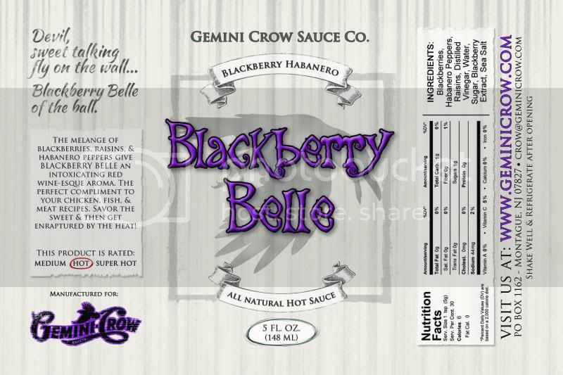
Maybe it's because I've been working on bar codes lately, but the original label is looking like a phantom Bar Code background. 


But now I'm all against...."presents".............under the Gemini Crow tag line.....


"PRESENTS" is an introduction, a first offering, an out-of-the-box.....  "presents" is not a word that should be on an established product.  2 years from now when you are still using these labels, are you still going to be "presenting " BLACKBERRY BELLE " to consumers?
 
 
The bar code label doesn't have "presents" but the newer rendition does.  I love the shadow of the crow in all these renditions.
 
salsalady said:
Disclaimer- I've rewined twice at least....
 
 
Maybe it's because I've been working on bar codes lately, but the original label is looking like a phantom Bar Code background. 


But now I'm all against...."presents".............under the Gemini Crow tag line.....


"PRESENTS" is an introduction, a first offering, an out-of-the-box.....  "presents" is not a word that should be on an established product.  2 years from now when you are still using these labels, are you still going to be "presenting " BLACKBERRY BELLE " to consumers?
 
 
The bar code label doesn't have "presents" but the newer rendition does.  I love the shadow of the crow in all these renditions.
 
'Presents...' is gone.... the whole idea was a poor white man's take of how Spike Lee puts, 'A Spike Lee Joint', before all the titles of his movies.....never did look right in the presentation and execution...I think GCSC looks better standing on it's own....
 
Not sure I follow on the phantom background of the barcode? All the newest versions of the label have them.....I even used the BC reader on my phone to test it on a print out and it worked fine....
 
I'm pretty happy with the current rendition....I think i took the qualities I liked abut the current label, improved the romance text, adding the bar code which adds credibility and opens up the door for 'proper' retail distribution, fixed the aesthetic look of the nutritional panel as it is now fluid and people don't have to flip the bottle to read it.....I'm happy and think i accomplished what i wanted. i dont think fans of the current label will even notice the changes uless they put two bottles against eachother, which is a good thing..........i think....lol
 
Lucky Dog Hot Sauce said:
I think she is referring to the thin gray stripes in the background of the old label - and now that she's pointed that out it's all I can see.

Glad you lost "presents" - that was bugging me too.
Scott understands re-wine-ese  (rhymes with Chinese) :lol: 
 
Reading my post this morning....it would be confusing with the the label with the actual bar code -v- the one with the stripes that I called the "bar code" label. 
 
I still like the original better, but in the new version, can you slightly distress the new black bold letters, like your logo, but with vertical distress so it goes with the background? I think I would like it then.

Or maybe horizontal. But anyway, yeah.
 
Can you post a version using the same font as what's used in the romance panel and address for the GCSC and BBHabHotSauce on the center panel?  I feel like the blocky font used doesn't fit the retro feel of the rest of the label.
 
ps- are you doing these changes yourself or paying someone else for each edit?  just wondering~

edit- I just went to your website and looked at the original labels that have the other font cuz I couldn't remember for sure what they had for fonts.  Definitley like that font better for the Company title and Sauce Name....

edit-  I see some of how this discussion progressed now after comparing the original to the new.  The banners Boss was talking about, I liked that look too, but I like the new look also.  "All Natural" worked on the old label because it was in the lower banner, almost like a Sig Line and the Name of the sauce was in the top banner.  It doesn't work on the newer version when included in the sauce name.  The circle around the weights worked on the original because the inside of the circle was a lighter color.  That lighter color didn't get on the newer label, so that's why I called it out.  Just some observations- 
 
salsalady said:
Can you post a version using the same font as what's used in the romance panel and address for the GCSC and BBHabHotSauce on the center panel?  I feel like the blocky font used doesn't fit the retro feel of the rest of the label.
 
ps- are you doing these changes yourself or paying someone else for each edit?  just wondering~

edit- I just went to your website and looked at the original labels that have the other font cuz I couldn't remember for sure what they had for fonts.  Definitley like that font better for the Company title and Sauce Name....

edit-  I see some of how this discussion progressed now after comparing the original to the new.  The banners Boss was talking about, I liked that look too, but I like the new look also.  "All Natural" worked on the old label because it was in the lower banner, almost like a Sig Line and the Name of the sauce was in the top banner.  It doesn't work on the newer version when included in the sauce name.  The circle around the weights worked on the original because the inside of the circle was a lighter color.  That lighter color didn't get on the newer label, so that's why I called it out.  Just some observations- 
 
I have a designer who does this for me.. :) a very patient forgiving one at that....
 
1. gonna ask her to change up the font in the center panel of the GCSC and sauce description stuff..Part of me likes the straight forward boldness of it as to the casual passer-by, i think it draws the eye and gives a easy description without having to stop and invest in checking out the rest of the label, but at the same time, it does look a little out of place considering the look of the rest....
To summarize where I'm at...
 
This is the current:

 
This is where I was a few days ago:

 
And this is where I'm at right now:


Asking my girl to:
1. Alter the font used in the center panel.
2. Lighten the distressed vertical lines in the background.
3. slightly darken the crow image...
4. I think im pretty content with the rest....
 
If you're set on the lines, pull the Crow in front of the lines, it looks like the lines are in front of the crow?
and check the sub-ingredients...
 
definitely like the new crow image!
 
 
(I still like the forest scene, where blackberries grow, and crows live....where a scary person with a scythe would be....;) )
 
salsalady said:
If you're set on the lines, pull the Crow in front of the lines, it looks like the lines are in front of the crow?
and check the sub-ingredients...
 
definitely like the new crow image!
 
 
(I still like the forest scene, where blackberries grow, and crows live....where a scary person with a scythe would be.... ;) )
I'm having the lines lightened and the crow darkened slightly, which should achieve that effect.
Working on the ingredients....The raisins seem to be a go, and finding out about the extract recipe. :)
almost done.
 
I just realized your logo has a hyphen Gemini-Crow and your name at the top doesn't. Try to keep that consistent.

And I like Sauce Co. (like in your logo too I believe) better than Sauce Company. You say company, but print Co. Company the word looks very corporate/office/cubicle.
 
The Hot Pepper said:
I just realized your logo has a hyphen Gemini-Crow and your name at the top doesn't. Try to keep that consistent.

And I like Sauce Co. (like in your logo too I believe) better than Sauce Company. You say company, but print Co. Company the word looks very corporate/office/cubicle.
 
Too late to f*ck with the logo. First time I ever really noticed that, although I would gather that my artist could say that the hyphen is the start of the 'R' in Crow, although the color outline wouldn't express that. Definitely don't want to use the hyhen in any normal text when mentioning the company.
 
Will have her to do it as 'Co.' too in the next set of edits....Agreed. But not a deal breaker in my eyes.
 
Oh it might be the flourish of the top of the C curling down but you can't tell because of the bird and other letters, so yeah, it was always a hyphen to me. Or maybe it IS a hyphen.

It's minor but in the future you may want to black that out. :)

Cool man!
 
The Hot Pepper said:
Oh it might be the flourish of the top of the C curling down but you can't tell because of the bird and other letters, so yeah, it was always a hyphen to me. Or maybe it IS a hyphen.


Maybe this will be one of the mysteries that is never answered....and in 40 years, when my will is read, I finally give the answer.......yeah..that's how it is all gonna play out.......be patient everyone! LOL
 
:lol:  
 
 
heck, 3 weeks ago when I was approving the final proof for the latest batch of salsa labels, I noticed there was a period in the address instead of a comma (PO Box 116. Carlton, WA 98814) .  I thought about changing it but then said "If I haven't noticed it in 18 years of labels, and noone's said anything...Leave It!~  :lol:
 
Back
Top