artwork Label feedback

HellfireFarm

Business Member
Be gentle, I'm a programmer, not a graphic artist 😰

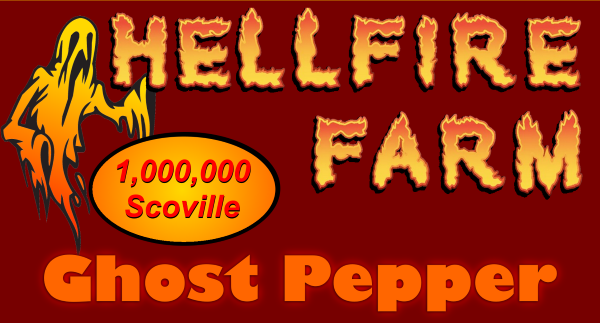
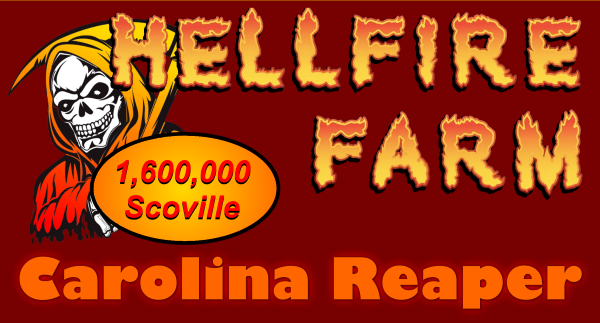
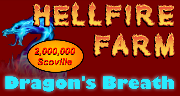
These are the front of a fold-over label for bags of dried peppers. I have verified that they are acceptable on the legal side (dried peppers are considered farm product so no specific requirements)

ghost-label.png


reaper-label.png


dragons-breath-label.png


I followed some examples on the market with the "scoville" bit but I'm having second thoughts about it.
 
Looks good for a foldover. If it gets the hole stamped in it you might want to make sure it is just the little round hole not the long one. Or else move the logo down a hair.

Perhaps write Scoville Heat Units. Keep the number the same size font just reduce the letters. What this does is give people the scoville info for those in the know, and for those not in the know, lets them know it is a heat unit so they can pick accordingly.

I like how the blue sets that one apart. But maybe don't use blue in the font, make it consistent like the others. But this is a good idea, using the color in the graphic to set them apart. The other two blend. For example, the ghost could be white. That label would really pop! And the grim reaper, a silver to black gradient from top to bottom, so the sickle is silver.

This way your product is consistent, but each one pops with what is different.

My last suggestion is, I would like to see a devil's pitchfork in your logo. As part of the fire in the font. Why? Pitchforks are used on farms (as in your name) and in Hell (as in your name). I was looking at your logo and thinning the M could be the bottom of the pitchfork and the handle could be the I. However this would mean changing the shape of the M and moving the words around so I don't think it works here. But it was just a thought for the future.

devils pitchfork.jpg
 
PS. If you like the grim reaper that color because it is also your main logo, keep it. I do like your logo! But try flipping the gradient so the redder is at the top just so the Hellfire letters pop off it more.
 
Yeah imagine 5 products on the wall. They all blend together (well, the first two do). That's why the blue is a good idea on #3.
 
I like the pitchfork idea too, just not sure how to incorporate it. Good thing we have tools like photoshop and paint.net nowdays to do that sort of stuff!

On a similar note, I was thinking of adding a "heat level" indicator to my products, in general. Maybe not the dried peppers but the spice blends. Instead of the typical line, colored pepper, etc. I was thinking of using a series of nine concentric circles (bet you can't guess why!) so Reaper powder would be ninth circle. Something like an anaheim powder would be first circle. And habanada powder would be no circle.

I know it's not technically accurate but I think those who know will get it.
 
Honestly, no one is going to correlate that with the 9 Circles of Hell and it not worth the effort, I'd so something intuitive and legible and not worry about messaging/hidden messaging there.
 
Welcome Hellfire Farm!

I like the labels. I think you might have tweaked them based on Boss's comments for the gradients?

IMHO, i think it works for a brand to have a consistent logo, and change images and colors for the individual items. Which is what you are doing.

You mentioned it is a farm product and is exempt from normal labeling requirements like weight, etc. Depending on where you are selling, consider adding weight somehow. Either a hand written or 'average ounces'.

I agree with Boss about the 9 rings of hell. I wouldnt get it. Just KISS. Thermometer or gradient color scale.

Regarding SHU... when you put a SHU listing on the label, customers will expect the peppers to be that shu, which doesnt happen. The listed shu of peppers are for the registered max shu of that specific pepper, not necessarily the shu of the peppers you are selling. So many factors contribute to the peppers' shu, you cannot guarantee what you are selling is actually that shu.

I strongly discourage putting shu claims on anything being sold unless it can be proven. Maybe put something like 'scorpion peppers average 1.8mil shu'.

Sauce makers also make this mistake. 10% of their ingredients are 1.5 mil reaper peppers so they claim their sauce is 1.5 mil shu. Doesn't work that way.

10% of the total sauce is 1,500,000 shu peppers, which means if 90% of the ingredients in the sauce are about zero shu...(vinegar fruits vegetables...) the finished sauce actually has a shu of 150,000.

Sorry for a bit of a tangent, hope this is helpful and i am looking forward to seeing your labels as they evolve.

If this is the front label of a fold-over, what is on the back?

Good luck and Have Fun!
Salsalady
 
Last edited:
PS. If you like the grim reaper that color because it is also your main logo, keep it. I do like your logo! But try flipping the gradient so the redder is at the top just so the Hellfire letters pop off it more.
Ok, i saw this comment, thought it was previously different. Actual fires are yellow at the heart and redder at the tips. ???
 
I can see how that could be misunderstood. Oops. I don't mean changing the letters, they are great. Change the reaper so he pops off the letters better because the yellows are blending (the H becomes hidden). Original suggestion is a silver to black gradient from the top, the quoted suggestion is keep the colors but flip the gradient so reddish at top. Then yellow letters would pop off it.
 
Again on the shu's-
Ghost peppers average about 600,000 to 800,000 shu. The record, in the early 2000's, was 1.2mil shu. A couple other peppers got Guinness records as One Offs. Since then, Guinness has revised their testing requirements.

Make sure what you are promoting is legit and you can back up your claims.
Best, SL
 
I can see how that could be misunderstood. Oops. I don't mean changing the letters, they are great. Change the reaper so he pops off the letters better because the yellows are blending (the H becomes hidden). Original suggestion is a silver to black gradient from the top, the quoted suggestion is keep the colors but flip the gradient so reddish at top. Then yellow letters would pop off it.
Ah, Yea, I see that.

The ghost is separated enough that it stands out. Could do with a slight color change, white or silver.

The reaper of the same color as the logo blends in. Needs a color to set it off.

The blue dragon has nice separation of the logo and item.
 
After a couple looks, i like the reaper and dragon labels better than the ghost. I like how the reaper and dragon are behind the letters. Maybe revisit the ghost image, make it larger as the other ones, white or silver highlights, slightly behind the upper left letters...

This is a theme you can carry thru to tons of product.

And it looks like the logo.HELLFIRE FARM is not the same width in each label. May not be an issue? And knowing these are work ups...


Ps...i am an electrician and sauce maker, not a grapfic designer. Take everything with a huge grain of salt.
:cool: SL
 
Last edited:
Back
Top