You are using an out of date browser. It may not display this or other websites correctly.
You should upgrade or use an alternative browser.
You should upgrade or use an alternative browser.
Busy day...
- Thread starter DevilDuck
- Start date
Cool - Are you starting to see a light at the end of the tunnel?
(is it another train?)
Where are you at with your labels DD?
(is it another train?)
Where are you at with your labels DD?
They look pretty damn good to me - what else are you hoping to do to them?
I was a 'Graphic Reproductionist' back in the day when that was a trade & we scratched emulsion off the back of film to make changes.
I've played with PS a lot through the years, done a few ads & book covers etc...but not for many years now.
Whats your plan for them?
I was a 'Graphic Reproductionist' back in the day when that was a trade & we scratched emulsion off the back of film to make changes.
I've played with PS a lot through the years, done a few ads & book covers etc...but not for many years now.
Whats your plan for them?
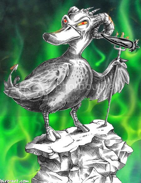
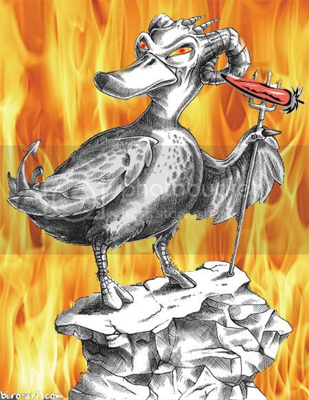
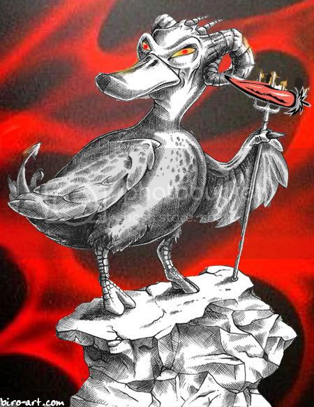
I'm having major issues with font styles, color, and placement. There's not a whole lot of room to work with. I've even tried moving the duck down a little and using a title bar at the top (brand name) and one at the bottom (sauce type), but then it starts to look cluttered.
You could put borders around -


Run the text over border & art to help match them together.


Run the text over border & art to help match them together.
Any idea what kind of font your after? Maybe some olde english to go with the nautical theme?
http://www.1001freefonts.com/old-english-fonts.htm
http://www.1001freefonts.com/old-english-fonts.htm
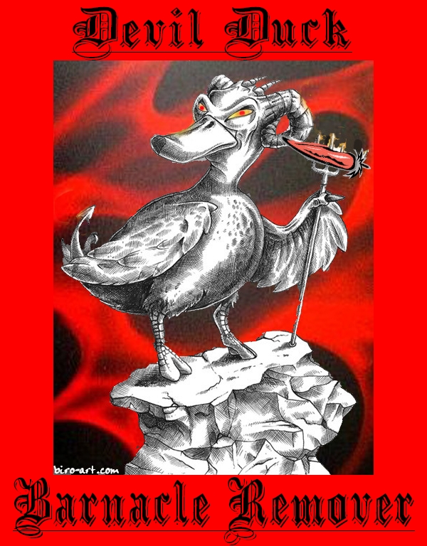
DevilDuck said:I got this font from your link called AngloSaxonCaps. I haven't tried it yet, but it looks really cool.
Do I detect a hint of norse collective unconsciousness?
A few ideas? {gibberish?}
1. - I thought you could also move the picture to a corner of the border and run your text along one edge & down one side - like a modern wine label.
2. - make the border like an old timber picture frame & put the text on brass plaques screwed into the frame.
chilliman64 said:BAN - have you been sampling distilled water tonight???
Theres that ESP of yours working fine again. What gave me away
that last post of yours. that and the fact that I'd had a number of thirst quenching beverages myself, we must have been on the same astral plane or some shit like that ")