You are using an out of date browser. It may not display this or other websites correctly.
You should upgrade or use an alternative browser.
You should upgrade or use an alternative browser.
labels Label Design Critique
- Thread starter DETurbine
- Start date
I like it - but then I'm partial to the sunburst background. 
Nice symmetry - little tough to read that color font on that background but I'm also on a smartphone right now.
Nice symmetry - little tough to read that color font on that background but I'm also on a smartphone right now.
but I'm also on a smartphone right now.
Well, your "Smart Phone" is dumb! Ha!
Actually looks great for a start, but LDHS is right, those vibrant colors with the backlight of a computer screen on a flat surface looks awesome. When they get put on paper, and in different light, will look different. The layout looks good, espescially for a hobby/gift sauce!
Print those bad boys!
salsalady
eXtreme Business
Check your spelling-
habAnero
scorPion
cilantro (unless culantro is an ingredient I'm not familiar with???)
Looks good for a hobby sauce label. If it were to be used for an actual sauce for sale, there would be several other things needed, but for friends and family, it looks good.
Sounds HOT also! Have Fun!
habAnero
scorPion
cilantro (unless culantro is an ingredient I'm not familiar with???)
Looks good for a hobby sauce label. If it were to be used for an actual sauce for sale, there would be several other things needed, but for friends and family, it looks good.
Sounds HOT also!
 Have Fun!
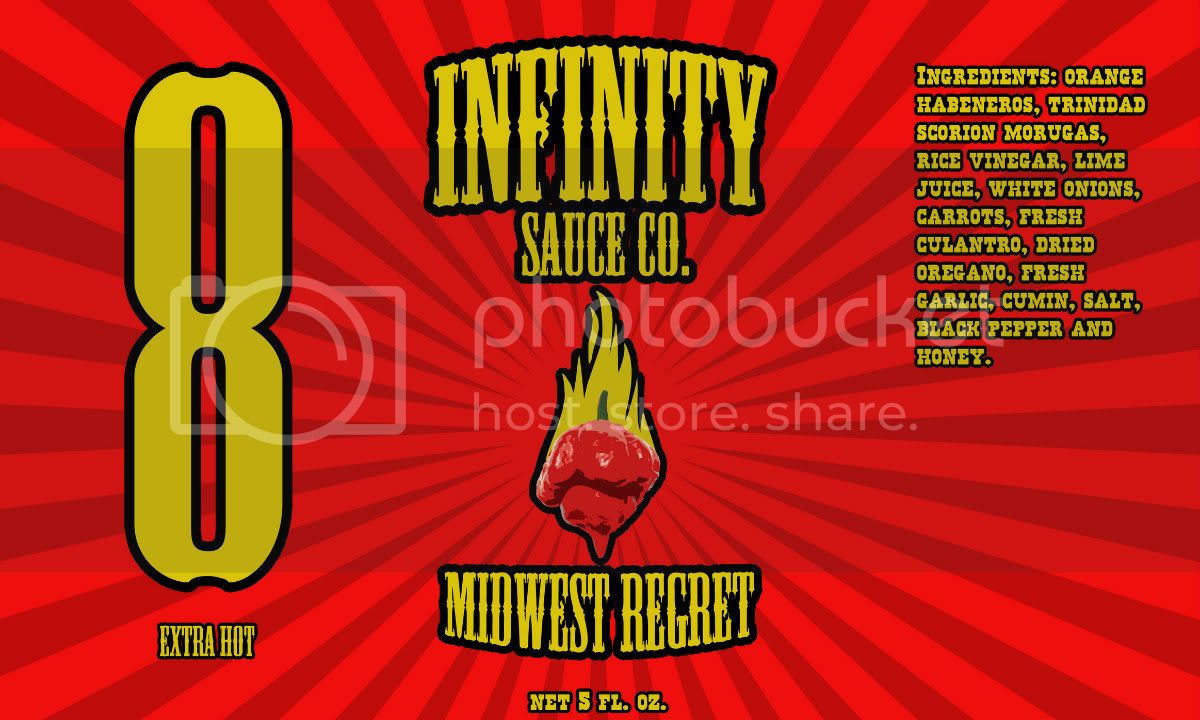
Hurts the eyes. "Stoke" feature is not really doing it. Pepper is lost in the red. 8 is so large looks like the name of the sauce.
Try a muted red. Reduce that stroke or remove it. Use a more legible font for the ingredients.
Try a muted red. Reduce that stroke or remove it. Use a more legible font for the ingredients.
Thanks for the input. all the spelling is now corrected. I didnt mention habanero because it was a legitimate error where as the p in "scorpion" must have just been me missing the key when I was typing it out.
The big and bold "8" was just an idea I had which I would make 10 different heat level sauces (1-10), but maybe its not as great as I thought.
The big and bold "8" was just an idea I had which I would make 10 different heat level sauces (1-10), but maybe its not as great as I thought.
I like the sunburst effect for sure. I also like the font choice. The pepper came out awesome but the 8 is a little large. Half the size would work better for a heat scale. Personally I like the brightness of the colors. If you are going to sell it there is other info that you will have to add but you have room. Did you design it?
troutbum, Thanks and yes I did create it.
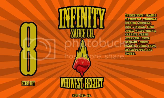
I ended up changing a few things on this after everyones suggestions. First I shrunk the 8 down so it wouldn't look too overpowering and also changed the background color to something that didn't blend in and overpower the moruga pepper design I had.

I ended up changing a few things on this after everyones suggestions. First I shrunk the 8 down so it wouldn't look too overpowering and also changed the background color to something that didn't blend in and overpower the moruga pepper design I had.

Hmmmm...1st a red sunburst, now orange sunburst. Your labels look really familiar, I just can't quite put my finger on where I've seen that style done before.


