artwork Logo Feedback

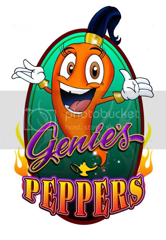
Just wanted to get some opinions on this logo. :) Nothing is set in stone and It's just something that is being played with so please rip it apart!! 
 
My sauce is being looked over as we speak (I have two I'm ok with the rest I"m trying to develop) ! I hope to get to first stages of production soon. I'm going to use this image for samples right now. :) 


I dig the concept.
 
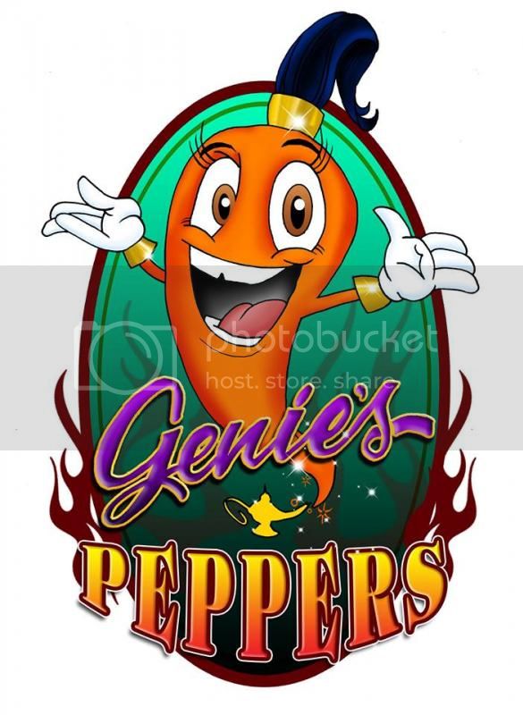
 What stands out to me is that there is a clear distinction between two parts. It looks like, with the exception of the 'peppers" at the bottom, its hand drawn.  The hand drawn pepper genie has some wonky line work and could use a redraw. The shapes of the eyes don't match up and the crack in the top teeth seems arbitrary. The line work  in Genies really doesn't match up with the line work in peppers.
 
Sorry - I've been a full time artist for the past 16yrs and theses things  usually stand out to me. 
 
The cursive line-work doesn't really work either in "Genie's" - the "3D" text effect is ineffective with the lines not matching up (e.g. where the tail end of the s wraps around "behind" the s.)
 
Agree with others that the flame should be red. 
 
If this is a concept drawing to bring to a professional artist for a rendering, it's fine - a pro could turn this into a very solid logo. 
 
Though it's not very original since there's Zaltan's (I think that was the name) and a couple other hot sauces with "genie coming out of a lamp" themes. 
 
I like it the only 2 critiques i have are the lines are not not sharp and crisp.....also not all of the colors blend well together (there are some colors that really pop well when combined with specific colors) and judy is right with the flames
 
Thanks for the critique everyone! I'm having the flames changed to see what the difference will be. I also mentioned the lines to him so we'll get that taken care of too. I'll post the redo as soon as I'm satisfied with it :) 
 
Lucky - Genie is my name lol. So it might not be original but I'm keeping it as my logo hehe.
 
kentisman - I have a Reaper, a Primo, and Hab so far. I have a 7 pot White that I'm working on and I have a Korean sauce that is done but I'm not sure if I'm 100% on it or not. The reaper, primo, hab, and Korean are all getting process approval right now. :) 
 
It's a little Disney for my taste... and remember that imagery is cool but you want your name to pop. I feel with the choices made (font color, style, size), when this is on a hot sauce bottle, your brand won't pop! Genie's will be a little lost, and Peppers will look cluttered... being a serif font with effects that small. Overall, the name will be lost. Try it out and you may see what I mean. Always physically test your labels on bottles.

I'm saying small because I assume this won't be on the entire front of the label. There is the sauce name, etc., and this would be a an oval on about 1/2 of the front. Words are going to get lost.

Also consider limiting the colors.
 
what color is the sauce behind it?  Is it on a glass bottle or white package?  Is the logo stroked around the entire thing?

Edit 2: For some reason I didn't realize it said Genie's, I thought it was Genius until I took a second look and associated the oil lamp with the genie.
 
Thanks again everyone for the feedback! I'm having another label designed including this one but this is a bit of an update on the colors etc. I'm also playing with taking the Genie's Peppers off of the image and putting it around the image somehow. What may end up happening is a completely different logo. 
 
 
It may be that I am just used to seeing things that others don't, because I'm in marketing, but I think that you should take a big step back from your screen and say what vegetable it looks like.
 
Seeing that noone else said that it looks like a carrot could mean I'm either completely blind or people are being nice. I am willing to bet the latter, because this is a really nice group of people.
 
In a professional opinion, I think that making her red would be more wise, because right now, even knowing I'm on a hot sauce forum, I thought it was a carrot.
 
Aside from that, it looks nice. I personally like the Disneyesque feel. It makes people a little "unexpecting" especially if the sauce is really hot.
 
Back
Top