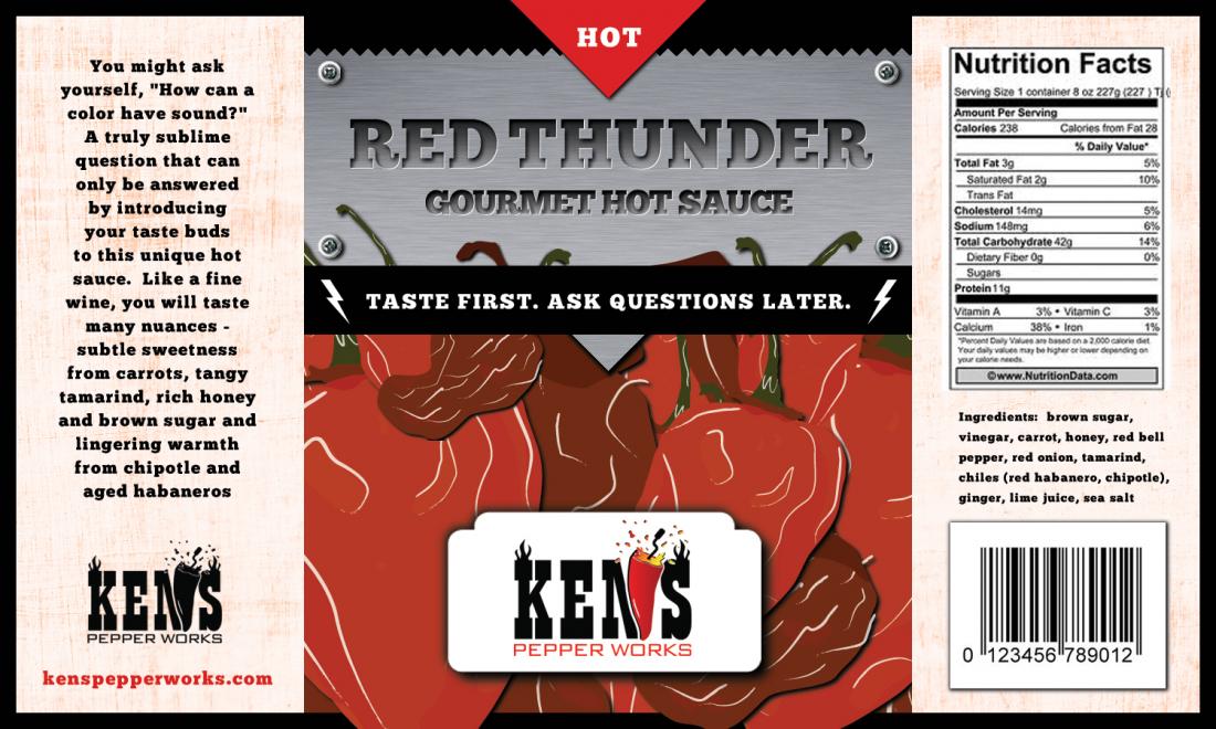
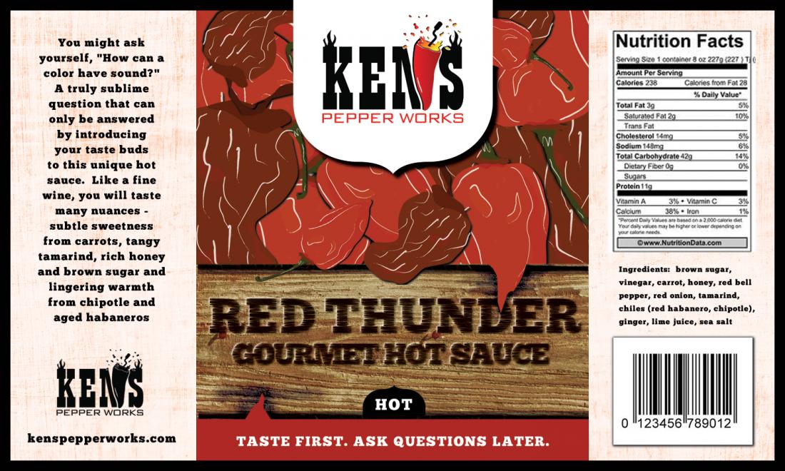
This is not something I would pick up off the shelf. It looks cluttered and generic, the passion of what you are trying to do with sauce is not being conveyed. Go simple an bold. Remove the brand confusion. Which is the brand? Tabasco is a brand. McIlhenny is the company. Is Ken's or Red Thunder the brand?
"Hot" is for salsa, Hot Hot sauce is redundant. Use a scale or other unique wording. Red Thunder... three lightning bolts, four lightning bolts, etc. Tie it into your theme.
Colors are muted. Font is not the best on the lettering, I'd go sans-serif and narrower.
Start the story on the side with "Like a fine wine..." and cut the top out. Not needed and not an attention grabber... sound... color... no.
Shield shapes look weird. On the second one the shadow cuts off half way up the right side.
Gourmet Hot Sauce sounds pretentious. Hot Sauce is enough. IMO. Your call. If Red Thunder is your "brand" it could work.
I actually like your Ken's logo all black better. It pops, and you can really tell that pepper is an N. Color, it's a little busy and draws your eye away from what is important. The sauce.
The wood is better than the saw blade or whatever that is. But does not say anything special about your sauce. Red Thunder. A storm brewing, a dark red and black skyline, lightning bolt heat scale on the bottle. Bold and simple, reds, whites, blacks, and yellows. Make it pop.


