labels Need Help Critiquing Label

I just received the first draft of the Red Thunder label and would love some community input.  I have thoughts of my own but will hold off to see if others independently have the same.  Here it is.  Thanks in advance.
 
Ken
 
KPW_Label_Draft_1.jpg

 
Oops.  I didn't realize there were more coming.
 
KPW_Label_Draft_2.jpg


salsalady said:
Maybe I need another cup of coffee before attempting to understand this one, but you lost me here....
:confused:


What's wrong with Red Thunder Cole Slaw Dressing?  There's lots of companies that make fruit/habanero hot sauces, what makes yours stand out is your Brand Name.... Red Thunder Mango Habanero Hot Sauce.
 
Seems like the feeling is most people like Red Thunder as a brand name.  If you do want to go with Ken's Pepper Works (which is fine, the name will work) drop the Red Thunder and go with more generic product descriptions. 
 
Ken's Pepper Works Mango/Hab Hot Sauce
Ken's pepper Works Creamy Coleslaw Dressing
 
I'm not sure we are talking about the same thing.  When I say Red Thunder is a brand, I'm talking about branding the flavor profile across different products - hot sauce, BBQ sauce, wing sauce, etc.  Franks Red-Hot is a brand but they wouldn't create a cole slaw dressing that tasted like ranch and call it Franks Red-hot cole slaw dressing.  People would expect it to taste like Franks Red-Hot. 
 
Hot sauces often have names.  Red Thunder is just a name to rebrand accross products that have a similar flavor profile, which should hopefully reinforce the Red Thunder "name", thus provide branding.  I should be able to have both generic and specific product names.  That's my conundrum.  I guess I could use the shortened company name like THP and a few others suggested and it could be Ken's Red Thunder Hot Sauce or Kens Ghost Pepper Cole Slaw Dressing.  In both cases the full company name is on the back label and the Ken's part of the logo is the branding in front.
 
Ken
 
PepperDaddy said:
Franks Red-Hot is a brand but they wouldn't create a cole slaw dressing that tasted like ranch and call it Franks Red-hot cole slaw dressing.  People would expect it to taste like Franks Red-Hot. 
 
Ken
 
You have the foresight to name your brand NOW to be able to uni-brand all these products. Double branding is not the way, don't sub-divide something that does not even exist yet.
 
Frank's is owned by Reckitt Benckise, they also own French's, and French's could surely release that dressing. But you wouldn't see Reckitt Benckise French's Cole Slaw Dressing on the bottle.
 
Their brands are separate. Not all jumbled. Name your brand, the best one for all these products. Or have another brand and do the same amount of work getting that brand out there. Not all on one bottle.
 
I'm not planning on double branding now.  I'm just thinking down the road w/ what I want to do w/ certain sauces names.  Right now I have one brand - Ken's.  If Red Thunder (or any of my sauces) do good down the road then I'll create products based on those flavor profiles and worry about it then.  With Ken's as the brand it will work now and down the road,
 
Hopefully there will be label updates to post soon.  Thanks everyone.
 
Ken
 
Thanks for explaining your concept, Ken.  If we had a poll going, I'd vote for using the "KEN'S" logo on all the products and leave off "pepper works" from the front of the label.  "Ken's Pepper Works" can be your business name and that name/logo can be used on marketing things like your website banner, business cards, letterheads.  
 
Using just "KEN'S" will allow you to make all sorts of products including product lines like the Red Thunder line of products you described.
 
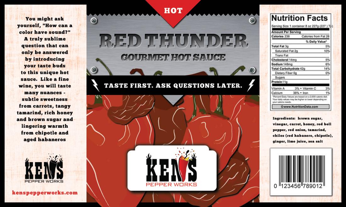
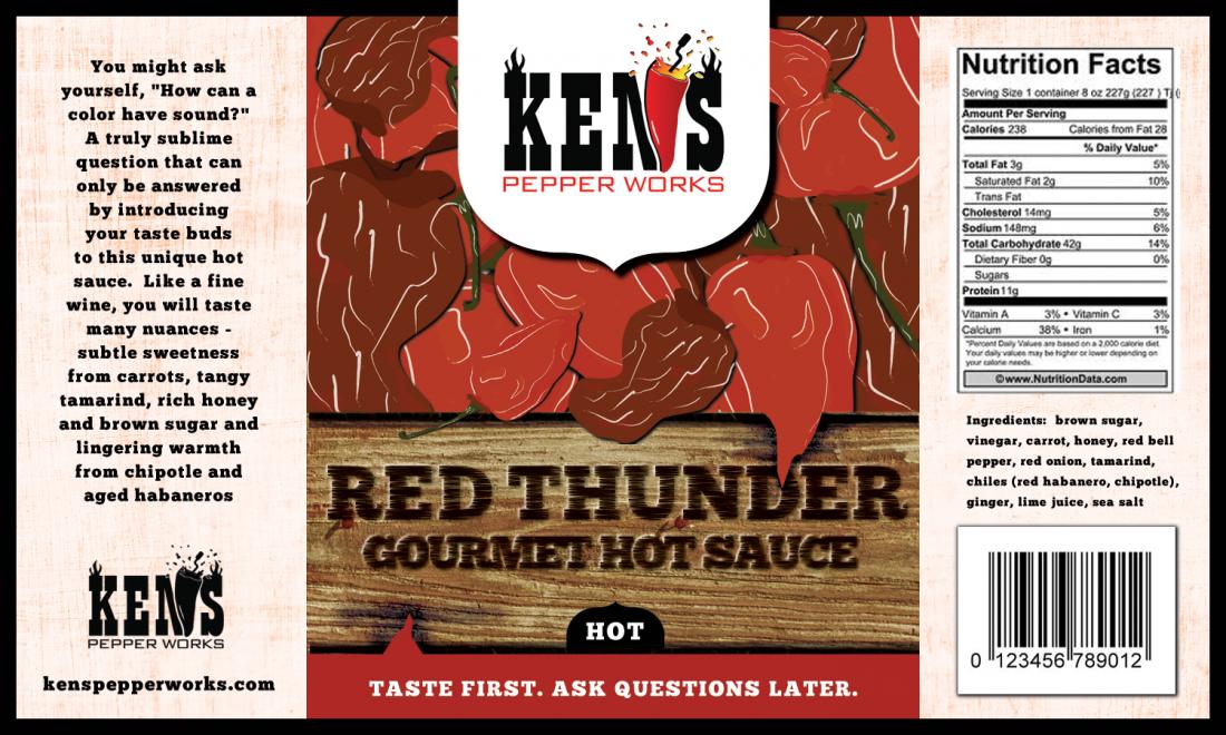
Next iteration of the label is here.  I included the second label because it has a few different elements but is obviously not complete.  Ignore the typo in the second label.  Please let me know your thoughts.  My initial thoughts are:
  • Square out the KEN'S white space and maybe replace w/ light gray to match the left panel.
  • Not big on the glow around the tag line. Either too much glow or frame it w/ a square and a off-white background 
  • I like the lightning bolts in the text on the 2nd label
Also, I think we are required to put the following on the label:
Manufactured for:
Ken's Pepper Works, LLC
755 Summer Top Circle
Fenton, MO 63026
 
I look forward to everyone's input.  Thanks.
 
Ken
 
Label_Draft_26Oct_2.jpg

 
Label_Draft_26Oct.jpg
 
Much Better!  I'm liking it~
 
Next question- "What is it?"  What kind of a sauce is it?  Yes, there's a description on the side panel but something needs to be on the front panel to let consumers know what it is. 
 
I'd move the "Taste First" line down into the black of the mountains where you will also likely have your Net Weight info and then add "Hot Sauce" under Red Thunder.
 
The 2nd design could work with the same suggestions as above.  On my screen, the lightening bolts in the red look like candy cane stripes.  If you go with that design, make sure it'll work for a lot of different screens and resolutions including small screens of phones etc. 
 
Yes, I forgot about the net weight thing.  Wherever the tag line is, it needs to be in the same place for every label.  Customers shouldn't have to look in different places to see it.  Having it in the same place on every label will add the branding effect.  Maybe I should work the other labels before I settle on a final placement.
 
Ken
 
Looking better!
 
Okay here we goooooooo lol.
 
1) I don't like periods in taglines. Change the first period to a comma, and remove the last one. You'll rarely see two periods in a tagline, if anything, a comma, or exclamation point.
 
I'd do one of these:
 
Taste First... Ask Questions Later
Taste First, Ask Questions Later
Taste First—Ask Questions Later
 
2) That font in the tagline is not good. It looks jagged like an old computer font. I see it is the same font as the name but it does not look good that small, it blocks up. Hmm, a handwritten script would look cool, like, hey, the maker of this sauce is telling me this.
 
3) I also saw candy canes in #2. #1 is way better, but needs some help.
 
4) Those do not look like any mountains I have seen. It kinda looks like your artist is good with fronts and effects but not drawing.
 
5) The branding is more clear now, BUT now we don't know this is a hot sauce.
 
Ken's
RED THUNDER (brand)
Pepper Sauce (type of product)
 
I say Pepper Sauce instead of Hot Sauce because you are Pepper Works, and also it kinda rhymes and flows.
 
6) Too much white glow (stroke in PS). Tone it down and tie it into the lightning, in other words, make it the same color and the whole thing will be electrified. This will take some playing with, you may need to make the yellow more white, but some color in between, and tie it all in, then whole label is electrified. Would make that thing POP.
 
7) More of a brewing storm. Black is good but mix in some charcoal and some swirling skies, but keep it dark like that. Done right, you don't even need those mountains.
 
Overall you are going in the right direction here.
 
The Hot Pepper said:
Looking better!
 
Okay here we goooooooo lol.
 
1) I don't like periods in taglines. Change the first period to a comma, and remove the last one. You'll rarely see two periods in a tagline, if anything, a comma, or exclamation point.
 
I'd do one of these:
 
Taste First... Ask Questions Later
Taste First, Ask Questions Later
Taste First—Ask Questions Later
 
2) That font in the tagline is not good. It looks jagged like an old computer font. I see it is the same font as the name but it does not look good that small, it blocks up. Hmm, a handwritten script would look cool, like, hey, the maker of this sauce is telling me this.
 
3) I also saw candy canes in #2. #1 is way better, but needs some help.
 
4) Those do not look like any mountains I have seen. It kinda looks like your artist is good with fronts and effects but not drawing.
 
5) The branding is more clear now, BUT now we don't know this is a hot sauce.
 
Ken's
RED THUNDER (brand)
Pepper Sauce (type of product)
 
I say Pepper Sauce instead of Hot Sauce because you are Pepper Works, and also it kinda rhymes and flows.
 
6) Too much white glow (stroke in PS). Tone it down and tie it into the lightning, in other words, make it the same color and the whole thing will be electrified. This will take some playing with, you may need to make the yellow more white, but some color in between, and tie it all in, then whole label is electrified. Would make that thing POP.
 
7) More of a brewing storm. Black is good but mix in some charcoal and some swirling skies, but keep it dark like that. Done right, you don't even need those mountains.
 
Overall you are going in the right direction here.
 
Great ideas.  I thought the lightning needed a little white.  Lightning is not deep yellow. I really like the idea on dark grays for swirling clouds.  That would help fill in the "negative space" as PepperDaddler put it as well as add some depth.  
 
Regarding the brand/product, it looks like this:
Company: Ken's Pepper Works
Brand: Ken's
Product: Red Thunder
Product Type: Hot/Pepper Sauce
 
Thanks.
 
Ken
 
Oh, well if Red Thunder is the product name (I thought you said this was a whole line of products like Red Thunder BBQ sauce, rub, etc.) you may as well bring Pepper Works back into your brand.
 
Can you explain? I mean are you going to have White Lightning, Black Rain, etc? Or are you going to have Red Thunder as the brand, so Red Thunder Hot Sauce, Red Thunder XXHot Sauce, Red Thunder Salsa, Red Thunder Booming Salsa, Red Thunder Acid Rain Rub? I'm confused again. Or would you just have Acid Rain rub, and that is a product name???????????????????
 
LOL
 
THP, I have 4 products right now: Red Thunder, Rio Grande Mud, Mustard Bomb and Island Sunshine.  They are each very different.  One day, if one of those products does well I plan to rebrand the flavor profile with other products, like Red Thunder BBQ sauce, Red Thunder Wing Sauce, etc.  Doing that now is getting way ahead of myself.  Right now I just need to be able to successfully sell the products I have.  I don't plan to make a brand out of every product I sell.  See posts above.
 
I read all the posts I just got confused by you saying branding vs. flavor profile.
 
If you have those 4 products, I'd say you can use the full name Ken's Pepper Works. Originally it sounded like Red Thunder was the brand. If it's a flavor, like Cool Ranch, I get it, you want the same "flavor" as a rub. Not like 5 Red Thunder sauces and 5 rubs.
 
I'd say if that is the plan, run with Ken's Pepper Works... then we KNOW this is your brand, and Red Thunder is a sauce name. However the shortened Ken's looks good too. Like we talked about before, Blair's and Blair's Sauces & Snacks. Same thing. Judgement call on that one, just wanted you to know the KPW makes more sense now. It was just hard to grasp exactly what you were saying in the beginning.
 
Deathtosnails said:
Red Thunder to me sounds like a gastro virus you'd pick up in Bangladesh.
 
Or the after effects of such said virus :D
 
Ken's Pepper Works works well Ken
 
Ouch.  I hope nobody else thinks that or sales will be pretty darn low!
 
"Beware... the instant you consume this fiery red concoction of peppers and select spices, your belly will rumble and toss about like a ship amidst the wickedest of storms... the storm known as Red Thunder!"
 
:lol:
 
yyyyyyyyyyyyyyyyyeahhh probably not. 
 
Back
Top