labels Need Help Critiquing Label

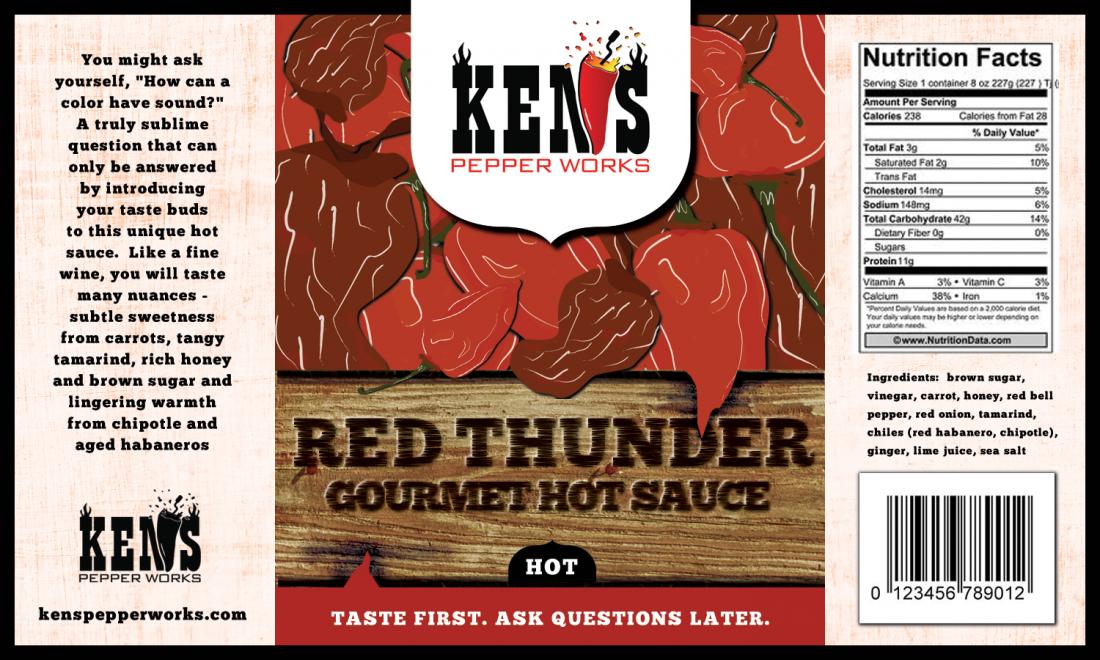
I just received the first draft of the Red Thunder label and would love some community input.  I have thoughts of my own but will hold off to see if others independently have the same.  Here it is.  Thanks in advance.
 
Ken
 
KPW_Label_Draft_1.jpg

 
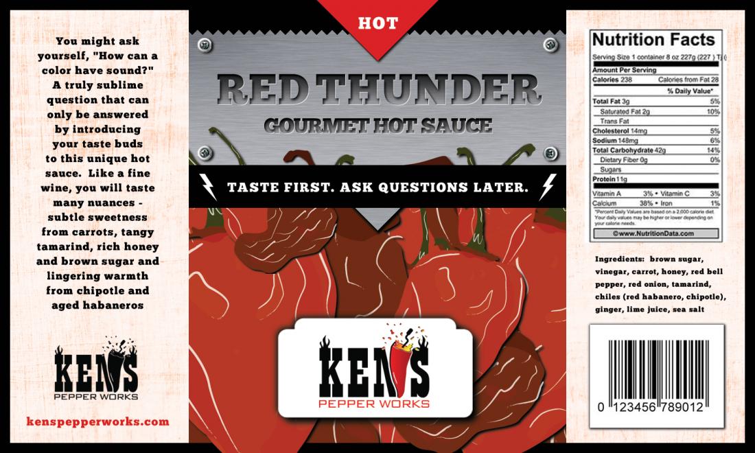
Oops.  I didn't realize there were more coming.
 
KPW_Label_Draft_2.jpg


You and Scott are the first to bring up the name.  So far everyone has loved the name and I do too.  I understand the concern, but I'm sticking w/ it. It's a thick brownish sauce w/ a little red and many who helped w/ consumer testing thought the name fit the sauce well.  Thanks for the input - I appreciate it.
 
Next up is Island Sunshine.  The perfect marriage between pineapples and scotch bonnet peppers.  Say "I Do" to Island Sunshine!
 
Ken 
 
Rio Grande Mud. ZZ Top fan, huh?
 
Sounds cool. Especially if it is jerk-paste like in color and consistency. I'd think it was a paste with Southwestern flavors. Something that comes in a jar. Someone might think it's a ZZ Top sauce though. Like if you said Appetite For Destruction... GNR., etc. It may be an homage but it may also look like it is novelty.
 
I don't like photo labels. First off they are usually too busy (as here the name gets lost) and I just don't like photos. Like going to a Chinese restaurant with the pictures of the food on the menu. I'd rater see a cool logo or icon. Cartoony or photo-realistic, but not an actual photo. But that is preference.
 
Good luck.
 
I never knew where I got the name from.  I just know I liked it and it seemed familiar.  Then one day I was driving to work and "Just Got Paid" popped up on the iPOD, along w/ the album name "Rio Grande Mud".  Then the lights went on.  It was all [SIZE=10.5pt]subconscious[/SIZE].
 
PepperDaddy said:
I never knew where I got the name from.  I just know I liked it and it seemed familiar.  Then one day I was driving to work and "Just Got Paid" popped up on the iPOD, along w/ the album name "Rio Grande Mud".  Then the lights went on.  It was all subconscious.
It's also an intellectual property that you don't have the rights to.

That's going to be a problem - especially since Bily Gibbons is a huge hot sauce fan and actually makes hot sauce himself (BFG Brand).

I strongly recommend avoiding IP encroachment at all costs.
 
Actually titles are copyright free, that's why you see so many song titles and album titles of the same name. It's the actual work that receives the copyright and not the title. However you can TM a title if you brand it. Like Star Wars, with merchandising, etc. However if it is not a brand (a mark you are trading with) you won't get the TM. I think RGM is free, but you should check.
 
The 3rd label is here – Island Sunshine.  If anyone has opinions I would love to hear them.  I think I like this one the most.  My main concern is the scotch bonnet should be yellow and it doesn’t look like a scotch bonnet.  But then yellow would blend in to the beach theme and not pop as much as the red.  Also, I feel like the tux should be black, but that may be too much black w/ the side panels. 
 
Finally, does the overall theme work?  The romance panel talks about the “marriage of scotch bonnets and pineapples” and say “I Do” to Island Sunshine, but that is not mentioned on the front.  Not sure if there is enough room or that I should mention it again.  I personally think the picture says enough and the consumer will “get it”.
 
Thanks everyone.
 
Ken
 
Label_IslandSunshine_Draft_1.jpg
 
Really, I always think of red and saw fields of them in the islands. :) Looking at my Walkerwoods jerk, the pepper in there appears red and not yellow. I dig the label but I'll let the experts weigh in.
 
I know the MoA I am growing are certainly yellow, guess today is a good day and I learned something new :) 
 
Constructive criticism:

The concept is good - "marriage of pineapple and scotch bonnet." That's about where the positive ends.

execution - it's really busy and at the same time muted. The sauce name doesn't pop at all, and the Ken's branding does which doesn't fit at all. That sharp square "Ken's" logo is stark white/red against the rest of the otherwise muted label and I find it incredibly distracting. Like it just got slapped on as an afterthought. It also totally draws my eye up to the top of the label and away from the main label image of this sauce.

Thematically it doesn't work at all for me - the name needs to tie into the theme. It doesn't. It ties into the island but until I read the romance panel I had no idea why you put a pineapple in a wedding dress or what the hell was going on here. Again - love the concept - marriage of pineapple and scotch bonnet is good. But concepts must extend to the product name too and here it doesn't tie in. You're expecting a consumer to see this on a shelf and make the connection between island sunshine and two pieces of produce getting married. I missed it 100% until I read that romance panel. The old saying about how if you have to explain it, it doesn't work applies here. As a consumer I'm not going to pick up your bottle and read the romance panel to figure out what's going on. I'm just going to grab a more appealing bottle that I do understand.

Other issues:
Is the vinegar white distilled? If so I do not think you can call it gluten free as it might contain gluten. Check with your state PA. I also think you need to list the type of vinegar (for allergen reasons) in your ingredients panel - we do in CA.

Your list of things to use it on doesn't tell me that's what it is. It's right below the romance panel, where for some reason you described almost all of the ingredients so it almost looks like more ingredients. I understand what you meant there but always assume the general public needs things spelled out for them. Strongly recommend adding "suggested use" or "use on" or "great with" or "try on" or some other qualifier. It looks weird to just have a random list of meats/Foods there.

There's also an extraneous "and" on the romance panel. ", and a touch of warm brown sugar and honey".

I'm still not a fan of "warm" as a descriptor for brown sugar. Again it calls attention to an ingredient people actively try to avoid these days, and you're using temperature to describe flavor - which might work for peppers (hot habaneros) but not for sugar. Sugar is sweet. It's an uphill battle describing any ingredient as other than the 1st thing people think of. Do a little word association - ask 20 people the 1st word that comes to mind when you say "brown sugar". If a single person said "warm" I'd be shocked.

When I read that romance panel I am confused and I have read a LOT of romance panels. You spend a lot of real estate giving flowery descriptors for ingredients that are already listed in the ingredients statement. In my opinion you're losing your audience there. At most I'd suggest staying with the theme - call out the pineapple and scotch bonnet and stop. People will find out about the "rest of the wedding party" in terms of detail. You actually started to enhance the theme there but lost it. The romance panel is not the place to duplicate an ingredients list. That panel is a place to connect with your customer. Suggest pairings, tell people why your sauce is different from every other sauce on the planet and/or something about your company. I think that entire panel needs a re-write. "The rest of the wedding party brings together a celebration of this island paradise matrimony with a perfect pairing of sweet and savory notes to enhance your food and blah blah blah" - even after reading your romance panel twice I have no idea what this sauce should taste like or why it would be good on chicken, pork, fish, etc. and I know nothing about your brand or mission statement.

The name is also a little cliche at this point. Google "sunshine hot sauce" - I can think of at least 3 brands that use sunshine off the top of my head without googling. It's lacking originality.

As for the graphic itself, I dunno man - the peppers are cute but I'm not much for cute. Not a big fan of the art. It looks a bit hasty and also kinda forced. I can't completely put my finger on some of it - like seeing a round peg being forced into a square hole. This label really doesn't work for me for these reasons and more - honest knee jerk reactions. All intended as constructive.

I'm just one guy though and not a marketing guru. I think the theme/concept could work, but it's gonna take a lot of re-work.

Good luck.
 
I'll throw my own thoughts into the fray:
 
1. I like it.  The theme you're looking for is achieved.  My own personal ideal of a pineapple bride and chile pepper groom don't necessarily hit the mark, but then again I'm sure everyone has different ideals there.  The point of scotch bonnet meets pineapple is conveyed.
 
2. I agree the logo looks 'inserted' and I would like you to switch the KPW to a clear or see through format so that it floats on top of the label (further I think this should be done for your whole line of products).  Problem solved for this and all future labels :D
 
3. Posting your labels to a huge community such as this takes balls.  Take the feedback with a grain of salt and never take anything personally.  Some will like, some will hate.  They are representative opinions of your potential customer base.  You don't have to satisfy all - not even a majority percentage of them - but you do have to listen and take notes.  Once that's all done YOU are the one who will make the call.  Be at peace with it. 
 
SmokenFire said:
I'll throw my own thoughts into the fray:
 
3. Posting your labels to a huge community such as this takes balls.  Take the feedback with a grain of salt and never take anything personally.  Some will like, some will hate.  They are representative opinions of your potential customer base.  You don't have to satisfy all - not even a majority percentage of them - but you do have to listen and take notes.  Once that's all done YOU are the one who will make the call.  Be at peace with it.
Absolutely true on all points.

Fortunately this isn't the 1st Ken has posted & he's already said he prefers honest & direct feedback. If I have to walk on eggshells in a feedback topic I won't bother posting at all - it's not personal, it's opinion. We all have our opinions. I don't mean to be harsh and I try not to pick nits (when I do I usually say I'm nitpicking).

When I posted my original labels I received blunt feedback and sugar coated feedback alike. The blunt stuff is what helped me to improve my labels. I didn't love hearing some of it, but there was a 4-5 page feedback topic and I still missed some stuff. I know too well how much you can overlook when you're really intimate with the subject matter. And when I was first starting I viewed the label as a whole when what I needed to do was to dissect it into the parts a consumer will see and in what order.

But you're spot on - next steps for Ken's will be to take or disregard any feedback given here and either tweak or not tweak his labels accordingly. No love lost either way - I'm rooting for Ken's and hope that his products are successful, :cheers:

At the end of the day it's Ken's sauce line and it's 100% up to him how he labels his sauces. But he did ask for feedback - and some folks will love the label and others won't love it. I'm neither - I look at it with my "customer hat" on and try to be constructive with my feedback.

Hopefully those who don't love it will also provide detail as to why. That way Ken can decide if it's feedback he values or just throwaway commentary/opinion. But in the end you're correct that it's up to Ken's to make a label that works for Ken's. Ain't my money ;)
 
I think the "marriage" of a pineapple and a pepper is a little too literal. Gimmicky maybe? But I can dig it if done right.
 
Some people may think that's a strawberry and a pineapple.
 
Ditch the sunglasses, it looks like cartoon characters, with a realistic pair of sunglasses someone googled and cut out. Plus they are crooked and the dude looks wasted, lol.
 
You mentioned the tux is not black, I think there is a reddish photo filter over the art, look at the tree. Probably to make it look like sunset, It's over the letters too.
 
Center the characters. When this is wrapped on a bottle Ms. pineapple with be in the center, Mr. pepper on the side.
 
I agree the name is a bit generic, Island Sunshine, but I'm cool with it. However, you may want to think of something that says pineapple and ties it all in.
 
Hawaiian Honeymoon (You do have pineapple and honey... and the wedding theme).
 
Lucky Dog Hot Sauce said:
Constructive criticism:

The concept is good - "marriage of pineapple and scotch bonnet." That's about where the positive ends.

execution - it's really busy and at the same time muted. The sauce name doesn't pop at all, and the Ken's branding does which doesn't fit at all. That sharp square "Ken's" logo is stark white/red against the rest of the otherwise muted label and I find it incredibly distracting. Like it just got slapped on as an afterthought. It also totally draws my eye up to the top of the label and away from the main label image of this sauce.
 
This has been a common observation so I will go back and resize on all the labels.  Good point.

Thematically it doesn't work at all for me - the name needs to tie into the theme. It doesn't. It ties into the island but until I read the romance panel I had no idea why you put a pineapple in a wedding dress or what the hell was going on here. Again - love the concept - marriage of pineapple and scotch bonnet is good. But concepts must extend to the product name too and here it doesn't tie in. You're expecting a consumer to see this on a shelf and make the connection between island sunshine and two pieces of produce getting married. I missed it 100% until I read that romance panel. The old saying about how if you have to explain it, it doesn't work applies here. As a consumer I'm not going to pick up your bottle and read the romance panel to figure out what's going on. I'm just going to grab a more appealing bottle that I do understand.
 
Have you been to the grocery store to look at hot sauce labels?  In St. Louis, there basically are none.  The ones that are on the shelf are pretty boring.  The TryMe brand is about the only decent label.   :P 

Other issues:
Is the vinegar white distilled? If so I do not think you can call it gluten free as it might contain gluten. Check with your state PA. I also think you need to list the type of vinegar (for allergen reasons) in your ingredients panel - we do in CA.
 
Good  point.  I have a call in to the PA for an answer.  Heinz, and most US manufacturers, use corn to make their white vinegar.  From what I found online, white vinegar made w/ grains is still below the 20 ppm requirement to be considered gluten-free.  I'll definitely ask my co-packer about the source.

Your list of things to use it on doesn't tell me that's what it is. It's right below the romance panel, where for some reason you described almost all of the ingredients so it almost looks like more ingredients. I understand what you meant there but always assume the general public needs things spelled out for them. Strongly recommend adding "suggested use" or "use on" or "great with" or "try on" or some other qualifier. It looks weird to just have a random list of meats/Foods there.
 
The "USE ON"  was accidentally left off and needs to be there.  

There's also an extraneous "and" on the romance panel. ", and a touch of warm brown sugar and honey".

I'm still not a fan of "warm" as a descriptor for brown sugar. Again it calls attention to an ingredient people actively try to avoid these days, and you're using temperature to describe flavor - which might work for peppers (hot habaneros) but not for sugar. Sugar is sweet. It's an uphill battle describing any ingredient as other than the 1st thing people think of. Do a little word association - ask 20 people the 1st word that comes to mind when you say "brown sugar". If a single person said "warm" I'd be shocked.
 
This is true.  But it's about how it makes you feel, not a word association.  For me, brown sugar is like comfort food...apple crisp, homemade caramel sauce, butter and brown sugar on carrots or butternut squash, bread pudding sauce, sweet potato casserole, coffee cake, etc.  With that said, I may cut back on the adjectives a bit.

When I read that romance panel I am confused and I have read a LOT of romance panels. You spend a lot of real estate giving flowery descriptors for ingredients that are already listed in the ingredients statement. In my opinion you're losing your audience there. At most I'd suggest staying with the theme - call out the pineapple and scotch bonnet and stop. People will find out about the "rest of the wedding party" in terms of detail. You actually started to enhance the theme there but lost it. The romance panel is not the place to duplicate an ingredients list. That panel is a place to connect with your customer. Suggest pairings, tell people why your sauce is different from every other sauce on the planet and/or something about your company. I think that entire panel needs a re-write. "The rest of the wedding party brings together a celebration of this island paradise matrimony with a perfect pairing of sweet and savory notes to enhance your food and blah blah blah" - even after reading your romance panel twice I have no idea what this sauce should taste like or why it would be good on chicken, pork, fish, etc. and I know nothing about your brand or mission statement.

The name is also a little cliche at this point. Google "sunshine hot sauce" - I can think of at least 3 brands that use sunshine off the top of my head without googling. It's lacking originality.
 
I'm okay w/ that  :P .  It's a happy sunny name that doesn't remind anyone of death, pain or bowel movements.  I like the TryMe sauces and that's obviously where I got the idea.  It seems to work for them.  I don't like most hot sauce names and don't really care for calling it pineapple habanero sauce - that's unoriginal.

As for the graphic itself, I dunno man - the peppers are cute but I'm not much for cute. Not a big fan of the art. It looks a bit hasty and also kinda forced. I can't completely put my finger on some of it - like seeing a round peg being forced into a square hole. This label really doesn't work for me for these reasons and more - honest knee jerk reactions. All intended as constructive.

I'm just one guy though and not a marketing guru. I think the theme/concept could work, but it's gonna take a lot of re-work.

Good luck.
 
As usual, good constructive comments. Thanks for the input Scott.
 
Ken
SmokenFire said:
I'll throw my own thoughts into the fray:
 
1. I like it.  The theme you're looking for is achieved.  My own personal ideal of a pineapple bride and chile pepper groom don't necessarily hit the mark, but then again I'm sure everyone has different ideals there.  The point of scotch bonnet meets pineapple is conveyed.
 
My vision was cooler looking pepper w/ some wrap-around sun glasses.  This guy looks like a real dork.  My fault for not providing more detail to tge designer.
 
2. I agree the logo looks 'inserted' and I would like you to switch the KPW to a clear or see through format so that it floats on top of the label (further I think this should be done for your whole line of products).  Problem solved for this and all future labels :D
 
I will be adjusting the logo size for all labels but not sure about the transparency thing.  I'm not sure it would be readable on the other darker labels, especially the Red Thunder.  I'll experiment.  
 
3. Posting your labels to a huge community such as this takes balls.  Take the feedback with a grain of salt and never take anything personally.  Some will like, some will hate.  They are representative opinions of your potential customer base.  You don't have to satisfy all - not even a majority percentage of them - but you do have to listen and take notes.  Once that's all done YOU are the one who will make the call.  Be at peace with it. 
 
I'm okay w/ all this.  This group has been beating me up on my company name, logo, sauces, and labels.  I cool with it.  :P
 
Thanks for your input SmokenFire.  Very much appreciated.
 
Ken
 
PepperDaddy said:
Have you been to the grocery store to look at hot sauce labels? In St. Louis, there basically are none. The ones that are on the shelf are pretty boring. The TryMe brand is about the only decent label.

Ken
lol - yeah, I'm used to California where there are dozens on the shelf in every store. Or hot sauce specialty stores - these are places you'll eventually want your sauce I assume. You're going to compared to the best labels in the store every time so you've got to keep it tight in my opinion.

Funny you mention TryMe - they have one of the sunshine sauces that came to mind. A whole brand of them if memory serves - Cajun Sunshine, Yucatan Sunshine (I have this one - it's tasty!)

Boss is right that there's nothing wrong with the name. I've seen Kentucky Sunshine and Tennessee Sunshine and a couple others. I think there's also a St Croux (sp?) Sunshine too. - that one is a tropical island theme. It has been done quite a bit. I'm not one to talk as there are a million & 6 lucky dogs...not hot sauces of course, just the brand name. My only issue with it is that I don't think it fits into your theme.

Like THP said - it has to be done right. The marriage theme can work but it needs to be really well done. To me this is a little loose - if you can tighten up the theme, the imagery and tie in the name ((lg text) island sunshine, (sm text)Hawaiian Honeymoon?) and it could work.

Best of luck!
 
The Hot Pepper said:
I think the "marriage" of a pineapple and a pepper is a little too literal. Gimmicky maybe? But I can dig it if done right.
 
Some people may think that's a strawberry and a pineapple.
 
Ditch the sunglasses, it looks like cartoon characters, with a realistic pair of sunglasses someone googled and cut out. Plus they are crooked and the dude looks wasted, lol.
 
Actually, he just looks like a goofball.  I'm sure the glasses are like they are so we can see his eyes, which help tell the story.
 
You mentioned the tux is not black, I think there is a reddish photo filter over the art, look at the tree. Probably to make it look like sunset, It's over the letters too.
 
Center the characters. When this is wrapped on a bottle Ms. pineapple with be in the center, Mr. pepper on the side.
 
Good point.  I don't want to block the palm tree but there is a little room to scoot to the right.
 
I agree the name is a bit generic, Island Sunshine, but I'm cool with it. However, you may want to think of something that says pineapple and ties it all in.
 
Hawaiian Honeymoon (You do have pineapple and honey... and the wedding theme).
 
The problem w/ Hawaiian is that scotch bonnets are from the Caribbean, not Hawaii.  People get married in St. John too  ;) .  
 
 
Thanks to everyone for the thoughtful input.  Overall, I think the colors will make it pop on the shelf first, followed by a closer look at the image.  Most consumers won't dissect a label like this so I probably have a little wiggle room.  Like everyone said, they don't have time.  I will apply many of these suggestions and a few of my own.  I think the sun could be a little brighter yellow so it doesn't look as washed out and the pepper stem and pineapple top could be a little greener, which may aid in recognition.  One friend suggested it was kinda sponge-Bobish, which is a good thing. :party:
 
Ken
 
Back
Top