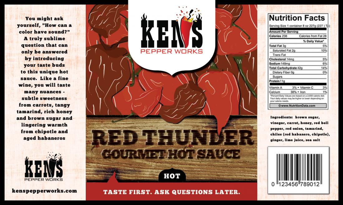
labels Need Help Critiquing Label

I just received the first draft of the Red Thunder label and would love some community input.  I have thoughts of my own but will hold off to see if others independently have the same.  Here it is.  Thanks in advance.
 
Ken
 
KPW_Label_Draft_1.jpg

 
Oops.  I didn't realize there were more coming.
 
KPW_Label_Draft_2.jpg


The next iteration is here. Also, since the  baseball game was so depressing last night, I worked up my own label - everything but the artwork.  I saw a 99designs hot sauce label (Mr. Saucy) that I liked.  I included 2 versions below.
 
There are still a few items that need addressing:
  • The "HOT SAUCE" text is still the same text
  • The side panels are 2 diff. colors of gray
  • No "Made by" declaration
But overall, the graphic is looking much better.  THP, good call on adding white to the lightning.  There are a few errors on my two labels, so no need to call them out.  I don't have the website address or a heat gauge and the last line of the "USE FOR:" text is missing. 
 
The main reason I created the two other labels is because the tag line needs a consistent location and mixing it in w/ the graphic probably won't provide that consistency. So I added the top and bottom banners to frame the label as well as house the tag line.  I kinda like it.  I think if the graphic was placed inside my label it would really look good. Also, the only part to change for each sauce is the verbiage and the image in the bottom 2/3 of the middle panel.  I would change the banner color for different sauces (yelow for Mustard Bomb,  light brown for Rio Grande Mud, orange for Island Sunshine).  The overall hue of the graphic would match the banner and blend in w/ the dark background.
  
Some updates to my label are:
  • There was too much contrast between the white text and black background so I darkened up the text a little, maybe too much. 
  • I think it would look better if the main color was a textured charcoal rather than black.  It would also blend w/ the graphic better and then the white text would look better.    
  • The banners could have some texture and be a little brighter, especially if the background turn charcoal
That's all.  I look forward to everyones input.  Thanks.
 
Ken
 
Label_Draft_31Oct.jpg

 
red_thunder_label_Ken_1.png

 
red_thunder_label_Ken_2.png
 
What are the silhouettes supposed to be at the bottom in #1?  Might look cool to bring back your red peppers and do a 1/4 silhoutte at the bottom so the lightning is hitting those? 
 
I'm not sure I get your tag line. I mean I get the origin of "shoot 1st, ask Q's later" but I'm not sure it translates well to a food product. Consumer confidence in food is a tricky one - any ambiguity and people freak out. And just like the feedback some had about your romance panel about telling people what to do or not do, I'm not sure how well people will resonate with "ask questions later".  If I have questions about a hot sauce I want them answered before I taste it. 
 
Keep in mind, I'm a kind of a weird dude so perhaps I don't represent the general public, but where before I thought it was kinda catchy, the more I see the "taste first...ask questions later" the less I like it. It just doesn't really say anything and it's giving me instructions. heh
 
I'm not positive these are an improvement. In the 1st one the silhouettes don't really look right - and overall the label is very dark. Changing the bottom might work - it'd add a complimentary red color by making the "mountain silhouettes" red peppers.  Then you'll tie in the lightning strike with the heat of the peppers. I dunno  - I'm still not sure it'll work. 
 
I do like the RED THUNDER font in the 1st one MUCH better than the 2nd two. The 1st one looks like military kind of thing. The next two look like the cover of a horror movie in terms of font. 

Oh - again, I see "smokey chipotle" on your "romance panel" description. 
 
I wasn't kidding about that being a protected trademark. There is a long time, very well known and very litigious sauce-maker who WILL sue you if you use that.  I don't think you want your name added to this web page: 
http://www.montezumabrand.com/recent-trademark-violators/
 
or this one: 
http://www.montezumabrand.com/about-history-legend/trademark-violators-list/
 
He takes his TM very, very seriously. 
 
I would highly recommend changing that.  
 
Lucky Dog Hot Sauce said:
What are the silhouettes supposed to be at the bottom in #1?  Might look cool to bring back your red peppers and do a 1/4 silhoutte at the bottom so the lightning is hitting those? 
 
I'm not sure I get your tag line. I mean I get the origin of "shoot 1st, ask Q's later" but I'm not sure it translates well to a food product. Consumer confidence in food is a tricky one - any ambiguity and people freak out. And just like the feedback some had about your romance panel about telling people what to do or not do, I'm not sure how well people will resonate with "ask questions later".  If I have questions about a hot sauce I want them answered before I taste it. 
 
Keep in mind, I'm a kind of a weird dude so perhaps I don't represent the general public, but where before I thought it was kinda catchy, the more I see the "taste first...ask questions later" the less I like it. It just doesn't really say anything and it's giving me instructions. heh
 
I'm not positive these are an improvement. In the 1st one the silhouettes don't really look right - and overall the label is very dark. Changing the bottom might work - it'd add a complimentary red color by making the "mountain silhouettes" red peppers.  Then you'll tie in the lightning strike with the heat of the peppers. I dunno  - I'm still not sure it'll work. 
 
I do like the RED THUNDER font in the 1st one MUCH better than the 2nd two. The 1st one looks like military kind of thing. The next two look like the cover of a horror movie in terms of font. 

Oh - again, I see "smokey chipotle" on your "romance panel" description. 
 
I wasn't kidding about that being a protected trademark. There is a long time, very well known and very litigious sauce-maker who WILL sue you if you use that.  I don't think you want your name added to this web page: 
http://www.montezumabrand.com/recent-trademark-violators/
 
or this one: 
http://www.montezumabrand.com/about-history-legend/trademark-violators-list/
 
He takes his TM very, very seriously. 
 
I would highly recommend changing that.  
 
I think the silhouettes your referring to are mountains?
 
Regarding the tag line, I know what you mean about telling people what to do or not to do.  But I think it's light-hearted and fun enough that most people will get it.  One thing that has been common w/ hot sauce for the last 30 years or so is humor.  It's been a great sales point for many companies. Of course the greatest tag line of all - in my opinion - is from a bar in Anchorage called Chilkoot Charlies: "We cheat the other guy and pass the savings on to you!"  It got me to buy a t-shirt.
 
I think the addition of clouds and textures to the sky made a big difference as well as the lightning changes.  When the graphic is smaller on a label I think it will look better.
 
What I was getting at w/ #2 and #3 was finding another format that would work for all labels.  The tag line needs to be in the same place every time and if it's placed over the "storm" graphic it might be somewhere else on the next label w/ a different graphic.  The Red Thunder font on  #2 and #3 was just there for reference (and to fill in space).  I plan to use the entire storm graphic and font from #1.  If the middle panel (minus the logo) were placed in #3 and the #3 background was lightened up a little, I think it would look better.  Here is a background that would work: http://99designs.com/product-label-design/contests/help-mr-saucy-product-label-234153/entries/25609382.  I like this label.  It's pops and looks very professional/gourmet.
 
Thanks for the heads up on the trademark violation.  I have seen you post that before but forgot about it.  This guy sounds like a trademark bully. Someone must have had a bad lawyer at one time that set some kind of case [SIZE=10.5pt]precedence[/SIZE] to allow him to sue so many over such wide ranges of use. The trademark should be for the product name, not just whenever the 2 words are used in a paragraph.
 
Thanks for the help.
 
Ken
 
I like your tagline. To me it means...

Once you taste it all your questions will be answered. No mystery ingredients, so just taste it. You'll love it. The only question left will be "Where can I buy more?". That sorta thing. That's what I get... down to a few words, so it's catchy. And a much better way of saying what you see is what you get. When you buy something in the store you don't get to ask the manufacturer what's in it, so it is not rude at all. It's clever.

There's plenty of taglines suggesting you will blow out your o-ring. :lol: I think you're okay here. Anyway, it's short and projects a positive message. That this is good stuff.

Ominous sky looks good.

The mountains look like whipped cream dollops mixed with crude paper cutouts of mountains.

Personally I don't like the artist. The theme overall got better but you need a better designer.

PS. Smokey is a misspelling or creative spelling of smoky. So use smoky. And it's not in your name or tagline, it's a descriptor. Not saying that person will not go after you, just saying...

That page has a lot of cease and desist but no court wins. Anyone can C&D. It appears he does that publicly to shame them out of using it. Even if they may not be in violation.
 
It can be reworded to read- "...and a smoky lingering heat from chipotles and aged habaneros. "
 or- "...and a smoky lingering heat from chipotle and aged habanero chiles."
 
 
The mountains aren't cutting it as they are drawn.  They either need to be redrawn or eliminated.  There's a lot of interesting things with the storm clouds and lightening.  See what it would look like if the mountains were eliminated and it was a straight black "box" across the bottom with the tag line and weights.  It could still have the glow behind it which would set it off from the storm clouds.
 
And to give you even more work :lol:  see if you can get the lightening in the letters to line up with the storm lightening.  The lightening in the "H" moved over a smidge, and the stroke on the right carried up to tie into the fork at the top. 
 
Each rendition is getting better.  Sometimes I don't think labels are ever actually "finished".  Especially when the AHJ's keep changing their requirements.  :rolleyes:
 
Thanks for everyones input.  It looks pretty unanimous about the mountains.  I'll give it a try w/out the mountains and also ask her to provide more texture and depth to the mountains.  That worked for the sky.  I may end up doing this same project on 99designs just to make sure I get the first one right.  Subsequent labels will be easier once this design is down.  I'll probably have the next iteration by the weekend.
 
Ken
 
Good luck Ken. I know it's a lot of work (believe me, I know) - but it's worth doing right. 
 
I have to say honestly, I like your "Ken's Pepper Works" logo/graphic more than any of the labels you've posted. I think it would make for a clean, interesting hot sauce label. It's very straightforward, communicates the product message and could be used on a variety of sauces with subtle tweaks for flavor/product name. 
 
But if you're married to Red Thunder I completely understand, and I wouldn't presume to tell you what to name your sauces. You asked for honest opinions, and there's mine. 
 
If you are sticking with the Red Thunder name/theme, I think you have a good start. As SL said, tighten up the lightning with the name so that the lightning bolt carries through the name cleanly (which is actually a pretty cool effect), fix the mountains so they look like mountains (should be pretty easy if you just find a pic of a mountain range & turn it into a craggy silhouette). 
 
I do like the notion of going to 99 designs though. There's something less than unified to these label renditions that really needs the right artist's touch to bring them together thematically. 
 
Question: was it deliberate to leave out "Pepper Works" in the 1st label above? I think it would look better with the full name, and if it's your company's full name it's appropriate to have it there. Plus as has been suggested earlier, there's a Ken's Salad Dressing company that's quite prominent, and since they're also a condiment (e.g. in the same TM classification) it might be risky to just use "Ken's" without "pepper works". 
 
I am not a trademark attorney by any stretch of the imagination, but I had a devil of a time getting Lucky Dog Hot Sauce since there were already a million & 6 "lucky dog" things out there. Had to do a sub-class of a sub-class of a sub-class kinda thing. I highly recommend talking an IP attorney before committing a ton of $ to this endeavor - it would suck to make a product, label it and then find out you're infringing on someone else's TM. You can get one for a couple hundred bucks for the job - which is a very small amount of money compared to starting a company. It's worth the peace of mind. 
:cheers: 
 
Lucky Dog Hot Sauce said:
Good luck Ken. I know it's a lot of work (believe me, I know) - but it's worth doing right. 
 
I have to say honestly, I like your "Ken's Pepper Works" logo/graphic more than any of the labels you've posted. I think it would make for a clean, interesting hot sauce label. It's very straightforward, communicates the product message and could be used on a variety of sauces with subtle tweaks for flavor/product name. 
 
But if you're married to Red Thunder I completely understand, and I wouldn't presume to tell you what to name your sauces. You asked for honest opinions, and there's mine. 
 
If you are sticking with the Red Thunder name/theme, I think you have a good start. As SL said, tighten up the lightning with the name so that the lightning bolt carries through the name cleanly (which is actually a pretty cool effect), fix the mountains so they look like mountains (should be pretty easy if you just find a pic of a mountain range & turn it into a craggy silhouette). 
 
I do like the notion of going to 99 designs though. There's something less than unified to these label renditions that really needs the right artist's touch to bring them together thematically. 
 
Question: was it deliberate to leave out "Pepper Works" in the 1st label above? I think it would look better with the full name, and if it's your company's full name it's appropriate to have it there. Plus as has been suggested earlier, there's a Ken's Salad Dressing company that's quite prominent, and since they're also a condiment (e.g. in the same TM classification) it might be risky to just use "Ken's" without "pepper works". 
 
I am not a trademark attorney by any stretch of the imagination, but I had a devil of a time getting Lucky Dog Hot Sauce since there were already a million & 6 "lucky dog" things out there. Had to do a sub-class of a sub-class of a sub-class kinda thing. I highly recommend talking an IP attorney before committing a ton of $ to this endeavor - it would suck to make a product, label it and then find out you're infringing on someone else's TM. You can get one for a couple hundred bucks for the job - which is a very small amount of money compared to starting a company. It's worth the peace of mind. 
:cheers:
 
LD, I'm stuck on a formal hot sauce name.  It just seems more marketable to me.  I left out "Pepper Works" in the first 2 labels but I agree it is better to include it, like in #3.  It saves space and the consumer can probably guess the website address just by looking at the logo.
 
I did a lot of research on trademarks and tradenames.  For a couple hundred bucks a lawyer will do the same searches I can do.  For another $200 they will provide a legal opinion and for about a grand they will do a complete analysis and web search.  I can see how Lucky Dog would be tough to trademark.  Mine should be a little easier.
 
I did get a setback today from the co-packer.  They were working on a cost estimate for each sauce and told me they were reluctant because my recipes had too many fresh ingredients and they usually use frozen or canned produce.  I don't know to what extent must be frozen or canned, but it does mean I need to reformulate using frozen in order to know how it would taste before committing to anything.  I asked them to provide a list of the ingredients that would be replaced by frozen or canned so I can test more at home.  Bummer.
 
Ken
 
two steps forward, one step back.......  It's the way it goes~
 
I'd be interested to see what the copacker cites for frozen ingredients.  Some things (fruits especially) I can see, but onions, garlic and chiles?   :think:   Hmmm~
 
This is what they sent back today.  It wasn't all-inclusive but I get the picture. 
 
    Pineapple – we can source both canned (chunks or crushed) or frozen (crushed)
    Carrots – we can source both canned (diced) or frozen (diced)
    Red Onion – we source this frozen (diced)
    Scotch Bonnet – we use this in pepper mash form
    Naval Orange – I haven’t been able to find a source for these....we can get canned Mandarin Oranges
    Red Habanero – we bring use this in pepper mash form
    Ginger – we use fresh ginger puree from Tulkoff Foods
    Garlic – we use minced garlic in water from Spice World
    Jalapeno – we use this in pepper mash form
    tomatillos – we use the canned variety (whole or crushed)
    Poblanos and Serrano – we use this fresh in smaller quantities, but we don’t de-seed them
    Scallions – we have not used these before, but we can bring in a mash format or I can look at a source for fresh
    Red Bell Pepper – we source this frozen (diced)
    Lime Juice – we source this in 55 gallon drums as a concentrate
 
One of my biggest concerns is the garlic, but I will be talking w/ them soon.  You can only do so much w/ email and at some point you have to just pick up the phone.  This is a major award-winning co-packer, so this is probably industry standard.  I have had several of their sauces and they are outstanding.
 
My knee-jerk thoughts on that list, in part based on a conversation I had with a produce guy at my farmer's market last week - he was in the business for 30 years and was a senior exec for a major company. He said that canned produce has no soul - sitting in water sucks the flavor out of it. Fruit especially, but veggies as well. I would avoid those at all costs. 
 
I am assuming "frozen" means "IQF" which is totally acceptable. If they mean frozen like the crap you get in the freezer section at the grocery store, you need a new copacker. That's the 1st thing I'd check. 
 
Seeds: seeds are not a problem if your copacker has a screen grinder. I am assuming they don't though if they're calling that out as a concern. That's a problem. Customers might be 70/30 "don't care" about seeds. Reviewers & competitions have lower tolerance, as "mouth feel" is often rated. Consistency is important and seeds can produce undesirable mouth feel/texture. This could be a deal killer for this co-packer, depending on how much you care about this. I went through 3 co-packers before finding the one with the right equipment to get a sauce the consistency i wanted - it added about 8 months to my launch. It's up to you whether this is a deal killer or not, but be aware that there is risk to having a seedy sauce. 
 
The mash peppers is a concern as well. You will need to get some of the mash and reformulate your recipes. 1 lb of mash is far different in taste/concentration than 1 lb of pods. That said, mash is sustainable, and available year-round. It's advantageous to be able to make sauce in January if you're running out, and you can't always get fresh pods. Plus mash pricing tends to be more consistent than fresh produce. I'd prefer IQF to mash though every day of the week and twice on Sundays. If you can get true flash-frozen Jalapenos in my opinion the flavor is superior and you won't need to change your recipes.  
 
Lime juice from concentrate is fine. You'll never taste the difference and I've yet to meet a mfgr who will source fresh lime juice. Plus it would cost a lot more.
 
garlic in water is a little weird. check with some Gilroy, CA companies - it's the garlic capital of the world. That said, if you have water in your recipes, they'll just off-set with the water in the garlic. Shouldn't be a big deal. But fresh, whole clove  garlic should be readily available.  
 
Strange they won't do fresh carrot or tomatillo. Sounds like they simply don't use any fresh produce, which is a little bit of a red flag. That said, it's also a pretty common manufacturing process. These folks want to make things as easy on themselves as possible, and fresh produce increases their workload. 
 
Sounds like you've got a lot of research ahead of you - best of luck. 
 
Thanks LD.  I'm sure its all IQF but I'll make sure I ask about seeds.  The co-packer mentioned they would run th erehydrated guajillos through a VCM to grind them down further.  BNot sure if this is the same but I plan to ask.
 
I personally like mash.  I has a nice salty, mellow flavor.  I have about 20 mason jars (1/2 gallon, quart and pint) on my dinning room table (much to PepperMamma's dismay), holding this years harvest.  I already use Red Hab mash, probably from the same provider the co-packer uses so the only change is the scotch bonnets.  Weight wise, it should be similar.  Mash is the same amount of peppers by weight as fresh except for the addition of salt.  So an extra 10% salt along w/ a mellower flavor probably means to use about 10%+ more mash by weight.  Anyway, the co-packer will help w/ this as they do these types of conversions all the time.  I contacted a 2nd co-packer yesterday (local) once I found out everything was going to be IQF anyway.  There are many more options in California than in the midwest.
 
Not being able to roast whole garlic could be a deal breaker.  I hate that Spice World garlic in a jar.  I will also need roasted tomatillo down the road.  Hopefully a phone conversation will clear this up soon.
 
Ken 
 
The latest version is below.  There have been a couple iterations since my last post and I think it's looking much better.  This is the 1st version of the thermometer and my only comment is to move the numbers to the left, add tick marks and put Mild, Medium, Hot and XHot on the left at 3, 5, 7 and 9, respectively.  Maybe add "Medium Hot" to the front somewhere?  Any thoughts?  Thanks in advance.
 
Ken
 
Label_Draft_16nov.jpg


Label first-
Tick marks on the heat gauge would be OK, don't worry about labeling what is mild, hot, etc on the gauge.  Let the consumer decide if a 4 is mild or medium. 
 
MUCH BETTER on the mountains!!!!!!!!  And the jagged edge on the top and bottom red bands works.  You have some text in the top band and some in the bottom so that looks balanced.  Lightening bolts are looking like they carry through the letters.....
 
NICE JOB! 
 
I missed this previous post about ingredients.  If I may add a dos centavos to LDHS's comments-    
PepperDaddy said:
This is what they sent back today.  It wasn't all-inclusive but I get the picture. 
 
    Pineapple – we can source both canned (chunks or crushed) or frozen (crushed) standard
    Carrots – we can source both canned (diced) or frozen (diced)  What? No Fresh?  lazy
    Red Onion – we source this frozen (diced)  No way I'd use frozen onions
    Scotch Bonnet – we use this in pepper mash form  see mash comments below
    Naval Orange – I haven’t been able to find a source for these....we can get canned Mandarin Oranges  Yea, probably true, but the didn't offer to use fresh oranges?
    Red Habanero – we bring use this in pepper mash form see mash comments
    Ginger – we use fresh ginger puree from Tulkoff Foods  also check with Ginger People directly.  You can buy minced/pureed ginger with no added ingredinets. 
    Garlic – we use minced garlic in water from Spice World What LDHS said, 5 pound (or more) bags/jars of whole clove peeled garlic available through produce companies everywhere.  Do you think restaurants peel all their garlic by hand?  :lol:  Yea, RIGHT!  Bulk bags should be available at Costco also.  There are ways to roast the peeled cloves.... 
    Jalapeno – we use this in pepper mash form more mash comments
    tomatillos – we use the canned variety (whole or crushed)  WTH? 
    Poblanos and Serrano – we use this fresh in smaller quantities, but we don’t de-seed them  :rolleyes:
    Scallions – we have not used these before, but we can bring in a mash format or I can look at a source for fresh  omg...scallion mash?????  :sick:
    Red Bell Pepper – we source this frozen (diced)  IQF OK but still...
    Lime Juice – we source this in 55 gallon drums as a concentrate 
 
One of my biggest concerns is the garlic, but I will be talking w/ them soon.  You can only do so much w/ email and at some point you have to just pick up the phone.  This is a major award-winning co-packer, so this is probably industry standard.  I have had several of their sauces and they are outstanding.
 
First off, don't accept the first co-packer that comes along.  Like LDHS said, it has to be mutually beneficial.
 
Re MASH-
The term "mash" has been cussed and discussed here and elsewhere several times.  What you think of as mash and what the co-packer brings in are 2 VERY DIFFERENT  beasts.  I'm sure I'll for get some, but here's a partial list of all the different terms mash applies to-
-a generic term for ground up produce usually including chiles, strictly referring to the consistency of a product
 
-ground up chiles with no salt, vinegar or other added ingredients, not aged or fermented
-ground up chiles with salt (sometimes up to 20% :eek:), vinegar or any number of other ingredients, not aged or fermented
-ground up chiles allowed to ferment without salt or any additional ingredients
-ground up chiles allowed to ferment with salt only
-ground up chiles allowed to ferment with salt and whatever else is thrown in the mix.....
OK- you get the idea....
 
Some pepper companies sell pepper mash which is strictly ground up chiles, no salt, no ferment.  Some sell ground up chiles with salt in ratios anywhere from 3%-20% salt.  Do the math on that one for something like a Red Savina mash that they are selling for $$$.  I don't know of any of them that sell a fermented mash. 
 
If you try to substitute a commercially purchased "mash" for a mash like what you have on the dining room table....  it just ain't the same animal! 
 
Also, after seeing the recent news clip in the Huy Fong Sriracha factory, and seeing the jalapenos going up the belt with all the stems on....and also seeing another clip of another sauce company using habs with the stems on.....  I dunno... just makes you wonder....  Something to be said for processing chiles in house, or at least having some kind of control/knowledge about what the processor/co-packer is allowing into the sauces.
 
Sounds like the co-packer doesn't want to do any hands-on work like peeling onions.  I would highly question using them.  I use canned mandarin oranges in a sauce and I go through each and every can picking out the few seeds and bits of membrane that are always in there.  If the co-packer won't even offer to peel onions, I doubt they'd do any extra work (like picking out seeds) for the canned products. 
 
And they may do it while you're standing over their shoulder, but if that's their level of effort regarding things like carrots and scallions...what about when you're not there?
 
Hope this helps a bit~
 
Mash from co-packers is usually pepper puree and vinegar for shelf-stability (to make sauce year round). This means you have no control over the quality of the peppers that were harvested, and it is most likely the cheapest vinegar (white distilled). But check to be sure so you know what you are getting.
 
Label looks HEAPS better. Lightning bolts pretty much lined up (I could nit pick the hair that they are off but I won't lol they look good) which makes the font make sense now. I don't like the grey marble effect, it looks like a kitchen counter... black would make it pop... and the mountains look a LOT better but maybe too realistic, try upping the contrast of that image so it is more black and white, and turn the sides black... I think it will really pop and you're almost done! Just my opinion.
 
High contrast always pops.
 
looking again after The Boss's comments, I agree about the marble effect.  I don't think it's needed, too much going on.  I feel like the visual WoW should be on the front panel.  The side panels are for information and need to be as easy to read as possible. 
 
Back
Top