Disclaimer #1: The following are my opinions only - and hey, what do I know, I'm not a graphic artist....
Disclaimer #2: all intended as constructive, otherwise I wouldn't waste my time.
That said, here goes...
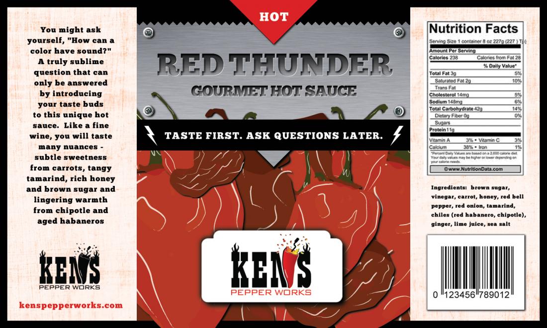
1. Maybe I'm in the minority but I am not a fan of the background image at all. For one it doesn't convey "thunder" at all. For another from anywhere past 12" away I can't tell what it is - just vaguely dark red collage of squiggly lines.
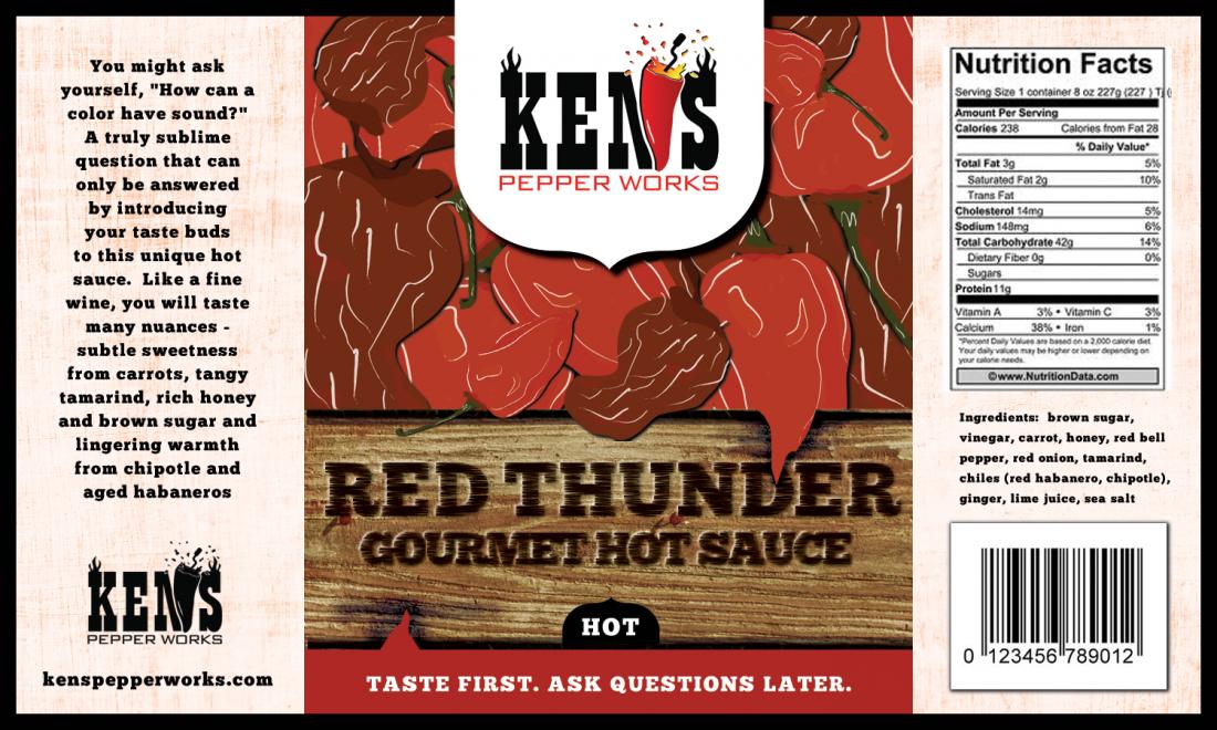
2. There are way too many design elements going on with both labels. While I concur with the majority that #2 is better, i still don't think it works. It's a mash-up of too many styles - like those old early 90s web pages that used flash animations and Christmas lights and dancing baby and 20 other things because they could. The Ken's branding looks like it was just slapped on in that badge-style and is totally incongruous with the other styles (wood? Pepper-collage? Red stripe across the bottom?) It just doesn't work for me at all - it fails to draw the eye to any key part of the label. That's my biggest issue with these designs. Go look at the most successfully branded products - you'll find a certain minimalism. "Less is more" and your eye is drawn to the brand name like a magnet. This is all over the place, and some of the elements just don't fit together.
3. Romance panel is far too wordy. I'd suggest trimming that down to at least 2/3. No consumer has that kind of attention span. I read it all because you asked us to. In a store I'd get halfway and zzzzzzzzz.
4. Agree with others regarding product name being too big. I'll add that against the wood grain background I don't even see "gourmet pepper sauce" at first - had to look for it.
5. The one thing I like is the tag line, but I don't like how it's just sort of slapped in on that red stripe at the bottom. Again - there's just way too much else going on for me to focus. Looking at this label I feel like I've got ADHD.
I would consider a means of making the framing more consistent. So that "ken's", "red thunder" and "tag line" are all similarly presented. With different colors and different backgrounds it's not easy or me to tie together. As a consumer I shouldn't have to work to figure out your product.
I would tone down the background - use empty space. Right now there is none. This is my biggest issue with these labels.
I would consider a product name change. Failing this, I would consider using imagery that conveys something even remotely related to the product name. Maybe red storm clouds with lightning striking a chile pepper. I dunno what would work - I just know this one really doesn't. It's got zero empty space, so there's nowhere for my eye to focus - so it doesn't.
Again - don't mean to sound harsh, and I'm not a graphic artist so take my opinions or leave 'em. But I've looked at hundreds of product labels and did study marketing for a while.
Good luck


