You are using an out of date browser. It may not display this or other websites correctly.
You should upgrade or use an alternative browser.
You should upgrade or use an alternative browser.
misc Opinions please
- Thread starter DickT
- Start date
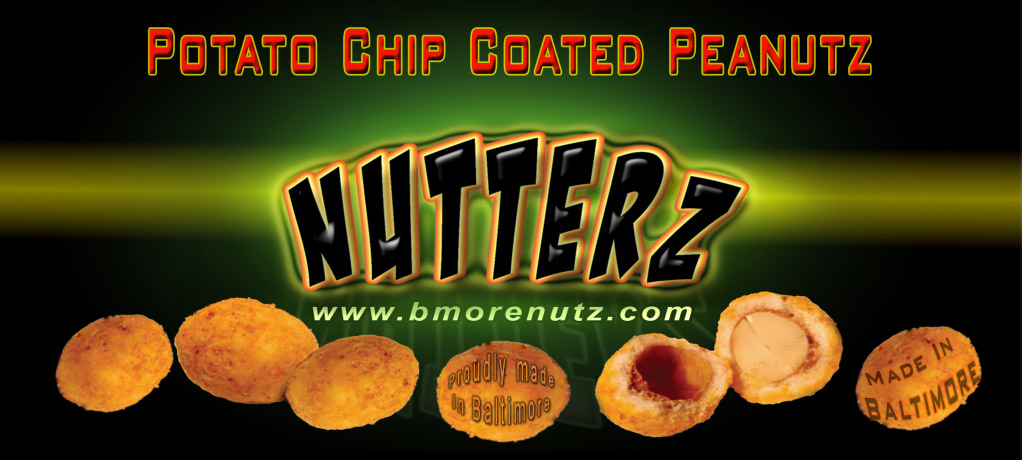
Nice! Don't you want to hint at the flavors though? And what about "Proudly Made In Baltimore"?
thehotpepper.com said:Nice! Don't you want to hint at the flavors though? And what about "Proudly Made In Baltimore"?
Proudly, good idea , As far as flavors, this will only be for the 3 oz bag ( chili nutterz) Thanks, I will add proudly, colors ok?
Poisonette said:I like the second one.
Interesting product and I love the url!
The 2nd one that says made in Balto?
QuadShotz
Banned
He could reverse my colors or just use whatever ones he likes...it's just an idea.
Mostly, I was trying to make it fit better. I also coulda put the text on a path, but didn't figure it would matter much.
Personally, I wouldn't put it on the nuts at all, I'd put it in text under them so as not to distract as much.
Mostly, I was trying to make it fit better. I also coulda put the text on a path, but didn't figure it would matter much.
Personally, I wouldn't put it on the nuts at all, I'd put it in text under them so as not to distract as much.
Hey Dick, even though the brand is Nutterz... I don't like Peanutz with the Z. Just my opinion.
thehotpepper.com said:Hey Dick, even though the brand is Nutterz... I don't like Peanutz with the Z. Just my opinion.
I think it's cool... kinda original
Novacastrian said:Im with THP on this one.
i'd stick to my marketing scheme personally... but i can see your point
The Z is newExtremeBurn said:i'd stick to my marketing scheme personally... but i can see your point
thehotpepper.com said:The Z is new
bmorenutZ, nutZ... i'm just sayin lol... just giving my point is all
thehotpepper.com said:Anywayz
haha... k i agree


