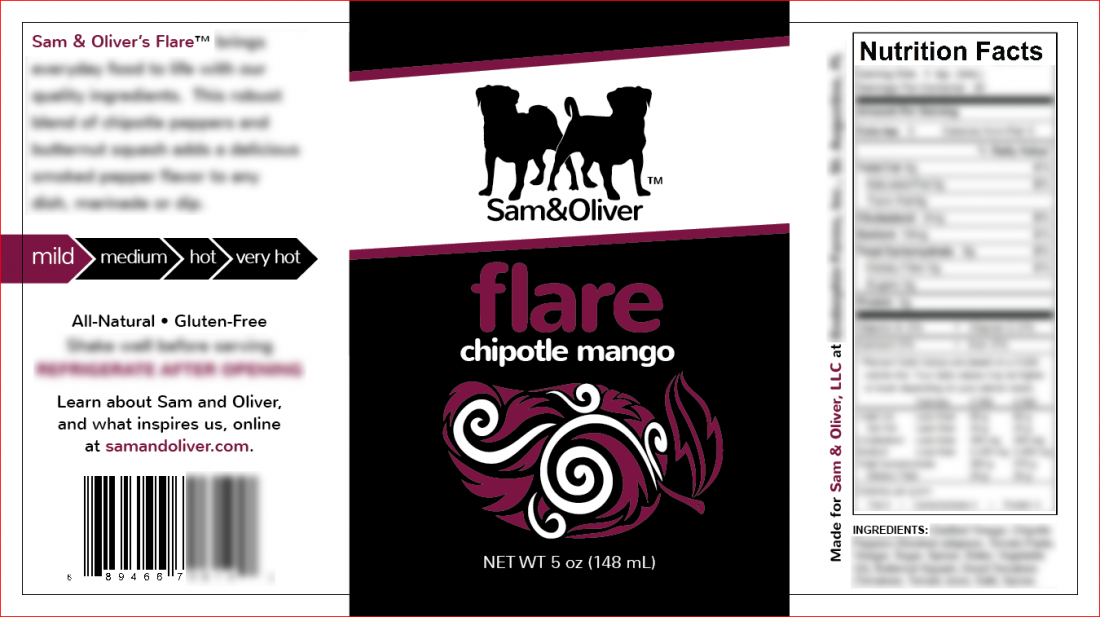
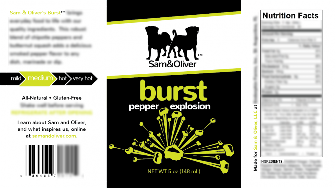
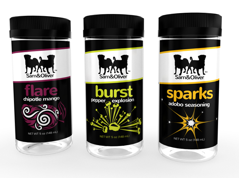
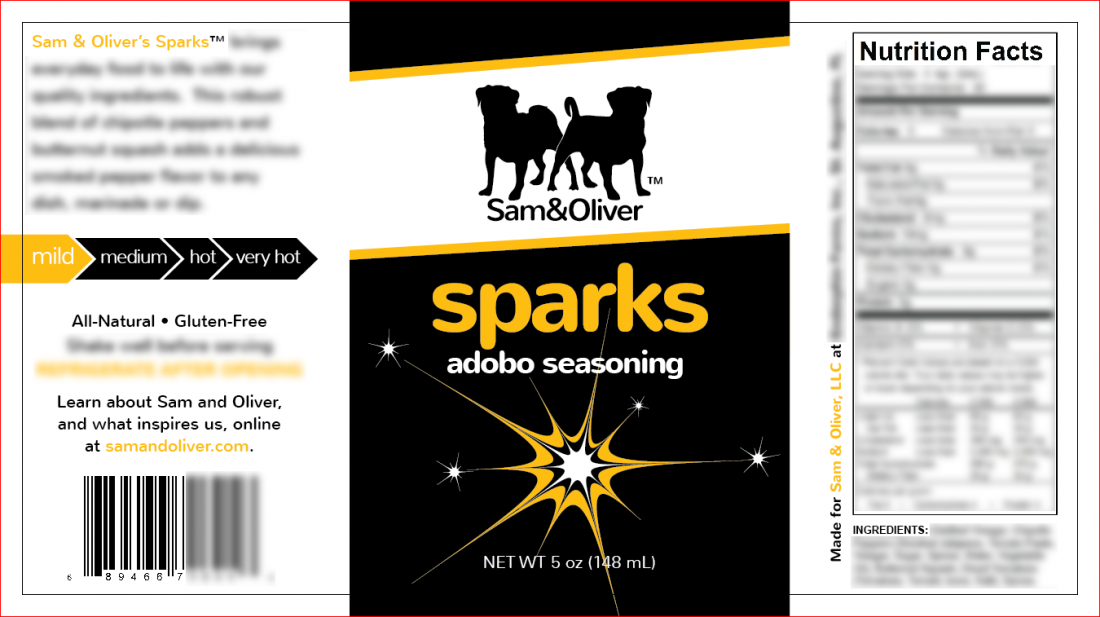
labels Sam & Oliver Sparks, Flare & Burst (dry spice labels)

So here's a preliminary concept of 3 dry spices, I thought to take a slight risk with the colors to keep the dry spice lines separate from the wet sauce lines (as will be the two BBQ sauce lines):
 
Sparks is an adobo seasoning is a dry spice blend of salt, onion, garlic, cumin, chipotle and other delicious things.  It smells divine and can be used on anything from vegetables, potatoes and steak to pizza, fries, sandwiches and more.
 
Flare is a mango-chipotle dry spice that has a great nose and adds some mellow sweetness to things like mashed potatoes, roasted butternut squash and even right on pork chops, etc.  Definite sweetness with a warm chipotle end note.
 
Burst heavily focuses on cracked 'gourmet grind' black pepper as it's primary nose and body.  I didn't go with butcher grind because it was too coarse.  Red pepper, Cayenne and other spices round this out, very close to concept of a steak or chicken grilling seasoning blend but with NO salt.  I know people argue whether to put salt on before or after grilling a steak, and I decided to err on the side of a) healthy and b) you can always add salt later which is c) another future line coming (smoked sea salt).  Salt can always be added later but not easily removed.
 
Here's the concept work (note, most fields are simply borrowed from the Cinder / Stoke line, but the label is not the same size as a woozy, this is 3x6" instead of 3.25 x 5.5".  Because of this, the center panel needed to be 1/2" wider so it didn't appear "boxed" by a white bar on each side when viewed.
 
Also to note: these are printed in 2 color in an effort to reduce cost of reproduction.  A 3rd color could be added but will require an extra plate and higher per-label costs.
 
Sparks1.png

 
Flare1.png

 
Burst1.png

 
Example1.png

 
Thoughts?  Too wacky with the colors?  To hard to read the colors?
 
Really?  I thought sparks was a fantastic name.  I'm keeping that one.  Flare and Burst are on the fence but I thought played well.  I've seen plenty of hot sauces that have names that aren't food related at all.  But then again these are dry spices.
 
Flare I'm more fond of than Burst because of the nature of what a flare is.  Slow, low start then a ramp up of heat and then out again.
 
Burst could go.  I'm not dead set on Burst but trying to find fun, singular words for explosion isn't easy.
 
It's getting a little too kitschy for me.

I think you are at the point where SL said in the other thread, you are going to have to stop trying to follow your theme with every product or it becomes cheesy and looks like you are reaching. Just call it what it is. Chipotle BBQ Rub. Habanero Dust. Etc.

Or pick ONE thematic name that fits your brand for all your dry spices. Like Volcanic Peppers has Volcano Dust. That is their entire line, with the type of dust it is under it.
 
I don't like this. I can't even explain what it looks like. Like some tubes of different gems for 13 year old girls to stick onto their clothing. I am not being harsh. This is what I see.
 
Is it the colors, or the images?  I requested a different direction for the colors of the dry line instead of the Fuchsia, Red, Orange and Green (of the wet sauces), these were concept choices for medium and mild dry spices.  Perhaps the black front should be inverted to white for the dry spices?
 
Handcrafted heat is the theme and tagline of the company.  I want each line to have a single word as the recipe line and the description underneith it "Sparks" (adobo seasoning) as shown.  "Flare" (mango chipotle).
 
edit: do you mean like creating a dry line with variants under it?
 
Sam & Oliver
Sparks <- Line of dry product
 
and then:
 
Adobo Seasoning <- product recipe
Mango-Chipotle <- product recipe
Pepper Explosion <- product recipe
 
It's all very confusing. First off I would never buy anything called Burst Pepper Explosion, it sounds like gum and looks like an energy drink. The 3 names are trying too hard to stay within your fire theme. It looks like reaching. If you have a 4th or 5th I can't imagine what they would be called. This is why SL and LD mentioned they don't do that. Once you start, you have to try to keep it up... so you have one cool name, the rest are cheesy, and your line is unidentifiable and cluttered.

Now you add a tagline to the mix. So you have:

Company name as brand on front
Individual brand names for each product that try to follow a theme
Individual catchy product names as descriptors
Tagline "Handcrafted Heat"

KISS!
 
You still have too much going on, and are reaching with those names.
Pepper Explosion is what the product is but sounds like a brand name.
Then you have the brand name above it. Burst.
Then you have the brand name above that. S&O.

You need to KISS. You don't have to be funny or catchy with every line on the bottle. It's trying too hard and clouds what the actual product is.

Just an example of something made up, but fits your template:

Mike's Heat
Factory Fire
Shooting Sparks

What is it?????????????

or...

Mike's Heat
Habanero Pepper Flakes

Which would you buy?
 
JoynersHotPeppers said:
I do not make rubs but mostly I keep my names as what they are and only a few have made up names.
If it makes sense, do it. If it's for the sake of following a theme and you are reaching for names, don't.

Also I doubt you try to be creative in the actual product descriptor also, when there are already 2 brands. 3 creative names is crazy.

Sam & Oliver
Burst
Pepper Explosion

All 3 branded. No mention of spice, rub, powder, or even a pepper. And no, NO 4th line! :)
 
Well Sam & Oliver logo has to be there.  That's a given.  That's the top half of the front panel.
 
The recipe name is in color, lowercase letters for attraction.
The flavor descriptor is below it in white bold lowercase letters
 
That's it, so there's 2 elements at play here:
 
Sparks Adobo Seasoning
 
There's not really anything else that needs to be done.  Sparks is the name of the product line, adobo seasoning is right under it.
 
The other two can be worked on.  Pepper explosion has multiple peppers in it, among them are black, red pepper and cayenne.  Don't forget the product is inside the package and can be seen through the clear sides, and there's room on the romance panel (and the right side, as the nutrition panel is not needed) for descriptions.  Wouldn't it being a dry spice be obvious to the person handling the package though?
 
Note: The example photo of the 3 jars is just what Adobe illustrator used for props, it doesn't look like the exact bottle which is taller and has clear sides.
 
JoynersHotPeppers said:
I do not make rubs but mostly I keep my names as what they are and only a few have made up names. 
 
What determines your use of a creative name though?

Edit 2:
 
Perhaps the product line could be less prominent and more 'there, but off to the side'
 
not to be devil's advocate at all, and this has been said by other's in previous threads...
 
everyone is just expressing opinions..being that we are all in the 'spicy' family, i think these opinions should be taken at more than just personal feelings. these people know what they are talking about and from what i follow, express themselves from a consumer standpoint and not strictly from personal...
 
in the end, it's your call and you have to be 100% happy with the final product...not anyone else....you can get 1000 different suggestions on what will make your label 'perfect', and 10 minutes later , suggestion 1001 will come in and tell ya what else needs to be done....endless cycle....
 
i have some updates to my labels I am doing, and I am already 'nervous' of sharing them with everyone, but i know it's all in the best interest of the product, and done with the express desire to have it appeal to the widest audience. Listen, absorb, and make changes that satisfy you first....
 
i liked the labels myself upon first seeing them, but can't help but agree with a lot of the suggested edits that have followed....
 
Sam & Oliver said:
Well Sam & Oliver logo has to be there.  That's a given.  That's the top half of the front panel.
 
The recipe name is in color, lowercase letters for attraction.
The flavor descriptor is below it in white bold lowercase letters
 
That's it, so there's 2 elements at play here:
 
Sparks Adobo Seasoning
 
There's not really anything else that needs to be done.  Sparks is the name of the product line, adobo seasoning is right under it.
 
The other two can be worked on.  Pepper explosion has multiple peppers in it, among them are black, red pepper and cayenne.  Don't forget the product is inside the package and can be seen through the clear sides, and there's room on the romance panel (and the right side, as the nutrition panel is not needed) for descriptions.  Wouldn't it being a dry spice be obvious to the person handling the package though?
 
Note: The example photo of the 3 jars is just what Adobe illustrator used for props, it doesn't look like the exact bottle which is taller and has clear sides.
 
 
What determines your use of a creative name though?

Edit 2:
 
Perhaps the product line could be less prominent and more 'there, but off to the side'
Honestly, only when I mix multiple types of peppers or add smoke through the smoker. Sometime you just have to go with what you like, not all will be happy no matter the outcome. 
 
 
Oh and a few have their names due to how they exit your body!  :hell:
 
I guess if you like it. :)

Way too much for me. If Sparks is a product "line" what is Flare, Burst? A line means multiple products, so all spices.

As for Sparks Adobo Seasoning, that does not roll of the tongue nicely or tell me anything except it is adobo seasoning which I can get in the Spanish foods aisle cheaper. Sparks does nothing to tell me why it is different, it's random and confusing.

Sam and Oliver's
Sparks Crushed Red Pepper

Look at it that way. What is the word Sparks doing there, and how are the pepper flakes different from what I get in the large container for my pizza?


Oh and a few have their names due to how they exit your body!   :hell:
 
LOL @ exit strategy.
 
These are preliminary concepts.  I don't mind any criticism.  I'd rather hear critique and "what sucks" during this phase than after press / product on the shelf.
 
Here's what my criteria was:
 
1) same theme, black bar front with high impact color and white (2 color on a white overlam paper rectangle with rounded corners 3x6")
2) visual or packaging distinction between the wet sauces so that at-a-glance the flavor and type can be discerned
3) professional, must be able to go on a restaurant table without being overly loud or too generic
4) will adhere to it's own heat index similar to, but not with the wet sauces.
5) The center panel must be 1/2" wider than the wet sauces due to the increased circumference of the packaging to prevent framing effect
 
The colors and artwork are in concept phase.
 
JoynersHotPeppers said:
Honestly, only when I mix multiple types of peppers or add smoke through the smoker.
Exactly! Descriptors, not random words when you already have a brand.

Is it smoky? Sweet? Unique? Work that in. SPARK conveys nothing.
 
k2-_4d772a84-fa77-414c-a2c8-210f938b75ed.v1.jpg

 
Quick random search.  How is this though....
 
McCormick <- brand name
Perfect Pinch <- made up line
"Salad Supreme" seasoning <- made up name
 
nothing on the front about any of the ingredients.
 
I guess that's what's throwing me.  I looked at an entire line of seasonings in the store and they all seemed to follow a certain pattern, some would be under the same line "Perfect Pinch" but the 3rd line here isn't always descriptive, it's just catchy
 
Dude I totally get what that is. It makes your salad better with just a pinch of the stuff. That is a great example of what you are not doing.
 
Your comes across as "Oh I have this fire theme, so I'll call this Sparks _____ for no reason other than the tying in the theme, as it tells you nothing."

Perfect Pinch tells me I just add a pinch and it makes it better. Salad Supreme means it is for salads.
 
Back
Top