Ok so I finished the label for my hot sauce. I had to change it from "weapons of ass destruction" due to the name already being used. So I changed it to "total rectal failure". Give me some feedback on the label.


Scoville DeVille said:Novelty. At best.
Sauce makers putting out a good product, and that are proud of it, don't try to sell it with outrageous names and graphics but, informative labeling.
I wouldn't buy it. I see labels like that and I already know what it tastes like.
Please don't take this as being snarky, it's just my 2¢
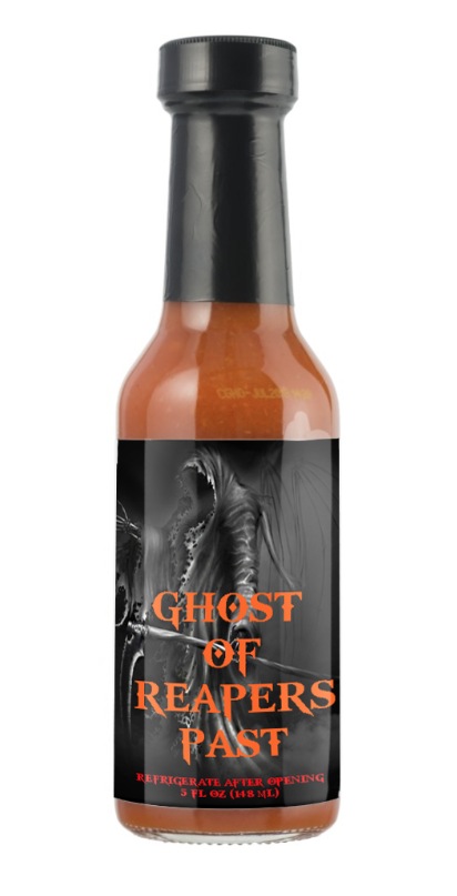
rebman2005 said:Ok here's the last and final one... I know I don't have the weight or contact info but this is something else I came up with... If it don't work I'll try something else...
Sent from my iPhone using Tapatalk
rebman2005 said:King I've never been tge "artistic" type
Sent from my iPhone using Tapatalk
rebman2005 said:Ok here's the last and final one... I know I don't have the weight or contact info but this is something else I came up with... If it don't work I'll try something else...
Sent from my iPhone using Tapatalk
salsalady said:
It comes back to what rebman is looking for or using the label for. For a hobby sauce for friends and family? Sure! It works for what he wants!
A small little graphics critique (but don't take my word for it as I'm not a graphics designer....)
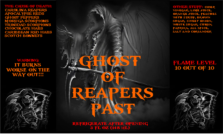
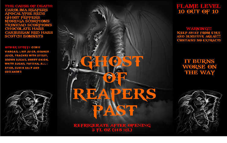
I would enlarge the central Grimm to fill most of the space on the central panel. Put Cause of Death on the left and Other Stuff on the right in vertical text blocks.
I get the Laughing Skeleton, and it seems to work on the label. Keep that-
If it's for a hobby sauce only for Friends and Family, I would-
Shrink the GORP in width, and make taller (so most of it is visible when looking at the bottle)
move all the text to the Left and Right
*** call out any subingredients that may be allergens
Make the central reaper imageTaller
rebman2005 said:better or worse?