beer Vote on our brewery logo!!!

Pick a logo

  • Logo 1

    Votes: 2 12.5%
  • Logo 2

    Votes: 0 0.0%
  • Logo 3

    Votes: 9 56.3%
  • Logo 4

    Votes: 5 31.3%

  • Total voters
    16
Just taking a few minutes to play around with #4....
 
I think my bigger problem with #4 is the idea of contrast vs. conflict - the two fonts don't contrast enough, so conflict with each other a bit. Without even playing with "collusion", this works better for me because there's more contrast. I'd still use a different font for collusion, but this is just to give you an idea of what I'm thinking about. Merely 2 cents....
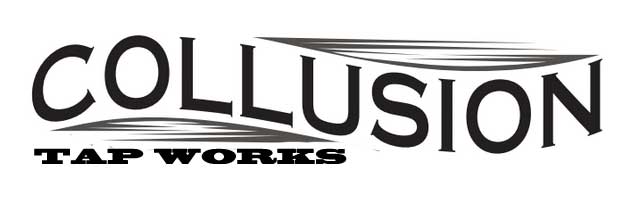
 
collusion.jpg
 
I really like TapWorks below the name Collusion!  Regardless of the font or style, the placement just seems to read better.  And the straight alignment of Tap Works below the curved Collusion works.
 
 
And to further complicate things- ;)
Collusion Tap Works for all the main marketing things
Collusion Tap Works Cider (add Cider right after TapWorks under Collusion)
Collusion Tap Works Beer (same as above)
 
salsalady said:
I really like TapWorks below the name Collusion!  Regardless of the font or style, the placement just seems to read better.  And the straight alignment of Tap Works below the curved Collusion works.
 
 
And to further complicate things- ;)
Collusion Tap Works for all the main marketing things
Collusion Tap Works Cider (add Cider right after TapWorks under Collusion)
Collusion Tap Works Beer (same as above)
 
If I can be so bold, Tap Works captures me on its own much more so than Collusion Tap Works.  If Tap Works isn't taken, I would register it right now, great name for a brewery.  
 
we had to register "Collusion Tap Works" in its entirety 
 
Collusion Brewing Company was apparently too similar to Conspiracy Brewing Company, so I went with Tap Works because we are the only brewery I know of in central PA, hell in all of PA, that has 32 draft lines pouring all of our own stuff

geeme said:
Just taking a few minutes to play around with #4....
 
I think my bigger problem with #4 is the idea of contrast vs. conflict - the two fonts don't contrast enough, so conflict with each other a bit. Without even playing with "collusion", this works better for me because there's more contrast. I'd still use a different font for collusion, but this is just to give you an idea of what I'm thinking about. Merely 2 cents....
 
collusion.jpg

 
I like that a lot
 
I was thinking of something similar, but some little voice in the back of my mind says I've seen something like that done already. But hey, I'm not a person to follow beer, since I only rarely drink it (and yeah, usually only half a bottle or glass), so maybe I'm thinking of it in a different context. Still, haven't seen it used with "collusion".
 
Boss, to me that looks like an MS PAINT cut out from clip art I used to do when I was 7.

I had them take geeme's idea and make the tap works straight in the number 4 logo. But I agree that the collusion font needs to change. Couple of different things in the works, but I think we have settled on 4, with a revision to 3 as well just in case. 1 and 2 areally way too hard to make them distinguishable as a solid color.
 
wheebz said:
Boss, to me that looks like an MS PAINT cut out from clip art I used to do when I was 7.
Yes it does. Uh was not making your logo I am not a designer you have one, I thought of a concept I thought was simple that fit your identity with taps so wanted to show you.

Good luck, I won't waste any more time here.
 
The Hot Pepper said:
Yes it does. Uh was not making your logo I am not a designer you have one, I thought of a concept I thought was simple that fit your identity with taps so wanted to show you.

Good luck, I won't waste any more time here.
No thats not a bad thing. I just didnt explain very well. It reminded me of a game I used to play called story weaver when I was young. I'm a clip art fan, I still do MS paint battles with friends
RocketMan said:
So when are we going to get a pictorial tour of the brewery and some info, you know the kind of stuff we Beer Geeks get off on
We haven't even started construction yet.
 
wheebz said:
No thats not a bad thing. I just didnt explain very well. It reminded me of a game I used to play called story weaver when I was young. I'm a clip art fan, I still do MS paint battles with friends
LOL...
 
Back
Top