labels Pure Evil label #2 update

salsalady

eXtreme Business
EDIT- added another label on Pg2-
 
It's time for more Pure Evil labels. 
 
This is the label that goes on the metal tin.  I've removed the words "food additive", kept "non-extract", should it say "1.5mil SHU"?  Any other comments?
 
View attachment PE2015 front copy.pdf
 
Hopefully the pdf will show, if not, please hang tight while I edit. 
Hmmm, BRB with a picture~~~
 
OK- here's a picture of the label in Adobe.  Let me know what you think~
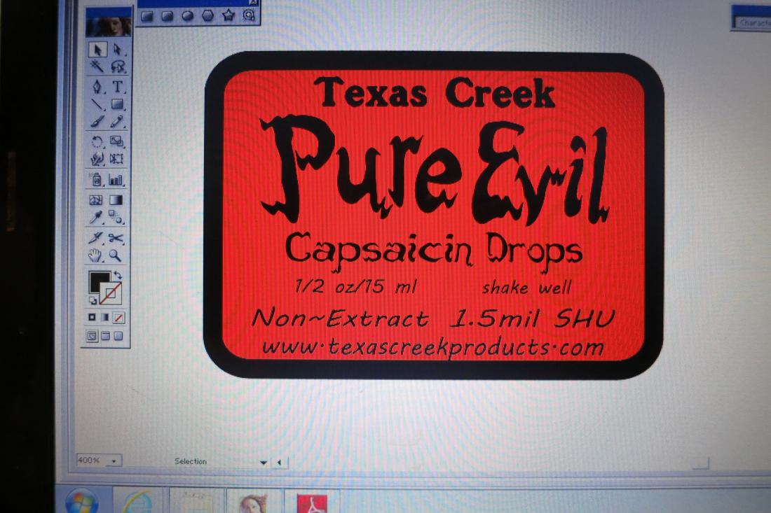
IMG_4820.JPG
 
This is the first time I've mocked up the slightly larger label with the www at the bottom.  I'm like-ing it also. 
 
I wasn't sure if the www on the side -v- on the bottom looks better, so that's what I'm posting out to y'alll.  Let me know what you think. 


Label needs to go out to print by the end of this next week.  Thanks for everyone'suggestions and please keep the comments coming.  More eyes can see things from all angles.
 
Much Appreciated!
 
I agree with the website printed on the bottom as opposed to on the side, and I also like the LARGER label! More attention grabbing/standout! 
 
Just looked at some bottle labels and the more rectangle labels (even on some square bottles) will indeed have the website listed on the side, but I find those are usually the ones I am always scanning all over them to try and find if they have one printed (and they are usually printed in VERY small font as well!). Having it up front (as long as it's not lost among the surrounding text or looks cluttered (not so from the pics here IMO)- on the front looks nice and serves its purpose. 
 
On that last thought and from a consumers standpoint- I am the type of person that always carries pen/paper with me when shopping (especially food/consumables), and will usually write down a products company name, name of product itself, or try and find a web address to look up (find more info, read reviews, etc..) before buying sometimes (especially if its pricey or something 'new'). Don't know if your products are sold 'on shelf' anywhere- but with the web address being clearly seen on the front would save others like me from having to pick up and scan the whole product looking for info to copy. (or take a photo with a phone instead of messing with paper...lol).  
 
Alchy~  I think the only place it's on the shelf is at HEAT hot sauce shop in Berkley, CA.  I was able to meet the owners at the Hot Sauce Festival in LA in July.  Really nice couple and they are active here on THP.  They know about the product and can talk with people in the shop, romance the customers.  ;) 
 
I hear what you are saying about checking out products before buying.  Pure Evil is $29.99 and $69.96, that is a chunk of change for a product people probably don't know about.  Not quite the same as risking $5-$7 on a bottle of sauce you may or may not like. 
 
 
For my other sauce labels, they are rectangular with the main label on the left side and all the other info/ingredients/www/etc on the right side with the text at 90 degrees.  So customers have to turn the bottle sideways to read the text, but all the text is going the same direction.


PS- @ geeme...:lol:  ...the Ghost Fire Hot Sauce is Painfully Addicting!  :lol:  not sure how addicting Pure Evil is.
 
Lucky Dog Hot Sauce said:
I must be missing the hilarity or "running joke". :rolleyes:
 
LOL. The dichotomy of hot sauce and romance.
 
Pure Evil - Romance Panel and googling to just get results like this - ahhh never mind... I find humor in strange places...
 
The Hot Pepper said:
 
LOL. The dichotomy of hot sauce and romance.
 
Pure Evil - Romance Panel and googling to just get results like this - ahhh never mind... I find humor in strange places...
S'all good man - i'd never heard it before taking marketing classes, but when communicating with my 1st co-packer it came up, and was a term that helped us communicate well.

As for finding humor in strange places, you're in NY - I can only imagine the places you go. :rofl:

Back on topic, but related, I think even with (or especially with) a product like Pure Evil, you have to "romance the customer - in this case, make it an informational blurb, instructional, and descriptive. When I was selling the PE in NY at the hot sauce expo, most of he questions were, "how do I use it" and "what's it for?"

SL could get out ahead of all of those with a brief romance copy blurb on the 2nd pannel. Maybe make some more sales.

Besides, evil can be very seductive - a little romance seem like a natural. ;)
 
Agreed. I think there's a market for the non-extreme chiliheads or even newbies if they just add one drop, so some romance or explanation is a good thing. How many people complain about vinegary sauce? There's an angle. Don't add Tabasco to your soup, add one drop of PE. 5 drops if you are extreme. What you have here is a dial-a-heat product.
 
Lucky Dog Hot Sauce said:
I've heard it from graphic artists, food manufacturers, and retailers. And my marketing teacher used it.

Maybe it's not an official or universal term, but i'd heard it for years. And I think it's a great description for it - it's the one place on the label where you can "romance" a customer.
Also, you apparently suck at the Google, because I searched "product label romance panel" and the 1st link talks about it:

http://jenndavid.com/converting-browsing-to-buying-keys-to-effective-packaging-design-part-3/

See "More room for romance" - the secondary panel is where the "romance copy" goes. Thus, the romance panel.
 
I totally missed this post thanks!
 
salsalady said:
OK, so ignore the bromance stuff...


which  label looks  better?
 
Hahaha SL you don't like off-topic????   ;)
 
I had a couple comments I'll post back later. Minor schtuff.
 
Is that Photoshop from the 90s? Looks like before the CS series.
 
Adobe Illustrator 10.  Circa 2003-ish.   
See What I Did There?  :lol:


I don't mind off-topics :lol:  Sometimes it's fun to just let it run, sometimes it's back o topic....
 
Last year, a stray cat showed up at our place, obviously displaced from the wildfires in our area, had a burned ear.  She's arthritic, but definitely a house cat, vet said she's about 13 years old, so I posted a FoundCat on the local SnarkBoard.  OMG!  Every other post was something snarky! 
 
 
Some of the better snarks were-
Get rid of the cat!  Cat's are decimating the songbird population (this old cat is arthritic, someone's pet, rarely goes outside, and will definitely not be catching birds)
Children are starving in Africa, you should be donating to the Childrens Fund instead of buying cat food. (OMG!  Are you freeking kidding me?  A lost cat? and I'm supposed to turn my back on it?)
:banghead:
 
Well, anyway, 4 pages later, the topic was still about the lost cat.  :D  Win!   I had about half a dozen people ask or comment later "are you the one posting about the lost cat?  What a bunch of DipSwitches! :rolleyes:
 
 
So to get back on PE topic-
I'm gonna have to seriously consider a 2nd label for the romance, at least on tins that are on the shelf.  "Dial-a-heat"....nice line!  Wonder if that can be incorporated somehow~~~
 
 
(see, I did it again!!!!  :lol:  xoxo)
:)
 
 
Definitely going to go with the larger, all horizontal label.  Thanks for everyone's comments.  I'll post when the new labels come in.
 
My comment was going to be make sure everything is centered. There are centering tools in AI but with the PE logo itself it is important to center "to the eye" instead of actual center.
 
With your Pure Evil text you have some flourishes coming off the letters. Since those are part of the font when you are centering it is using those flourishes from tip to tip but the text looks right-heavy. You want it more weighted in the center. You want to use the vertical parts of the P and l, and center to the eye, so nudge it left and center it where you think it looks right and don't use the ends of the flourishes.
 
Even regular text can be off with centering tools due to kerning and the white space around letters. Rulers can help. Built-in or even physical.
 
Check everything. Hope that helps.
 
Roger that, Boss!   and for the mock up, I did use the centering tool. 
 
I usually use the "to the eye" centering.  This was a quick mock up to snap a pic and post for input.  The letters are custom drawn, not from a font file.  I manipulate for balance, plumping up a lot of the letters, making some of the tails longer, more jagged, shrinking and stretching individual letters for balance.  I've changed the shape of a couple of the letters from the first version to the second version, partly so I can keep track of what product the customer has. 
 
The first PE labels were for 1mil PE.  After about 8 months, we upped it to 1.5milSHU and put the next version of the label on the hotter PE.  It's helped to be able to tell people what version of PE they had. 


Is there a way I can post the image out of AI instead of taking a photo of the laptop screen?
 
hmmm.... seems like I've tried that before but will post up after the final tweaking. 


sheesh, please don't pass it around that I'm tweaking......
 
An interesting thing has been happeneing, and interesting in not a good way.
 
For the last few months I've noticed the ends of the labels are not sticking down on the small dropper bottles.  It helps if I really smoosh them down, but I don't know what's happening after they get to the customer. 
IMG_4868.JPG

 
These labels are about 3 years old.  I recently had someone return a bottle because it contains alkeehawl.  (Don't Ask!  :rolleyes:)  anyway, when I opened the retured tin, the bottle didn't have a label, leading me to think it came off the bottle.
 
Ok, THAT's not good!
 
Discussion with the printer reveals that they guarantee the labels for a year, but after that, the adhesive can get dry, in some climates the humidity will do a number.
 
So the end result is that, even though I have about 500 more of those labels, I'm going to order up some more, and work in the changes like on the other PE.
 
Let me know what you think, anything need tweaking?  The printer will adjust the black border so it will be narrower on the label.  The die cut or whatever...
IMG_4866.JPG


www looks dated when listing a domain name.

Think about all the ads you see for websites or products. It looks more modern to drop it.

texascreekproducts.com
 
PS- boss, I've been trying to SaveForWeb, but can't find where it's saved at????  Does it go to downloads or something?  Every other Save goes into the Folder.
 
Back
Top