labels Pure Evil label #2 update

salsalady

eXtreme Business
EDIT- added another label on Pg2-
 
It's time for more Pure Evil labels. 
 
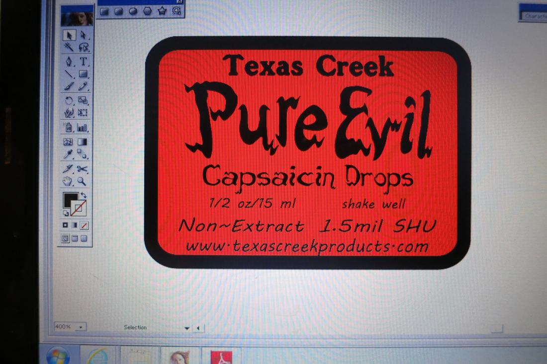
This is the label that goes on the metal tin.  I've removed the words "food additive", kept "non-extract", should it say "1.5mil SHU"?  Any other comments?
 
View attachment PE2015 front copy.pdf
 
Hopefully the pdf will show, if not, please hang tight while I edit. 
Hmmm, BRB with a picture~~~
 
OK- here's a picture of the label in Adobe.  Let me know what you think~
IMG_4820.JPG
 
Really? no WWW. ?
 
and this didn't get mentioned on the other label that I just put in for printing!!!!!
 
I can probably catch them Monday.
 
I'm happy to update, I was just commenting that it didn't get mentioned on the other label.  No Worries.


Side bonus from these old labels is that I have some labels with a little bit romance on them that I could apply to the back of the tin.
 
I've been using some of the old front labels (no addy, ingrediients, etc) on shipping boxes.  It puts the Pure Evil label/logo out there for every mailperson to see.  Wonder how many orders I might be getting from that market?  :lol:
or maybe not as the old labels say 'food additive'..
 
At least your not printing up huge 'Caution/Warning... Skull & Cross bones... Toxic/Potentially Harmful Contents... etc...) labels and plastering them allover the box!!! I once received a shipment or 2 like that from a (well intentioned) seller of some raw materials to measure out and make your own fertilizer. The ingredients were not the safest if inhaled, rubbed in your eyes and the norms that one would think would be at least common sense not to do when exposed to raw/pure chemical materials- but he went a bit overboard I suppose just to (potentially) cover his backside if someone ended up getting hurt. If something is actually dangerous, that's what Hazmat is for! It's scary enough if you actually ever get something with Hazmat labeling all over it! (now add to that a skull sticker! :eek: ) I'm sure the mail carriers are used to delivering them, but as the recipient...the first time you get said package, you are quite self-conscious of what you think others may think you are up to (like a tweaking Washington meth cook! :D .... or especially in this age of 'terror'...anything could be seen as potential or probable bomb making essentials. You think 'Yeah, I'm probably on some watch list now, I've been reported for sure!')
 
I like the idea of the stickers on the box- might even make the mail carriers handle them more 'gently' (how they are supposed to handle all packages already!!) Just don't mock up any Radioactive stickers or big bold labels with the words 'Burn' or such... all then is good.  ;)
 
I agree also with the dropping the WWW- that totally slipped past me, I was more focused on the overall look of proportions of the fonts/sizes without actually targeting what was specifically printed. Outdated 'these' days indeed, but certainly still used- still seen on tons of packaging!
 
Looking forward to the final product all stickered up and spiffy!
 
Thanks for your comments Alchy~
 
 
I gotta post to the printer to remove the outdated wwwwwweww.w.w.w..w...www...w
Just posted the "hold the presses" for the label to the printer, it really wasn't quite on the way to the presses YET....but soon...
 
As it turns out, the printer doesn't have the 1.625x2.000 label as a die cut for the label material needed, but they do have a 1.75x2.00 and some other sizes.... so I kinda get a Hall Pass for making changes on the label.   
 
So now I have to go back and re-configure the labels to include that extra .10".   :banghhead:
 
 
:lol:
 
Thanks for y'alls comments,  I'm happy with the (as the printer rep put it...) "sans www" look. 


sheesh... just thinking about the last 3 runs of labels that have www. on them.  Oh Well!   I'm think the next big investment might be for 48,000 pre-printed salsa tubs. 
 
Yea, that's a mind blower.  96 cases of tubs and 96 cases of lids...........Where are they gonna be stored????????  How many square feet does that actually take up???
 
QUICK QUESTION!
 
In getting rid of the www. now it all looks run together.
 
 
texascreekproducts.com
 
I can manipulate the letters so there's about 1/2 of a space between the words, but it doesn't look like fully separate words.  But visually, it gives just a tiny break
 
texas creek products.com
 
The above example has a full space as I'm just using the fonts here on THP.  But what do you think?  Yes for a break between the words?  No, run them all together?
 
Here's another fuzzy picture of the computer screen
IMG_4872.JPG
 
Run together it's normal for a domain name. It was the same spacing as before right? So losing the www didn't mash it up. ;)
 
You know how people read hashtags... with all those damn words, don't worry, today's eyes can read it.
 
just checking if the small separation might just make it a little more easier to quickly read and remember.  I don't ###, but they post a lot of # on the news and such and sometimes I have to take a minute to figure out what the #words are. 
The Pure Evil market generally is tech-savvy and social media involved people, so I guess I needn't worry about my antiquated eyes. 
 
Looks odd with spacing.
 
You can always do TexasCreekProducts.com if you are really worried about it, but I wouldn't.
 
OK- Here's the 2 labels side by side, there are some differences, so let me know which looks better and I'll make both the same.  4 things to look at, let me know if you see something else....
(The one on the LEFT is for teh outside of the tin, the one on the RIGHT is for the bottle, has ingredients and addy stuff)
 
  • web addy- one label is the full width of the line above, the other is smaller. 
  • Non Extract- Caps or No Caps
  • Dash- one has a straight dash (I like that one better) the other has a bent dash that looks mor like a ~
  • 1.5mil SHU on the tin, not on the bottle
IMG_4873.JPG
 
Opinions as per request:
 
The web addy: As you mentioned in an above post about the web address looking squashed/run together... I'd go for label #1 rather than #2 in regard as to that specific visual aspect. I like how after the 'Capsaicin Drops' line (then space) the next lines descend in an inverted triangle/pyramid shape and give space on the sides that make it easier to read. The second label with the more 'block/vertical' alignment appears (to my eyes) a bit more squashed together. But this all depends on if you add the 1.5mil to the label (if not- then #2 label I'd choose. If possible put more space in label #2 between 'Capsaicin Drops' and 'Non-Extract' like in label #1)
 
I would capitalize 'Non-Extract'- looks more professional and more consistent with the other words (above it) on the label.
 
Straight dash!!
 
And I would keep the 1.5mil on the label. I think it just fits with the product itself... being a product specifically Capsaicin related... to have a definite printed number seems to complement perfectly! Like '2 peas in a pod'. The consumer knows the product is hot, you tell them how hot!  :P
 
And one thing you didn't mention that I see- the corners (one rounded/one straight edged). I would go with whatever is consistent with the packaging it goes on itself. If it's a round/tubular tin- go rounded edges... an angular box- go straight edges. That's my take on the container/tin component. This of course is not 'law' by any means with the product bottle itself (For example- hot sauce bottles... I've seen both rounded and straight edge labels on bottles. Many use non-round edges and it looks great!) So how you have them (1 rounded/ 1 straight) may just be 'perfect', or if you wish to continue the 'same-as' theme... perhaps pick one for both labels.
 
:party:
 
Thanks for the comments, Alchy~
 
Both labels will have the rounded corners. 
 
The Right label is shorter height-wise, and the left one will be 1/8th inch taller than the previous version.  I used the same Pure Evil logo on both but scale is smaller on the right one.  I'm not sure I can get that line of space between Cap Drops and Non-Extract/1.5mil, but I'll see what can be done.
 
I like your comment about the inverted V for the bottom 3 lines.  That does look better than the more blocky right label. 
 
Next version-
IMG_4874.JPG


The Hot Pepper said:
Methow screenshot - use digital camera to take pic of screen lol!!!!
 
SL... "Print screen" "paste" or... save as a jpeg. ;)
 
:rofl: :rofl: :rofl: 
 
this goes right up there with folks at the farmers market who blow on the taster to "cool down" the next sample of sauce they're about to taste. 
 
:rofl: 
Ps - you can also do Alt+PrtScn to get just the active window (e.g. click on the window = active = highlighted top bar) 
That way we're all spared from seeing the Magic Mike wallpaper I'm sure you have on your 'puter. 
:D
 
Hey Now...quit dissing on the Methow Screen Shot!  
 
Half the valley still uses smoke signals to communicate~


2015 PE Snip.JPG

 
This snip ain't much better!
 
try it as a gif-
2015 PE Snip gif.GIF


HEY!!!! it worked!!!!!!!!!

Final Question....unless someone sees something else....
 
Look at the letter alignment on the non-extract lines.  On the right, the letters are aligned across the bottom, on the left they are more...random?...freeform?...not sure the word I'm looking for, but I'm sure y'all can figure it out.
PE Snip gif2.GIF


I kind of like the free form on left. 
 
I agree on the spacing for the website. Some people  aren't savvy enough to realize they type the address with no spaces. Though I also agree it makes it easier to read. Since web pages aren't case sensitive you could always separate the words by putting each starting letter in caps. Though that may irritate some grammar nazis TexasCreekProducts.com
 
Back
Top