labels Pure Evil label #2 update

salsalady

eXtreme Business
EDIT- added another label on Pg2-
 
It's time for more Pure Evil labels. 
 
This is the label that goes on the metal tin.  I've removed the words "food additive", kept "non-extract", should it say "1.5mil SHU"?  Any other comments?
 
View attachment PE2015 front copy.pdf
 
Hopefully the pdf will show, if not, please hang tight while I edit. 
Hmmm, BRB with a picture~~~
 
OK- here's a picture of the label in Adobe.  Let me know what you think~
IMG_4820.JPG
 
I agree to keep them (non-extract and 1.5mil SHU) printed on the label- just so you could always claim 'You were warned!'  :P  Some of course would see it as a 'challenge', but hopefully it would properly act as a deterrent for anyone who may have any ideas to use it in any non-recommended ways. Seeing it actually printed and in hand- make you think twice!
 
Really need some of that for Fall/Winter pots of Chili... stay warm!  :twisted:
 
I like the changes - "food additive", while literal, is unappealing as the general public has been trained that "additives = bad" (no additives, preservatives, etc)

Have you considered a romance label though to convey uses? I think that would really help.
 
Lucky Dog Hot Sauce said:
I like the changes - "food additive", while literal, is unappealing as the general public has been trained that "additives = bad" (no additives, preservatives, etc)
 
Agree, I told her that once in PM.
 
Lucky Dog Hot Sauce said:
Have you considered a romance label though to convey uses? I think that would really help.
 
I find this term hilarious. I googled "romance panel" once and found nothing accept links to this site, and a panel of romance authors lol. I know you used it first, and this may be the longest running joke in THP history as you even got other saucemakers to adopt it. :lol:
 
But I imagine it's someone's pet term you picked up possibly? Or a professor's?
 
Thanks for the comments, everyone!
 
 
Alchymystic said:
I agree to keep them (non-extract and 1.5mil SHU) printed on the label- just so you could always claim 'You were warned!'  :P  Some of course would see it as a 'challenge', but hopefully it would properly act as a deterrent for anyone who may have any ideas to use it in any non-recommended ways. Seeing it actually printed and in hand- make you think twice!
 
Really need some of that for Fall/Winter pots of Chili... stay warm!  :twisted:
Alchy~ every bottle has a page rubberbanded around it that says "really hot, do't misuse, keep away from children and idiots."  Doesn't help!  :rolleyes: 
 
They still do Stoopit Human tricks.  :lol:
 
And even with the descriptions, people still think they are eating 15mil SHU drops!  :banghead:


Lucky Dog Hot Sauce said:
I like the changes - "food additive", while literal, is unappealing as the general public has been trained that "additives = bad" (no additives, preservatives, etc)

Have you considered a romance label though to convey uses? I think that would really help.
 
I'm not sure about a romance panel on the tin label.  The bottle label has a small bit and there's the page that comes with it that has a couple paragraphs of "romance".  Right now, there are 2 online stores that carry Pure Evil (HEAT Hot Sauce and Firehouse Pantry).  There's my Texas Creek website and the Amazon listing.  All of those have descriptions/romance in the listings.  HEAT also has Pure Evil in their Berkley store, where they can talk about it directly with the customers. 
 
I kinda like the front label as is, but maybe I could look at a second label on the back with the romance.   It's up for discussion, though, if someone can make a case for adding description to the front or another label on the back of the tin.  Right now I feel like all I do is add sticker/label/sticker/label....


The Hot Pepper said:
 
Agree, I told her that once in PM.
 
I find this term hilarious. I googled "romance panel" once and found nothing accept links to this site, and a panel of romance authors lol. I know you used it first, and this may be the longest running joke in THP history as you even got other saucemakers to adopt it. :lol:
 
But I imagine it's someone's pet term you picked up possibly? Or a professor's?
True Dat!  It only took about 3 years to use up that run of labels and get to the point of ordering more. :lol:  Unfortunatley I have about 3000 labels for 9.6 that still have "food additive". 
 
The negative connotations of "food additive" are why I took it out.  I originally had it on there to make sure people knew it was intended to be ADDED to things, not eaten straight.  Didn't even think about food additives as bad things.  Course, noone pays attention to the Intended Uses and they still do straight drops. 


I wasn't sure about adding "1.5mil SHU" but I figure Pure Evil's market customers will know what SHU's are or will at least be interested enough to look it up.  If they don't know what an SHU is the prolly shouldn't be buying it.  :lol:
 
Also, Pure Evil 9.6 has "9.6 million SHU" right on the label so I thought putting 1.5mil on the original would tie the line together.  Actually, now that I just looked at the other label, should it say "1.5 million SHU" or is "1.5mil SHU" OK?
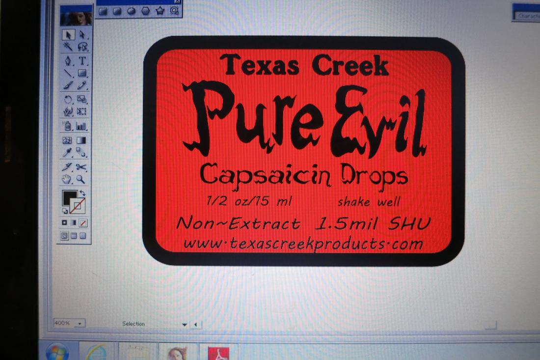
 
I'd just go ahead and write out the full 'million' rather than 1.5mil. Sure there are some dunderheads that would think 1.5 milliliters or something. Lol. If you have the label space, using a full word or terminology does come off more 'professional' rather than using shorthand. Leave the SHU as is (no need for Scoville Heat Units to be worded in full...might could add a descriptive definition to a small paper printout or such to include with each order telling what it means perhaps.) But yeah, I would think (I hope) that anyone who would buy would at least know what SHU is!!!  :rolleyes:  ;)
 
Here's some more pics of the existing labels, etc.
 
Original 1.5mil
BSSStudios PE 2014 - Copy.jpg

 
IMG_4823.JPG

 
IMG_4824.JPG

 
IMG_4825.JPG


The 9.6mil
IMG_4822.JPG

 
IMG_4821.JPG

 
brs3.jpg


Now after looking at all these....I'm more dissatisfied with the Food Additive on everything.

AND!!!!!   the 9.6 has the ingredients on the label on the outer tin.  Original doesn't. 
 
 
Hmmmm, more inconsistencies than I was aware of. 
 
Alchymyst, thanks for the comments.  I don't have anything on the info sheet about SHU, maybe should look at that.  Let me work on the label and post a photo of the screen.  :lol:
 
2 versios using 'million"  One with the www on the bottom, one wiht it on the side. 
 
The side version almost seems less cluttered.  I can change the size of the label to keep it all on the front panel ad make it square instead of rectangular.
 
BRB with that one~
IMG_4827.JPG

 
IMG_4828.JPG


Another version/comparison.  The original size label and a slightly larger one.  Looking for balance, clarity, y'all know, what looks good?  what should be larger, what should be the focus?
 
IMG_4829.JPG


The Hot Pepper said:
 
But I imagine it's someone's pet term you picked up possibly? Or a professor's?
I've heard it from graphic artists, food manufacturers, and retailers. And my marketing teacher used it.

Maybe it's not an official or universal term, but i'd heard it for years. And I think it's a great description for it - it's the one place on the label where you can "romance" a customer.
Also, you apparently suck at the Google, because I searched "product label romance panel" and the 1st link talks about it:

http://jenndavid.com/converting-browsing-to-buying-keys-to-effective-packaging-design-part-3/

See "More room for romance" - the secondary panel is where the "romance copy" goes. Thus, the romance panel.
 
OK, so ignore the bromance stuff...


which  label looks  better?
 
That's what I'm asking about,  If I need to post better pictures of the labels let me know. 
 
Positioning the www at the bottom looks better, or off to the side...let me know with comments.


salsalady said:
That's what I'm asking about,  If I need to post better pictures of the labels let me know. 
 
Positioning the www at the bottom looks better, or off to the side...let me know with comments.
 
And that's what I'm saying - I think it looks better at the bottom.

When all the text is going in the same dorection it is more aesthetically pleasing, in my opinion.

When you have the website on the side like that I find it to be cluttered looking.

My $.02
Ps - I prefer the larger label as well.
 
Back
Top