Our 3rd product line will be a Bavarian influenced, mustard based BBQ sauce (mustard/habanero) with a medium heat at max.
This bottle I chose was the exact same height as the 5oz woozy bottle, but fatter. Same look, but wider. It's called a Stout bottle, and apparently are only made twice a year and are a tad more expensive, but I love the look.

This was chosen over the standard glass/pet decanter style, or the lanky ringneck bottles that I've been seeing everywhere primarily for these reasons:
This allows for 4 'panels' across the label itself:
Is putting a recipe on a label considered a waste of space? Tacky? Gimicky? Should I instead do more back-story on the Bavarian influence on South Carolina's BBQ? What would be the best use of a 3.25 x 2.25"W section on the right side of a label (see dimensions above)
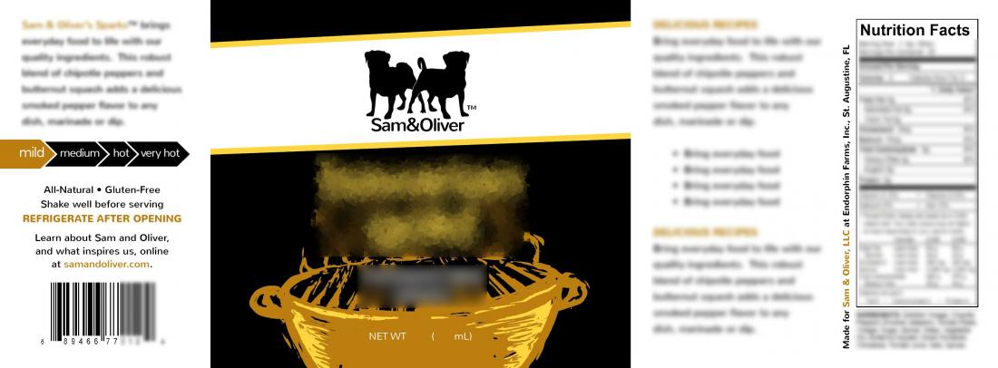
Here's an early mock of the label so you can see the width easier, not necessarily the exact design yet, but wanted to show where the panels were:

This bottle I chose was the exact same height as the 5oz woozy bottle, but fatter. Same look, but wider. It's called a Stout bottle, and apparently are only made twice a year and are a tad more expensive, but I love the look.

This was chosen over the standard glass/pet decanter style, or the lanky ringneck bottles that I've been seeing everywhere primarily for these reasons:
- Same overall neck and shoulder look as the woozy but 3" wide
- Same height as the 5oz woozy (7" tall), so labels line up on a shelf
- Cost is only about 5 cents more per bottle, but production is limited
This allows for 4 'panels' across the label itself:
- Left Panel - Romance Panel, Heat Index, UPC 1-3/4" wide
- Front Panel - Product Logo/Artwork - 3" wide
- Right Panel - Additional serving suggestions / recipes - 2-1/4" wide
- Back Panel - Nutritional info / ingredients 1-1/2" wide
Is putting a recipe on a label considered a waste of space? Tacky? Gimicky? Should I instead do more back-story on the Bavarian influence on South Carolina's BBQ? What would be the best use of a 3.25 x 2.25"W section on the right side of a label (see dimensions above)
Here's an early mock of the label so you can see the width easier, not necessarily the exact design yet, but wanted to show where the panels were:

