You are using an out of date browser. It may not display this or other websites correctly.
You should upgrade or use an alternative browser.
You should upgrade or use an alternative browser.
misc Rough draft
- Thread starter DevilDuck
- Start date
QuadShotz
Banned
Looking great DD!
That concept UB came up with is sweet..gotta love canadians with photoshop skills.
(I was born in London, ONT. jus in case ya wonder..)
If you need any help, I got time and have been using Photoshop since v3.
Been awhile since I did commercial work, but I'm one of the artists over at dslreports.com graphics forum and regularly help folks out.
I also know a lots of links for public-domain clipart and fonts, etc.
Here's one I like for starters: http://www.wpclipart.com/index.html
I also run a reseller webserver and have 10yrs of experience in web work in case you have the need/help.
Anything for a brother chilehead, eh?
-Q
Hey DD,
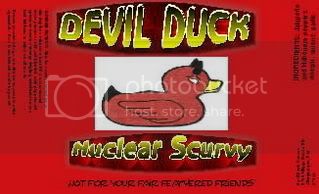
For the nuclear scurvy, could you whiten out the duck, more like your avatar, and turn the duck's eyes fluorescent green? Something really vibrant, so they kinda pull you into the bottle? Just a thought..
For the nuclear scurvy, could you whiten out the duck, more like your avatar, and turn the duck's eyes fluorescent green? Something really vibrant, so they kinda pull you into the bottle? Just a thought..
DevilDuck said:The program mrpepper told me about is awesome and really easy to use.
http://www.thelogocreator.com/MegaPak.htm
I'm just using the free version, but I plan on getting something a little more versatile from them soon.
Didn't you win some contest on the hot sauce blog to rebrand your company? I'm sure it was you. I could be wrong.
What ever happened with that? I'm assuming nothing because you're still coming up with your own designs.
I like what I see though.
Any idea when your product will come to market?
DevilDuck said:Yeah, that didn't work out so well for me.
As for getting to market? Not sure. Money is tight right now, and it takes some substantial cash to get off the ground.
If I'm lucky, this year...sometime.
How so, not work out? I thought that would have been an awesome opportunity.
Did they trash all of your ideas? That happened my uncle when he hired a company to rebrand.
Ok...my 60 days are up. This stays on this website, ok?
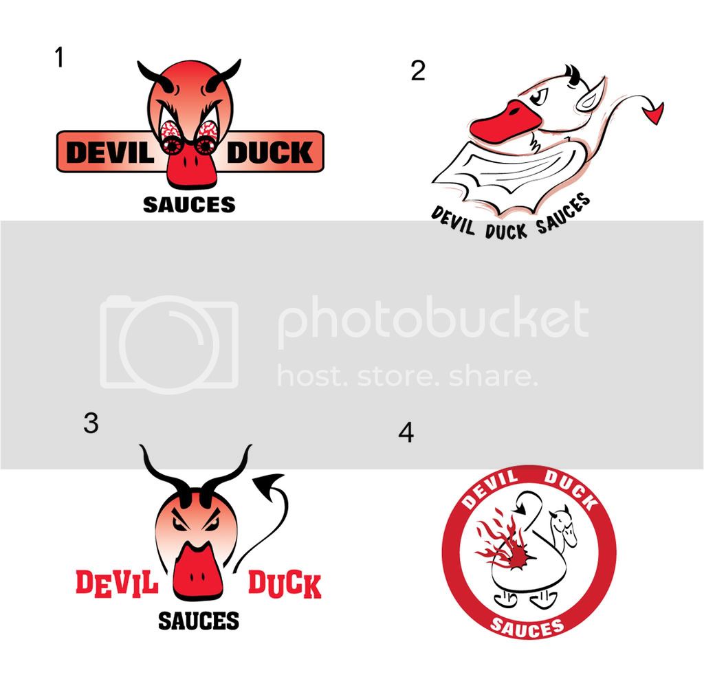
First of all, I asked her for something 1/2 way serious and not too cartoony. Definitely NOTHING with a flaming ass, or the like. This is what I got:
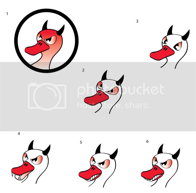
Then, after a BIG sigh and several e-mails back and forth...even a 30 minute phone call to Canada on my dime, I asked about trying to give a more 3-D view with a snarl and less cartoony. This is what I got:
So, now you can see why I just gave up on that and went back to doing my own thing. She was also pretty much telling me what I needed and disregarding the images I was looking for. I have never been more disappointed. I guess it's a good thing I won. I sure wouldn't pay for something like that.
First of all, I asked her for something 1/2 way serious and not too cartoony. Definitely NOTHING with a flaming ass, or the like. This is what I got:

Then, after a BIG sigh and several e-mails back and forth...even a 30 minute phone call to Canada on my dime, I asked about trying to give a more 3-D view with a snarl and less cartoony. This is what I got:

So, now you can see why I just gave up on that and went back to doing my own thing. She was also pretty much telling me what I needed and disregarding the images I was looking for. I have never been more disappointed. I guess it's a good thing I won. I sure wouldn't pay for something like that.
OH NOOOOOO
Dude, my wife just mentioned how hard it may be to use your own images in a screen print sense, but OMFG that other stuff is pretty bad.
Some of the best design ideas come from 4 yr olds. They also make good testing panels.
Ask a youngster what they think of Chuppa Chup labels.
BTW they were designed by Dali.
Wow, those suck. This is from a "professional" designer? From Canada? I apologize, our quality of work is usually much better than that. LOL!
Hmmm, sometimes I guess it's true, you get what you pay for.
I like your original design waaaayyy better. Go with that.
Maybe get that artist guy who did the cool duck to convert his image to curves or maybe someone on here that can do it in Abobe Illustrator could do it.
That would make it easier for printing.
Wow, those really suck.
Well, yeah.
The good thing about the program I'm using, it that it seems to be Vector based. I can save the image to any size I want in damn near any format I want. Printing a t-shirt or a banner shouldn't be a problem at all. I still need to do some work on the ones I posted (blending edges, more opaque in areas...) but, I can use those.
I'm actually thinking about dropping the colored backgrounds as well. I think doing that will clean things up a little.
DevilDuck said:Well, yeah.
The good thing about the program I'm using, it that it seems to be Vector based. I can save the image to any size I want in damn near any format I want. Printing a t-shirt or a banner shouldn't be a problem at all. I still need to do some work on the ones I posted (blending edges, more opaque in areas...) but, I can use those.
I'm actually thinking about dropping the colored backgrounds as well. I think doing that will clean things up a little.
Just keep in the direction you're going. My brother and sister like what you've done. She's in marketing and thinks the new designs are crap and look like someone's 4 year old drew them.
My brother just thinks it's cool. But he's 17, so anything evil looking is "cool".
i like the dropping the background color idea, let the sauce color the lable and have your cool graphics on their background. nice to see a sauce
That's why you go for 4-color press on labels....but ya, screen printed shirts are right out.ring sting said:Dude, my wife just mentioned how hard it may be to use your own images in a screen print sense, but OMFG that other stuff is pretty bad.
Tell me about it! I do graphic design too and those look like someone who has just started messing around with Illustrator.Omri said:Don't wanna be mean, but that's so unprofessional. :
I'm actually thinking about dropping the colored backgrounds as well. I think doing that will clean things up a little.
i like the dropping the background color idea, let the sauce color the lable and have your cool graphics on their background. nice to see a sauce
Could your labels be printed on a clear plastic label? so the sauce is the background? Is this what you mean TPP? That might look real good.

