labels Sam & Oliver Stoke chipotle adobo sauce label critique

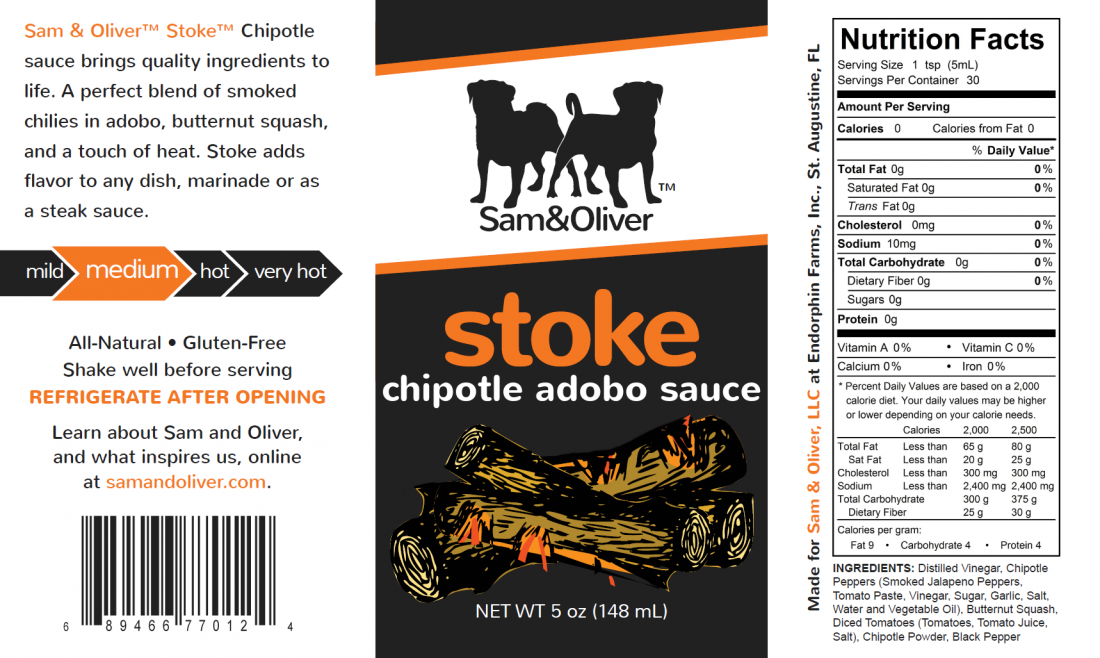
Looking for critique and feedback for my 2nd line of sauces being produced very soon... Stoke Chipotle adobo sauce
 
After crowd sourcing the first 2 names in a contest, I had to settle on Stoke since Smokin' and Ember were both taken... so Stoke it is.
 
stoke1.png

 
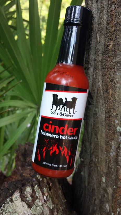
The bottle layout is for a 5oz glass woozy, black top with black shrink band.  The designer and I thought we should keep the same motif and layout design, with Stoke's heat ringing in at a medium level on the heat index.  It will look similar to this, printed on a 3.25 x 5.5" rounded-corner rectangular label in gloss with over-laminate
 
sam bottle.jpg

 
Thoughts on the design?
 
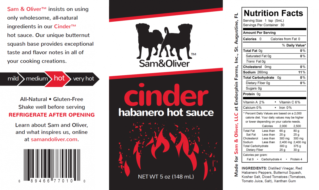
Here's Cinder for reference:
 
cinder1.png


Edit: now with less "WTF happened?" on the cinder label
 
Will have an updated label tomorrow.  chi'dobo just doesn't look right on the label, as fun as it is to say outloud.
 
I went back to stoke
 
a few nips, a few tucks and a few more Bob Ross moments later... and I should be all set.
 
Now to find names for my adobo seasoning, chipotle seasoning, buffalo wing seasoning, carolina "gold" style bbq, blackstrap rib, peanut butter wing and Mind Flay :)
 
Sam & Oliver said:
 
Now to find names for my adobo seasoning, chipotle seasoning, buffalo wing seasoning, carolina "gold" style bbq, blackstrap rib, peanut butter wing and Mind Flay :)
:banghead:
 
I'm gonna need another couple boxen of wine for that!
 
Looking good!
 
The heat levels seem to be riding a bit high and are not vertically centered except medium.
 
Sam & Oilver(tm) Stoke(tm)... ahhhh! We get it. These are your trademarks. Comes across as paranoia, why does the consumer need to know this in the description? Especially since they are not (r) registered as trademarks. They are TMs to you. Sorry, it's info we don't need. It's already assumed and implied.
 
The description is not great. Of course smoked peppers add smoked pepper flavor. And throw a comma after squash.
 
Could be rewarded overall. "Brings quality ingredients to life." Bah! Sounds like GE or something, not food. Wakens your tastebuds? Maybe. But the ingredients should not be living lol.


when i centered the heat index vertical it looks wrong. one monemnt for me to screen shot it

i apologize here is the correct one

i'll work on the romance panel. i tried to keep it similar to cinder with the intro. eventually it will be a registered trademark
 

Attachments

  • IMG_7431.PNG
    IMG_7431.PNG
    470.6 KB · Views: 88
Now medium looks off too lol.
 
The orange medium one is the first pic looks correct.
 
The black popped way more! I see you went grey. It doesn't jump out. Also there's weird squigglies you see now.

I still say the heat levels ride high, looks like medium is about 2 pixels high and the rest, 1. The end of the arrow should be the vertical center of the lowercase letters that don't extend up. In other words, it should line up with the center of the "o," or they might go even lower to be balanced to the eye. Sometimes you've got to center "to the eye" instead of trying to be correct. Some things will look off.

Just what I see!

Overall looks good and fits your brand.
 
If STOKE is TM, shouldn't it have a TM on the front panel also?  Fat Cat and Torchbearer both have "R" or "TM" on the front panel but not on the sides or address.  Having "TM" on the side seems to clutter it up.  :shrug: 
 
 
MEDIUM still looks out of alignment to me also.  Very Nit-Picky, yes, but that's what makes a great label when it's all said and done.  Overall, nice looking label that maintains the look of the Cinder sauce label.  It'll make a nice looking product line up when they're all done. 
 
The Hot Pepper said:
Sam & Oilver(tm) Stoke(tm)... ahhhh! We get it. These are your trademarks. Comes across as paranoia, why does the consumer need to know this in the description? Especially since they are not (r) registered as trademarks. They are TMs to you. Sorry, it's info we don't need. It's already assumed and implied.
SL we agree again!

Can you see if there is any ice forming down below?
 
(tm) means you consider this your trademark, but it is not registered. Anyone can put it after whatever they want unless it is registered by someone. To me it looks amateurish. And putting it all over looks a bit paranoid. No legal bearing. Just a "Hey this is my trademark, I haven't registered it yet, but just letting you know to stay away." Once you "trade" under a "mark" it is an implied mark, whether you put the (tm) or not. If someone begins using it after you, you have the same chances in fighting it whether you put the letters there or not, because it is not registered. If it is that important to you, like SL says, pick a spot, don't put it every time you mention it.

Even if it's the (r), pick a spot! Clutter! ;)
 
The Hot Pepper said:
The black popped way more! I see you went grey. It doesn't jump out. Also there's weird squigglies you see now.

I still say the heat levels ride high, looks like medium is about 2 pixels high and the rest, 1. The end of the arrow should be the vertical center of the lowercase letters that don't extend up. In other words, it should line up with the center of the "o," or they might go even lower to be balanced to the eye. Sometimes you've got to center "to the eye" instead of trying to be correct. Some things will look off.

Just what I see!

Overall looks good and fits your brand.
 
It's a 2 color print.  I have to buy a plate of Pantone 151, and solid black.  The background is all black, you shouldn't see any squiggly lines off the press.
 
As for the TMs, i simply followed what I did with Cinder.  I'll take the TM off the first word of the romance panel, but I didn't want a TM after stoke on the front panel.
 
Hmm...I didn't use the "r" symbol on my labels - yet both LDHS & Food's Best Friend are registered TMs.

Do I have to clutter my label with those? It does look weird on the front panel. Maybe I'll start putting them on the side of the bottle...hmmm
 
:whew:!   Glad that ones done!
 
How long do we have before those next proofs come out? 
 
 
:lol:  Just kidding, Jeff....... You know we're here to help~~~where else can a person spout of criticisms and get told "Thank You"?  :lol:
 
I love this process and I never comment after it's on the bottles of the products unless I see an error. I figure they've made their mind up and considered our suggestions but stuck to their guns in other areas. I remember back with LDHS' labels, he went to print and I noticed one flaw in the horseshoe and I PMed him, and he knew about it. Fixed now I'm sure. But I love this process, and I also love seeing the finished product, so don't be afraid to post it!!! LOL!!! :) For peace of mind, you may want to wait until it's on the bottle as I am sure you are doing. 
 
Back
Top