-
✅ Expert and friendly hot pepper grow advice.
✅ The latest information on hot pepper varieties.
✅ Reliable seed trading.
✅ Hot sauce recipes and food safety guidance.
✅ Hot sauce business tips for startups.
🌶️ And more!
It's all here, at The Hot Pepper! The Internet's original hot pepper community! Est. 2004.
You are using an out of date browser. It may not display this or other websites correctly.
You should upgrade or use an alternative browser.
You should upgrade or use an alternative browser.
labels-artwork Ol Man Stillmanz new labels finally done lol
- Thread starter stillmanz
- Start date
stillmanz said: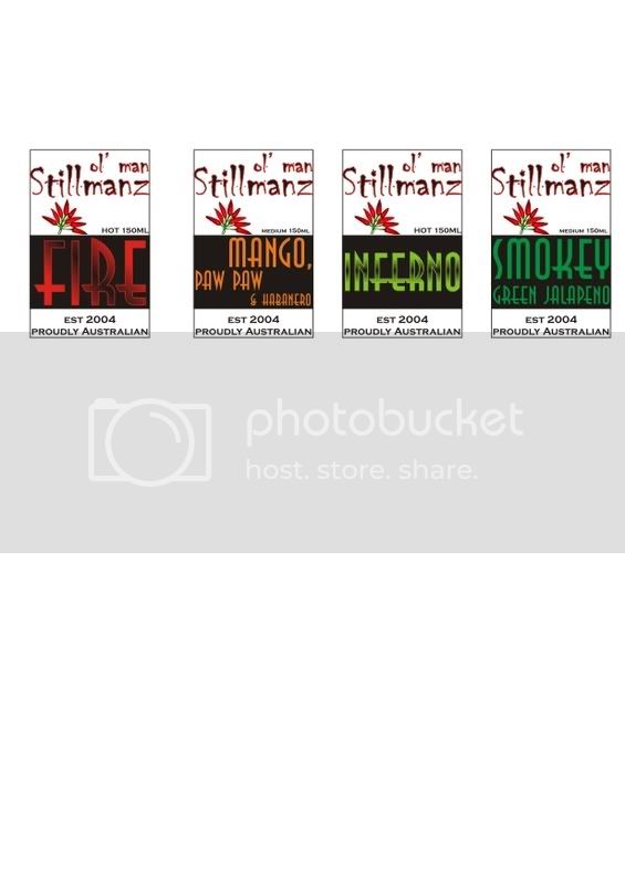
They are similiar to the old ones but we have attemped to pull them into more of a recognisable range. We wanted a clean basic design and I think we got that.
Still haven't finished the Texas pequin, the devils tongue jerk sauce or the wild naga sauces yet...
Mick
They look real good Mick, fine job.
I've seen the Chiller font used a lot but looking good.
Interesting you pointed out the chiller font we always have used it from the begining, and the wife who designs the labels, absolutely hates it says its hard to work with etc but I really like it and for me its the font for my branding it fits for were I want my sauce to be and portray, I think she's done well. I like it... clean and uncluttered but still with some peronality.
I like the font too! And I don't think I've seen it on hot sauce so it's still original, I think I've seen it used on horror film sites, etc.stillmanz said:Interesting you pointed out the chiller font we always have used it from the begining, and the wife who designs the labels, absolutely hates it says its hard to work with etc but I really like it and for me its the font for my branding it fits for were I want my sauce to be and portray, I think she's done well. I like it... clean and uncluttered but still with some peronality.
i like it alot... you did achieve the clean look... simple is the way to go... i cant stand busy labels... although i must say, your lables for the signature series and superhots are even better... my favourites being the Texas Pequin, Devils Tounge, and Trinidad Scorpion...clean and attractive...