labels Sam&Oliver sauce company - sample label, bottle render soon

Previously on TheHotPepper.com
 
photo-thumb-7830.jpg
 "Should I just start over?" 
photo-thumb-2.jpg
 "There has to be a point where you stop taking advice and roll with what you like."
 
photo-thumb-7830.jpg
 "It's the pride of trying to do everything yourself..."
  
photo-5768.jpg
 
"...if you have a vision you want to achieve, hiring an artist can be a great way to go..."
 
--------------------- 8< *snip*
 
So here's the product design that the marketing firm and I settled on after discussing our company vision and direction.  Aside from minor edits (I see a few even now) I wanted a product packaging that would appeal to a broad general population audience from young to mature, with a bold look that could be easily identified and used by back-yard-grillers to sandwich shops to restaurant tables without losing it's charm.
 
Sam&Oliver is committed to only using the best wholesome ingredients to create healthy and fun condiments for anyone who wants to enjoy them with their food creations, and as such the packaging should also reflect this ideal with a clean label.
 
Sample Label:
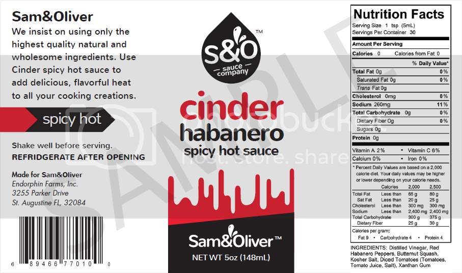
 
samandoliverlabel-v42_zpsd4a97b34.png

 
Bottle Render by the design firm:  Finished product will use black caps and a black tamper-evident shrink band:

(coming soon)
 
Here's the Brand:
 
snologo_zps70090023.png

 
and
 
snologo2_zpscee79993.png

 
Colors used for the logo:
 
snocolors_zps9f4a3443.png

 
So that's what I've been doing for the last few weeks.  Once this is finalized I can start my Kickstarter, and then look into production, then product liability insurance and trying to figure out how to actually sell and/or ship the stuff for a fair price.
 
Kalitarios, if the dogs' beards are grey, I'm afraid to ask about your hair color now!  :lol: 


We (all of us here on the THP forum, including you) have been through this with Ken's Pepper Works, LDHS, Matanzima, Feisty Parrot, Gemini Crow....and a few others and we truly have the best interest of the sauce maker at heart.  I think most people like the new look.  Minor details of the Heat Scale, and the delineation Drippy stuff (make it a shallow chevron or shallow wavy line...whatever...it's a minor detail in the bigger picture...), that can be worked out without emotion.
 
Everyone seems to feel like mixing S&O with Sam&Olivers on the label and on other promo materials is a mistake.  Sam & Olivers (whether you bring the dogs into the label or not) is a good, catchy, roll off the tongue name.  You will be explaining who Sammy and Ollie are....but...that's your choice.  I like the black silhouettes of the dogs with the words over top.  But mixing S&O with Sam&Oliver's.......that seems to be the huge sticking point with this logo/brand/etc for most people....


I'll take a pic tomorrow of my product line labels and let y'all have some comments about it.  I know what the issues are, and my stuff has evolved over almost 20 years.  Hopefully it will help you look at things with a long term vision.  I wish I'd had this forum back in 2003~~~  It would of saved me some $$$...


Side note- SalsaKid has been helping making salsa and labeling, but he neglected to mention to me he pulled the last batch of salsa labels out of the box.  Last Wednesday, we made another batch of salsa and I found out I had 43 labels left.  OH, CRAP!!!!  I sent a panicked email to the printer who's been making our labels since Day1 back in 1994....3 days later...Box Of Labels at the PO!!!!  I LOVE THOSE GUYS!!!! 
 
Now I owe them a box of hot sauces for the Rush Order~~~  small price to pay, and I'm more than happy to oblige.  :cool:


Chin Up, Jeff,  we really are in your corner- 
 
One of the later iterations.  Still going back and forth a bit on some nitpick stuff (block justify on ingredients, etc).
 
I just don't want to wind up paralysis by analysis
 
Edit: Decided to own the whole drip thing and move it above.  Why not, right?  also, made some tweaks to the layout while keeping as clean as I could.  I have to turn the pugs black (will use cool grey (seen in OP) as outline)
 

Attachments

  • sando3.PNG
    sando3.PNG
    442.5 KB · Views: 72
Kalitarios said:
Edit: Decided to own the whole drip thing and move it above.  Why not, right?
The person that commented on the dog label to me... I had also shown them your label, and they said "eww is that blood?" So... there's that. Now with it actually dripping down, even more so.

But hey... go with it if this is what you like.

Not trying to beat a dead horse but you did just ask lol.
 
I'm thinking I may take the black wedge off the top (distracting) and lose the drips for a solid stripe of red behind the wordmark

this was a prototype, lol
 

Attachments

  • pugs2.PNG
    pugs2.PNG
    36.4 KB · Views: 84
Glad you dropped the S&O but now the name is on the front twice and redundant. Make the teardrop logo bigger. Take the name off the bottom. Cinder is hot, like an ember. Lose the drips and play on cinder so people don't think cinder block. Nothing says hot or cinder right now. :)
(EDIT: wasn't commenting on the above)
You seem lost again.
 
Not sure what you mean, it says Cinder habanero hot sauce right on the front.  Everything from two (yes 2) marketing firms said it was good to have repetition of the name on the front on both logo AND at the bottom.  there's a more specific heat scale on the left panel now...
 
The sauce drop/wordmark:  I have both a marketing director who designed the concept (he called it a wordmark) from one firm and another guy who does advertising from a food company both working on this now, haha.  It's starting to get spendy but I set aside the funds for it.
 
The drips will come off, I liked the white clean look better anyway.
 
Marketing rule #1, he said " repetition, repetition, repetition "
 
Edit: I can't picture how I seem lost, I am completely focused and it makes sense.  Just working with 2 marketing teams to cover all the bases.  The cartoon/silohettes was discouraged as the brand I want to portray is more serious.  Having pets on the label (specifically dogs) could both alienate cat owners or non-pet owners.  Cartoons was discouraged because it could be perceived as gimmicky/non serious and not be picked up by guys, or restaurants may not put them out on the tables (their words, not mine).

Here was another concept putting the dogs at the bottom, which was seen as a big no-no
 

Attachments

  • dogs.PNG
    dogs.PNG
    306.6 KB · Views: 79
Kalitarios said:
The cartoon/silohettes was discouraged as the brand I want to portray is more serious.  Having pets on the label (specifically dogs) could both alienate cat owners or non-pet owners.  Cartoons was discouraged because it could be perceived as gimmicky/non serious and not be picked up by guys, or restaurants may not put them out on the tables (their words, not mine).
LOL. Don't show dogs, but it's named after dogs. Fire these people.

I think I'll let you figure this out, I've taken it as far as I can. One comment. You're zapping the fun and passion out of your own product as well as your identity.

GENERIC comes to mind.
 
With the name "cinder" the background should be fire & brimstone, not drippy blood sauce.

That's my gut take.

If the name is "slasher" or "mayhem", drippy good.

Bed of coals would make sense, and tie the background together with the name, which is missing here.

I remain confused by "spicy hot"

People know mild, medium and hot. Calling it spicy is a little odd, unless it's your only sauce. If you have multiple heat levels it will become difficult to differentiate.
The Hot Pepper said:
LOL. Don't show dogs, but it's named after dogs. Fire these people.

I think I'll let you figure this out, I've taken it as far as I can. One comment. You're zapping the fun and passion out of your own product as well as your identity.

GENERIC comes to mind.
And this sums up precisely what I've been saying.

Whimsical this bottle is not. Pugs are whimsical. Run with it. You've got passion & humor, your bottle has neither.

Don't let the designer drive the process and tell you how mature you need to be. That's a fail right there.

The only other issue is that pugs are not cinders.
 
Again. The name of my company is taken from the first names of my dogs. Its not pug hot sauce.

I asked the designers to create a professional product thats more business orientated than whimsical. It's supposed to be more clean cut like A1 lsauce label. I plan on making 2-3 hot sauce recipes and sauces that arent even hot at all. So it's not A HOt Sauce company. It's a sauce company making a few recipes that are hot.

Spicy hot is used all the time by restaurants in my area to distinguish between temperature hot (heated up on the stove) and spicy food. Spicy hot males your tongue tingle.

Aaaaaaaanyway. In had them drop the word spicy on the label so it's a non-issue.

Not sure why insults are being thrown around when i'm trying to adapt the advice i get here with what marketing says what sells and what doesn't work.

To recap:

It's not a dog hot sauce. Yes, that's where in created the comany name from. I entice the audience to visit the webpage for more info and about a dozen stories about sam and oliver and hoe they shape my life around me.

This was supposed to be a label for a recipe that is made with habanero peppers. Is SPICY. Has a unique mouthfeel and will eventually be sold along side other recipes such as bbq sauce, seafood dipping sauce, a ranch product, rubs and marinades.

It was never intended to be sold by humor. Does that help clarify what I'm asking for from advise?

I get the feeling that everyone expcets me to be going for a product someone will pick up and laugh, then expect fun and games...
 
Wait. What insult? Generic? That's a term used for products with no branding or identity. I was still at the stage of helping but my suggestions are going in a totally different direction so I stopped. There's no insult. But it is my opinion it looks very generic. You said you are not trying to get on Wal-Mart shelves a couple pages back so I thought this was something you were going to have no fear with... and show your passion. I guess I misunderstood. You mentioned the dogs originally, but why? Now you want to hide them... afraid to offend. Modeling after A1 and trying not to offend with your own passions, it seems more like you are trying for that more generic product that fits those stores. That's cool. That's what you want, so go for it. Wish you luck!
 
Because every time i tried to go with what i wanted it was torn apart here. I was encouraged to use professionals to assist so i did. Again, it was torn apart.

Clean business like appearance with appeal to comsumers young to mature, bold looking without being too loud.

That was my criteria i brought to 'the pros' and the labels i have been posting up are revisions of critiques from here, as well as all the people where i work (stanley black & decker whq) which have design engineers, packaging engineers, marketing folks, sales folks and regular joes. Hell there's even a kitchen on site with a full time staff.

I dont use their designers on my prouct, btw i hired someone who is a marketing director and someone who is in advertising.
They not only offer asvise on what should or shouldnt work on a product, they have demographics and stats/figures to back those guidelines up.
 
I posted that dog label and you asked if you could buy it from me, that's how much you liked it. Then you told your team and they gave you some BS about offending cat lovers. Really? Go with your gut. Yes, you were told pros can help but that's when you had a hab/shield that no one understood. We suggested a designer. A designer works for you! I don't think anyone expected you to go with a branding team that was going to tell you what you can't do.
 
Again, nothing wrong with a clean slick look. I dig those! There's confusion. LD suggests glowing embers... and you answer back with every sauce is not a hot sauce. Well that one is. So why have every bottle look the same if it causes confusion on the hot sauce bottle? You can still retain the same look, while customizing each bottle to fit the name.
 
Am I helping? I am trying to. Seriously. :)
 
So is the breakdown on the front panel then, i think this is the cause for the most confusion. I personally like the left and right panel now. Wish the nutrition panel could be smaller but i guess there are regulations on size so i will leave that to the design that was given to me by the co-packer on that one.

I am not sure how to picture embers on a white label. And where they would go
 
You don't have to do embers... it was just a suggestion. The sauce is called Cinder, but some people think cinder block. You need them to think hot... fire... embers... cinder, etc... so show them! This way, no confusion, and instant recognition. Hey this is a hot sauce. Hey this is called Cinder. It must be hot.
 
Why don't you make every bottle the same, but use a unique divider line on each for identity? A diagonal stripe with an image. Embers for Cinder... wood grain or smoke for BBQ, with brown letters/line, etc. Still a clean look.
 
Quick example:
 
cinder_sauce_label.jpg
 
I was liking the first of the latest renditions...then they kept going!!!!   
 
For the center panel, I like the diagonal lines in the color delineations and was going to suggest making the drips into a matching diagonal line.  That would allow the Sam&Oliver logo more room.  Also it looks like there's some room on the right side of the center panel where it could be expanded. 
 
I like the 2 little pugs by the contact info.  Gets them on the label, but on the side, with a "come to the website to find out more..." lead on.
 
I like the diagonal black band at the top and the bottom.  Sets a nice boundary. 
 
I like the band of embers that the Boss posted and that could easily be worked into  the front panel. 
 
Repetition of name is good but I don't think you need it twice on the front panel.  You already have it in the romance panel, down below next to the dogs, you could add it to the Made by section.  "Made for Sam&Oliver's Sauces by Endorphin Farm, etc, etc,"..
 
I would- Loose the lower S&O from the front panel, use that space for a small band of embers.  Delete the lower red bar and make that a wider embers bar, just for this label.  Change it up for other labels.  For your other future sauces, the middle sauce name will change and the Embers bar can change to another image or just a color band like the red on the current label. 
 
I don't know if you're doing these mock ups or the firm is doing it, but I would like to see one with-
remove the black drop shape
keep the diagonal Sam&Oliver Sauce Company that's in the drop right now, but make it much larger across the whole top.  The Diagonal S&O looks good, but I wanna see it MORE!  Getting rid of the drop outline allows the name to be much larger....much easier to see...much more remembered....( I think you see where that's going :) )
Cinders Hot Sauce in the middle with a diagonal band of embers below. 
NetWt at the bottom, doesn't have to be really big, black diagonal top and bottom.
 
Don't stress on the verbage right now...other than spelling Reeferigerate right.... :lol:
 
 
Side note- Why is "Cinder" TM'ed???


EDIT-
Just realized something that's been bugging me about Cinder---
 
Cinder is a cinder block used in construction
CinderS is what's in the campfire!
 
 
Cinders Hot Sauce  makes sense, sounds good, brings in the fire......


What do y'all think?
 
edit #2- maybe it's the singular/plural thing.  A cinder from a fire will go out right away.  Cinders will keep burning for quite a while.  One cinder in a bottle of sauce...meh...but a sauce that tastes like you ate a spoonful of cinders.....Yea...That works!
 
salsalady said:
Cinder is a cinder block used in construction
CinderS is what's in the campfire!
 
 
Cinders Hot Sauce  makes sense, sounds good, brings in the fire......


What do y'all think?
 
No way. Sounds like some chicks name now. Cinder works. A cinder block is named so because it is made in a cinder mold or something. People know what cinder is... if you show the cinder (embers). You wouldn't say cinders anyway. A fire burns and becomes cinder.
 
Back
Top