Previously on TheHotPepper.com
 "Should I just start over?"
 "There has to be a point where you stop taking advice and roll with what you like."
"It's the pride of trying to do everything yourself..."
 "...if you have a vision you want to achieve, hiring an artist can be a great way to go..."
--------------------- 8< *snip*
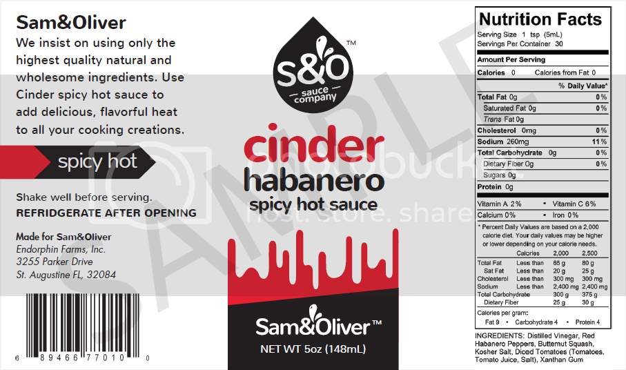
So here's the product design that the marketing firm and I settled on after discussing our company vision and direction. Aside from minor edits (I see a few even now) I wanted a product packaging that would appeal to a broad general population audience from young to mature, with a bold look that could be easily identified and used by back-yard-grillers to sandwich shops to restaurant tables without losing it's charm.
Sam&Oliver is committed to only using the best wholesome ingredients to create healthy and fun condiments for anyone who wants to enjoy them with their food creations, and as such the packaging should also reflect this ideal with a clean label.
Sample Label:
Bottle Render by the design firm: Finished product will use black caps and a black tamper-evident shrink band:
(coming soon)
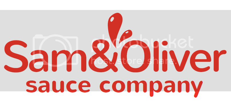
Here's the Brand:
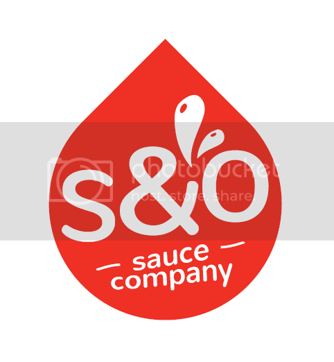
and
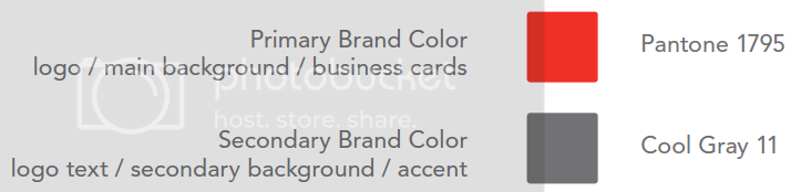
Colors used for the logo:
So that's what I've been doing for the last few weeks. Once this is finalized I can start my Kickstarter, and then look into production, then product liability insurance and trying to figure out how to actually sell and/or ship the stuff for a fair price.
--------------------- 8< *snip*
So here's the product design that the marketing firm and I settled on after discussing our company vision and direction. Aside from minor edits (I see a few even now) I wanted a product packaging that would appeal to a broad general population audience from young to mature, with a bold look that could be easily identified and used by back-yard-grillers to sandwich shops to restaurant tables without losing it's charm.
Sam&Oliver is committed to only using the best wholesome ingredients to create healthy and fun condiments for anyone who wants to enjoy them with their food creations, and as such the packaging should also reflect this ideal with a clean label.
Sample Label:
Bottle Render by the design firm: Finished product will use black caps and a black tamper-evident shrink band:
(coming soon)
Here's the Brand:
and
Colors used for the logo:
So that's what I've been doing for the last few weeks. Once this is finalized I can start my Kickstarter, and then look into production, then product liability insurance and trying to figure out how to actually sell and/or ship the stuff for a fair price.


