labels Label Updates (yet again)

I knew I had to add a bar code to the labels for this round, as well as fix the nutritional panel/ingredients to be laid out vertically, instead of horizontally....It led to this.....I'm very happy...More towards where I want to take things in a branding perspective...
 
THEN


I knew you were going for a vintage term, but they don't always convey properly.
 
You do have tones of vaudeville, it looks a bit like a vaudville movie poster and the very top font, like a theatre company. The old label didn't have this, it came across darker and ominous. 
 
The Hot Pepper said:
I knew you were going for a vintage term, but they don't always convey properly.
 
You do have tones of vaudeville, it looks a bit like a vaudville movie poster and the very top font, like a theatre company. The old label didn't have this, it came across darker and ominous. 
 
Another part of the 're-brand' tweaking.
 
I don't want to corner myself within a niche or 'controversial lyrics' on the bottle...I see plenty of HS companies with crazy labels, and I can see from a business stand point how it can turn people off before they even try the sauce. I'd rather live on the side of caution.
While it never came up once to me, I don't want to offend potential retail or wholesale opportunities in any sense, and can simply have 'more fun' with the marketing side of things...always working on the balance...
 
Yeah cool. Vaudeville is a cool theme, like I said I see hints, but you could throw even more in there, and then some terms from that time would make more sense. Not really a niche just a look and feel, like how Coney Island beer has those cool "side show" "freak show" type labels.
 
https://www.google.com/search?rlz=1C1CHFX_enUS525US525&es_sm=93&tbm=isch&q=vaudeville+poster&spell=1&sa=X&ved=0CBoQvwUoAGoVChMIwL2_ibPPyAIVCzs-Ch3Qrw3e&dpr=1&biw=1280&bih=899

https://www.google.com/search?q=coney+island+beer+labels&rlz=1C1CHFX_enUS525US525&es_sm=93&source=lnms&tbm=isch&sa=X&ved=0CAcQ_AUoAWoVChMI_O633rPPyAIVhno-Ch3bQAFp&biw=1280&bih=899#imgrc=_
 
The Hot Pepper said:
Yeah cool. Vaudeville is a cool theme, like I said I see hints, but you could throw even more in there, and then some terms from that time would make more sense. Not really a niche just a look and feel, like how Coney Island beer has those cool "side show" "freak show" type labels.
 
https://www.google.com/search?rlz=1C1CHFX_enUS525US525&es_sm=93&tbm=isch&q=vaudeville+poster&spell=1&sa=X&ved=0CBoQvwUoAGoVChMIwL2_ibPPyAIVCzs-Ch3Qrw3e&dpr=1&biw=1280&bih=899

https://www.google.com/search?q=coney+island+beer+labels&rlz=1C1CHFX_enUS525US525&es_sm=93&source=lnms&tbm=isch&sa=X&ved=0CAcQ_AUoAWoVChMI_O633rPPyAIVhno-Ch3bQAFp&biw=1280&bih=899#imgrc=_
 
Exactly...I'm gonna pass those links over to my designer to see if we can implement a little bit of that into the label...Just a bit, as I don't want it to be a parody or back myself into another corner, but thats the 'vintage-ness' I am looking to achieve....Gratzi!
 
grantmichaels said:
I don't read the labels of anyone's sauces ...
 
None ... nobody's ...
 
Tell me what it is with a descriptive name, at a glance, and leave room for me to see it in the bottle ...
 
That's just me, though ...
 
It's not just you, it's a segment of the population. And another segment of the population scrutinizes labels heavily. And another segment of the population is in between light and heavy scrutiny. 
 
But not everything you read is "active" reading, and not all influences for product purchasing decisions are deliberate. Some are intuitive and based on subtle nuance, whether you believe this to be so or not. 
 
Take a look at your grocery aisle sometime and see how much green there is. You'll be a little surprised at the amount. Labels, hang-tags, packaging, call-outs on labels, or even the product color. Do you think it's a coincidence that the scrubby part of those scrubby sponges are green?  It's not. Green is supposed to be a positive influence on purchasing. Many studies have been conducted on what drives consumer purchasing and color factored heavily into it. 
 
There are many many more factors of course, but that's one of them. 
 
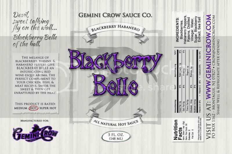
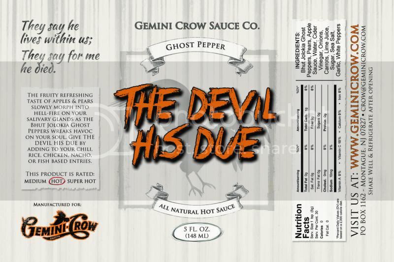
Likewise, sometimes it's the subtle things that influence your decision-making. Take the banner on Crow's label for example. If a prospective consumer doesn't know what a Ghost Pepper is, they're sure as shit not going to know what a "Apple Ghost" is, and they may not need to consciously think "hey, what's an Apple Ghost?" - it might just be that at a glance they see something that they cannot identify with and in that split second they're negatively impacted in their decision.
 
This can be for 1000 different reasons, be it imagery, color, or phrasing.
 
Similarly, if they see "Apple & Ghost Pepper" then they will instantly know several things. One, they know instantly that the sauce has apples in it, and two that "ghost" it's a type of pepper, even if they've never heard of it before. This is all critical information that you simply can't assume people know. 
 
I think it's a major mistake to omit the word :"pepper". Some might disagree, but you'll notice that I have it on every one of my labels. "Mild Lightly Smoked  Pepper Sauce" or "Hot Fire-Roasted Pepper Sauce".  On the romance panels I say "ghost pepper", or "fire-roasted jalapeno pepper".
 
I was taught in my marketing classes that one can never assume that the public will take the effort to think about your product. You need to make it a total no-brainer for them or risk losing them altogether. People (generally) don't want to have to work to figure out what something is, and sometimes making the consumer do that extra bit of work will be the difference between making the sale or not.  You have a split second to capture their attention on the shelf. And if they don't know what you're selling them at a glance from the description on the front, you've failed at product packaging. 
 
Especially in a grocery store where the sauce-maker is not there to explain it to them. 
 
As such I would never put "Ghost" on my label without the word "Pepper" following it. Because I'm going to assume that only about 30% of the population even knows what a ghost pepper is. Maybe that's a poor assumption on my part, but even if it's only 30% of the population that doesn't know, that's 30% that I lose by failing to clarify it for them. 
 
And sometimes it's not at a conscious level.  
 
That said, I just won a grand champion in a marketing division, as well as a 1st place for label art at the Scovies for a product that has no description on the front other than "hot sauce" on the banner....but that also said, it's a pretty eye catching label, which also helps. 
 
Lucky Dog Hot Sauce said:
I think it's a major mistake to omit the word :"pepper". Some might disagree, but you'll notice that I have it on every one of my labels. "Mild Lightly Smoked  Pepper Sauce" or "Hot Fire-Roasted Pepper Sauce".
You have to look to the future for this and consider continuity. Let's say you have Jalapeno sauce. Fine. Now, you have Scorpion sauce. Okay you need to add pepper otherwise most people will not know what you mean by Scorpion. Okay, Scorpion Pepper Sauce. But that does not follow the continuity of your Jalapeno Sauce, Habanero Sauce, etc. So plan ahead, put pepper now... Jalapeno Pepper Sauce, then Scorpion Pepper Sauce matches. Hope that made sense. lol
 
The Hot Pepper said:
You have to look to the future for this and consider continuity. Let's say you have Jalapeno sauce. Fine. Now, you have Scorpion sauce. Okay you need to add pepper otherwise most people will not know what you mean by Scorpion. Okay, Scorpion Pepper Sauce. But that does not follow the continuity of your Jalapeno Sauce, Habanero Sauce, etc. So plan ahead, put pepper now... Jalapeno Pepper Sauce, then Scorpion Pepper Sauce matches. Hope that made sense. lol
 
Totally agree. And by having that descriptor, when someone creates the new hottest whatever, the groundwork is there. "Reaper Pepper" makes sense to a consumer, even if they have no clue what a reaper is. They'll at least know that it's a pepper because you've included that descriptor. 
 
Do the work for the consumer - don't expect them to think. 
 
Yes and there were sauces with reaper in the name before the pepper because it is an evil name, so adding pepper let's you know. Otherwise it could just be a name for being hot.

Unless you don't care if people know what pepper it is, or if only chiliheads get it, and I can see that too. Up to you.
 
I like going back to the original font.  Definitely prefer a banner that says-
 
Apple & Ghost Pepper
Hot Sauce
 
 
Blackberry and Habanero Pepper
Hot Sauce 
 
(No Plurals)
+ to saying "pepper"


But now you have 2 different logos.  The graphics one on the side and the OtherFont printed one on the front panel.  It seems to me that one style/logo should be chosen and used for everything.  You'll be fighting an uphill battle with brand recognition if you use the swirly one on your business cards and the retro-font on the labels.  If you give your business card to someone and say "Pick up my sauce at XYZ Market" and they take the card to go looking for the sauce....:shrug: ..might not find it if they are looking for the swirly logo.
 
See how it looks with the Swirly Font on the front panel, or how it looks with the retro font on the side.  Either one could work, just need to pick one and run with it.
 
it is a badass logo, so why isn't it front and center?
 
 
also, if you go with (Not Jolokia) Ghost Peppers in the romance and banner, make the ingredients the same.  Ghosts are mainstream enough now. 

just trying to get everything consistent. 
 
salsalady said:
it is a badass logo, so why isn't it front and center?
Damn you!!!!!! I could see that, at the top instead of the company name font, yes. Like how on every Anheiser Busch beer no matter if it is Bud, Busch, whatever, you see the AB logo, small. Or Kellogg's cereal. You make a good point. At first, I was like... company logo, can be on side, may not fit every bottle theme, but no. You are right. It IS badass, and pops. And if you sell T-shirts and have banners with it (as he does I believe) then yes, it needs to be on front for brand recognition.

You win this round.

Plus Gemini Crow is the brand here. There is no company umbrella with multiple brands. Yes, that needs to be on front imo.
 
:lol:  considering we're on the same team, GeminiCrow wins!  :lol:
 
I'd prefer t-shirts with the side logo, not the one on the front panel....
just sayin'~~~
 
And maybe not have the logo color-outlined if on the front panel.  I like the semi-monochromatic look of the original labels with the sauce name in color.  Guess it would have to be played around with.  Try one with color outlines, one without. 
 
 
Didn't we go through this with Sam&Oliver?  Eventually he came up with a logo that could go on anything and everything.  Consistency between labels is something I'm missing.  The old hot sauce labels (which were designed 13 years ago to match the salsa label) are a totally different look than all of the new product labels. 
 
Not to derail this topic, but a couple weeks ago I received a random email basically saying "your website and labels suck, they look like they were designed by a teenager in the 80's [I believe the phrase screams 1980's was used].  Let me know if you want to update your website and get it into the 21st century.  Unless they were designed by your teenager or your significant other.  In that case, I don't want any hard feelings so, never mind."
 
I was like...WTF?  I know my labels are mixed up and the website sucks, but I'm not willing to drop a few thousand dollars to re-print perfectly good labels right now.  Eventually, yes, everything will get a re-work.  For now.....it's not a priority.  :crazy:
 
This guy said "you should talk to someone who knows how to do graphics..." ...I didn't bother to explain to the schmuck that when I get ready to do updates, I have a great resource right at my fingertips.  :lol:
 
Funny part is when he came up with the logo I raved about it... and I somehow missed that it is not on front where it should be...
 
And yeah, insulting people is no way to get work. They think it is... seen it many times.
 
I have to admit to thinking something like that when I shopped there, SL ... it was the show-through of some MS Front Page or some pre-Adobe Macromedia, or something ...
 
But, I mean, whatever ... you're already multiple hats, right? ...
 
In another life I'd be able to write up some tut's for folks ... but not in this one I'm living.
 
Lucky Dog Hot Sauce said:
I agree with the logo on front. The gray-on-gray "Gemeni Crow Sauce Co" at the top center could easily be replaced with the nice coca-cola font logo he's rockin on the side of the bottle. 
 
So to make sure I am clear on the suggestion...
Do a basic color-less version of my logo on the top of the center panel.....So it'll be in the left panel in the color of the sauce logo/sauce, but basically, black/white in the center?
 
i think i toyed with that idea early on but thought it looked distracting.....i can try again though....
 
I'd just scrap it all and start from scratch at this point. lol
(Kidding)

No, I dunno - I just like that logo better and don't get why it's inconsistent with what's on the front of the bottle.

A muted gray version might look good. I can see how the color version might be distracting....
 
Lucky Dog Hot Sauce said:
I'd just scrap it all and start from scratch at this point. lol
(Kidding)

No, I dunno - I just like that logo better and don't get why it's inconsistent with what's on the front of the bottle.

A muted gray version might look good. I can see how the color version might be distracting....
 
Scrap it is an option.....coming soon -  Gemini Crow Snow Removal service...... no label neccesary!
 
 
We'll try a version! Only issue I see is that in order to fit it in the space (as is), the logo is gonna be sooooo tiny...but we can try
 
Back
Top