customer perception is a critical point for things like HFCS.
+++ on No Plurals!
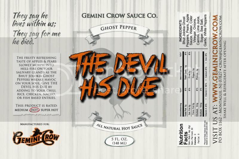
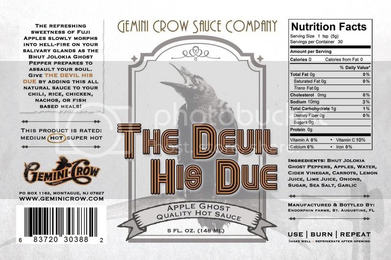
Apple & Ghost Pepper
WAIT A MINUTE! Jack the Reaper?????? Where did that one come from?
Hmmmmmm... gonna have to look at that one for a day or so. Initial response is- I don't like the backwards and disjointed letters. Haven't made up my mind about the name itself....gonna have to look at it a couple more times...............think about how it works into the overall line.
Just wondering,,,,any other sauces out there by that name?????
aight- after a quick examination-
For Jack the Reaper- I totally do not like the font, not sure about the name, but I kinda get where it's going.
The fond doesn't work with the old fashioned look.
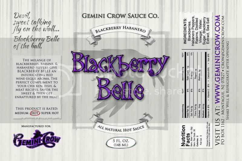
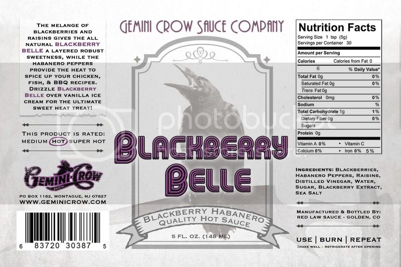
Blackberry Belle looks like...maybe a little bit Hollywood, but still looks gothic/vampire/Munster-ish
burn- a classic caligraphy
Devil's Due- looks like something scratched onto an old barn board
Gemeniah's- still kind of old fashioned but funky looking font
JAcK th3 r3Ap3R......does not fit with the rest of the brand.
PS- really hoping the Coke-Logo can make it onto the front panel.
")
Keep at it, it'll get there~~~