Nice looking labels here, thought I would throw my 2 cents in. Most of my suggestions are regarding copy/content. And they are merely suggestions!
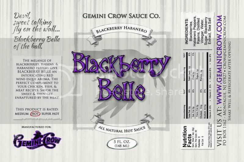
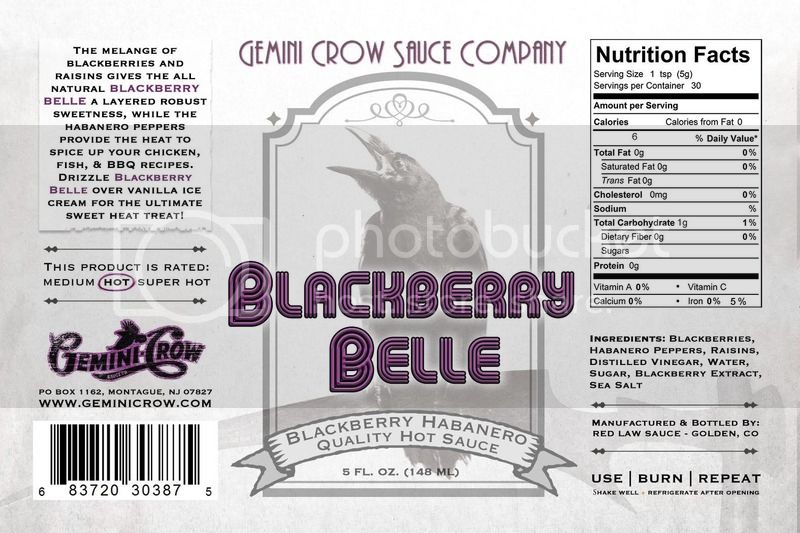
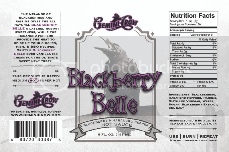
Blackberry Belle
Technically mélange should have an accent mark over the first “e” – it’s not incorrect without it, but it’s kind of like using jalapeño without the tilde. Everything gets Americanized over time, but I feel like if you’re going to use a fancy French word like mélange, you should probably go with the accented spelling. It’s a great word, but I am betting at least 75% of people don’t know what it means.
Jack The Reaper
I agree, the backwards lettering is disorienting. Like others have said, the last thing you want to do is confuse the customer.
Change “lure” to “lures.”
“False sense of serenity” is a decent play on “false sense of security” -- the more familiar phrase.
Hyphenate “chicken-based.”
Remove “will” after entrees – makes it more active voice (and shortens the copy as well).
Burn
Straightforward is one word. You might have to break it due to the label justification.
Hyphenate “super-intense” – you could drop super, intense alone is a powerful adjective. Again, might save you some space on a crowded romance panel.
Complement, not compliment.
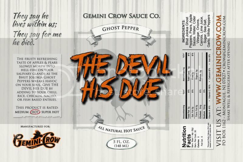
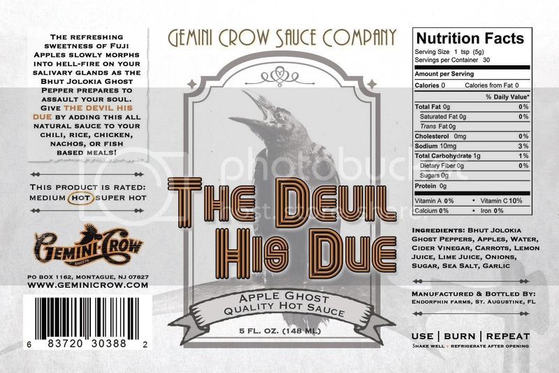
The Devil His Due
Hellfire is typically one word.
Remove Jolokia.
“Entries” is an odd word choice – how about “dishes” or “entrées”? Or maybe that’s just a typo?
Geminiah’s Fiery Catsup
This is a lot of copy – suggest dropping “Are you” from the first sentence.
Suggest dropping “Is” from next sentence.
Take the apostrophe off “blahs” – it’s plural, not possessive.
Suggest dropping “of” after “some” in the middle sentence.
The last sentence is awkward – suggest rewriting to something like:
Featuring the Native Floridian Datil pepper — prepare to fall in love with your new favorite condiment!
Either way, punctuate that last sentence. J
-----------------------------------
Nice work, and good luck!